Vaccination and seropositivity. The hyper-vaccinated Upper East and Upper West Sides. African American vaccination rates lag those of Spanish speakers.
In A Deeper Look at Vaccination Inequity in Los Angeles County, we delved into the inequities of the COVID-19 vaccine rollout in the largest county in the United States. Here, we head eastward to the Big Apple. This time around, we go beyond concerns of fairness and begin to worry about vaccine hesitancy.
Vaccination and Seropositivity
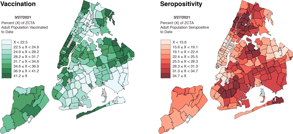
The map on the left-hand side of Figure 1 shows the percentage of the adult population that has so far received at least one dose of a COVID-19 vaccine. The map on the right shows the corresponding percentage of adults who have so far had a positive antibody test for SARS-CoV-2. The two maps look like negatives of each other.
As we noted in A Deeper Look, many people who’ve already come down with COVID-19 don’t think they need to be vaccinated. (Consider Sen. Rand Paul’s provocative tweet of November 17. ) While there is now a strong medical case that those already infected should get vaccinated as well – In fact, we’re doing just that at our own community health center. – the perception that one is naturally protected is nonetheless a critical determinant of vaccine demand.
Prior studies of equity in vaccination rollout – and, in particular, studies of disparities in racial and ethnic vaccination rates – have ignored this important negative relationship between seropositivity and vaccination rates.
Two-Way Plot
Map comparisons may be illuminating, but they’re hard to work with. So let’s convert the negative relationship for New York City into a two-way plot.
Figure 2 plots the percentage of adults who have had at least one COVID-19 vaccination against the percentage of adults who have had a positive antibody test. As in A Deeper Look, this two-way plot allows us to quantitatively test the relationship between past COVID-19 infection and the demand for vaccination.
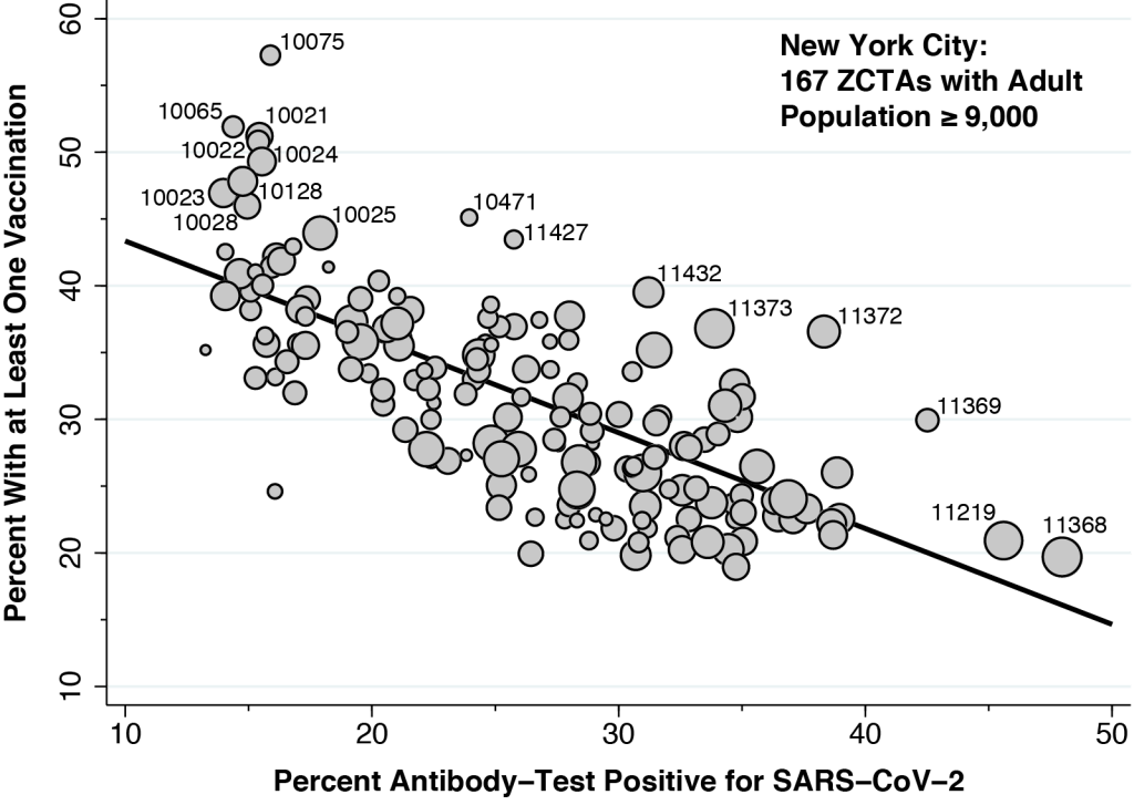
In contrast to our two-way plot for Los Angeles County, here we rely on New York City’s database of antibody tests for prior COVID-19 infection. The estimated slope of the fitted line is –0.71, which means that, in the absence of any other confounding factors, 71 out of 100 previously infected individuals have so far chosen to deter vaccination.
Vaccination itself may eventually cause some currently marketed antibody tests to turn positive. If so, the trend seen in Figure 2 would understate the actual deterrent effect of prior infection on vaccine demand, so that the real number would be greater than 71 out of 100. Still, this bias is likely to be small, as the vast majority of antibody tests were done before the U.S. vaccination rollout.
In Figure 2, we’ve drawn attention to a few specific Zip Code Tabulation Areas (ZCTAs). At the upper left, there is a cluster of nine ZCTAs located in the Upper East Side and Upper West Side, affluent areas bordering Central Park. At the extreme right, we see Corona in Queens (11368), where 48 percent of adults so far tested have had detectable antibodies against coronavirus, followed by Borough Park in Brooklyn (11219), where the seropositivity rate has reached 46 percent. Tracking the outliers from right to left, we see East Elmhurst (11369), Jackson Heights (11372) and Elmurst (11373) in Queens. Along with Corona, these contiguous ZCTAs formed the Queens-Elmhurst hotspot that emerged in late March 2020 in the early days of New York City’s epidemic.
Upper East Side – Upper West Side
Figure 2 should not be interpreted to mean that prior SARS-CoV-2 infection is the only determinant of the likelihood of vaccination. It’s just that we need to take prior infection into account when we analyze other potential determinants.
To that end, Figure 3 shows the influence of household income. This new figure is the same as Figure 2 except for the color coding. The darker-colored points represent ZCTAs with a median household income of at least $67,800 (the median of the medians), while the lighter-color points show the ZCTAs with a median household income below that threshold. The data on income and other demographics come from the Census Bureau’s American Community Survey.
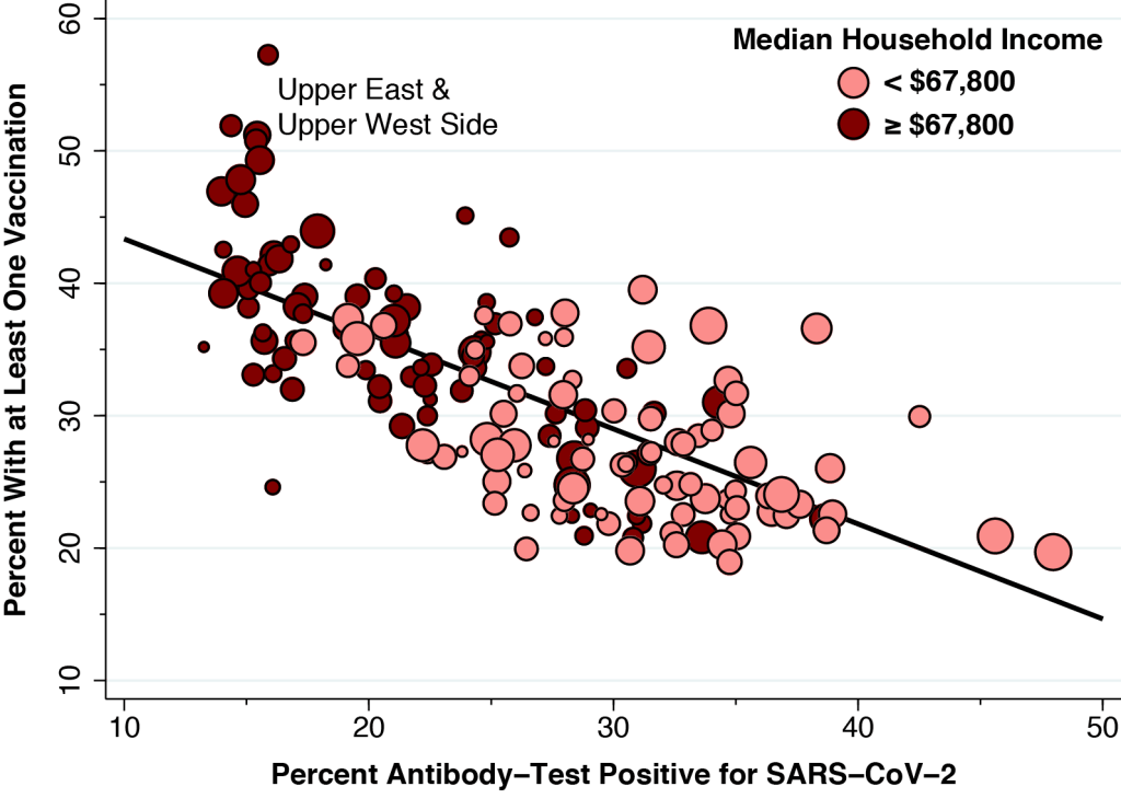
If higher household income in fact enhances vaccination rates – even after accounting for prior infection – then we would expect to see the darker-colored points situated above the line and lighter-colored points situated below the line.
Figure 3 shows us that income indeed matters . Its influence, however, is concentrated in the cluster of outlier points in the upper left, all of which correspond to ZCTAs on the affluent Upper East Side and Upper West Side, where median family incomes exceed $120,000 annually. To be sure,there is an obvious relationship between income and the likelihood of having ever been infected. However, in contrast to our findings for Los Angeles County in A Deeper Look, there is no income gradient in vaccination rates at any given level antibody-test positivity.
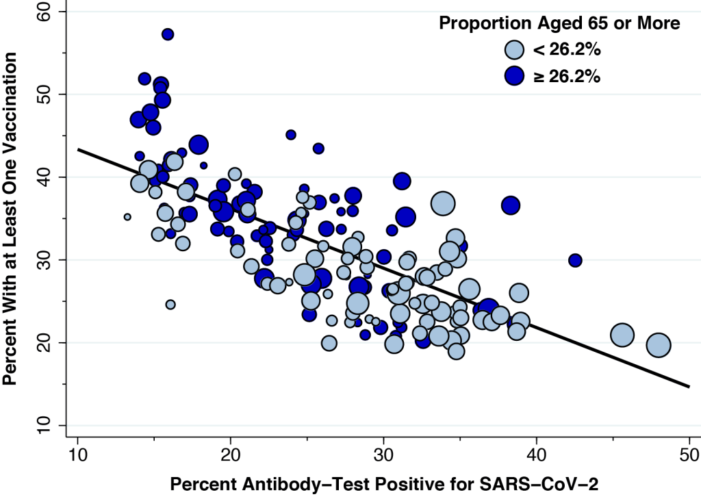
Figure 4 shows the corresponding plot to gauge the influence of age. Again, we’ve copied over Figure 2, but this time the darker color-code points correspond to those ZCTAs with a higher proportion of senior citizens. The figure confirms that age matters, even when we take prior infection into account. Like Figure 3, the influence of age is concentrated in those ZCTAs with the lowest prior infection rates, especially the cluster located on the Upper East Side and Upper West Side.
Black and African Americans
Figure 5 once again reproduces our basic Figure 2, but this time we’ve broken down the data points by the proportion of individuals in each ZCTA who describe themselves as Black or African American. In contrast to Figures 3 and 4, we’ve shaded the data points in three colors. The lightest shade represents 84 ZCTAs with less than 10.3 percent (the median across all ZCTAs), while the two darker shades identify the 83 ZCTAs with a proportion of Black or African Americans above that cutoff. The very darkest shade represents 47 ZCTAs that are further distinguished as being significantly below the fitted line.
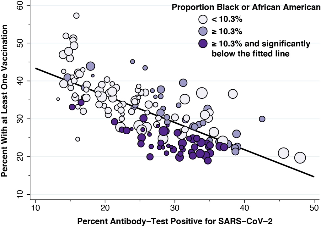
Figure 5 shows a pattern quite different from those in Figures 3 and 4. While ZCTAs with a higher household income or a higher proportion of elderly residents have higher vaccination rates, the opposite trend is observed for the proportion of Black and African Americans. Moreover, the lower vaccination rates among ZCTAs with more Black and African Americans is seen for a wide range of antibody-test positivity.
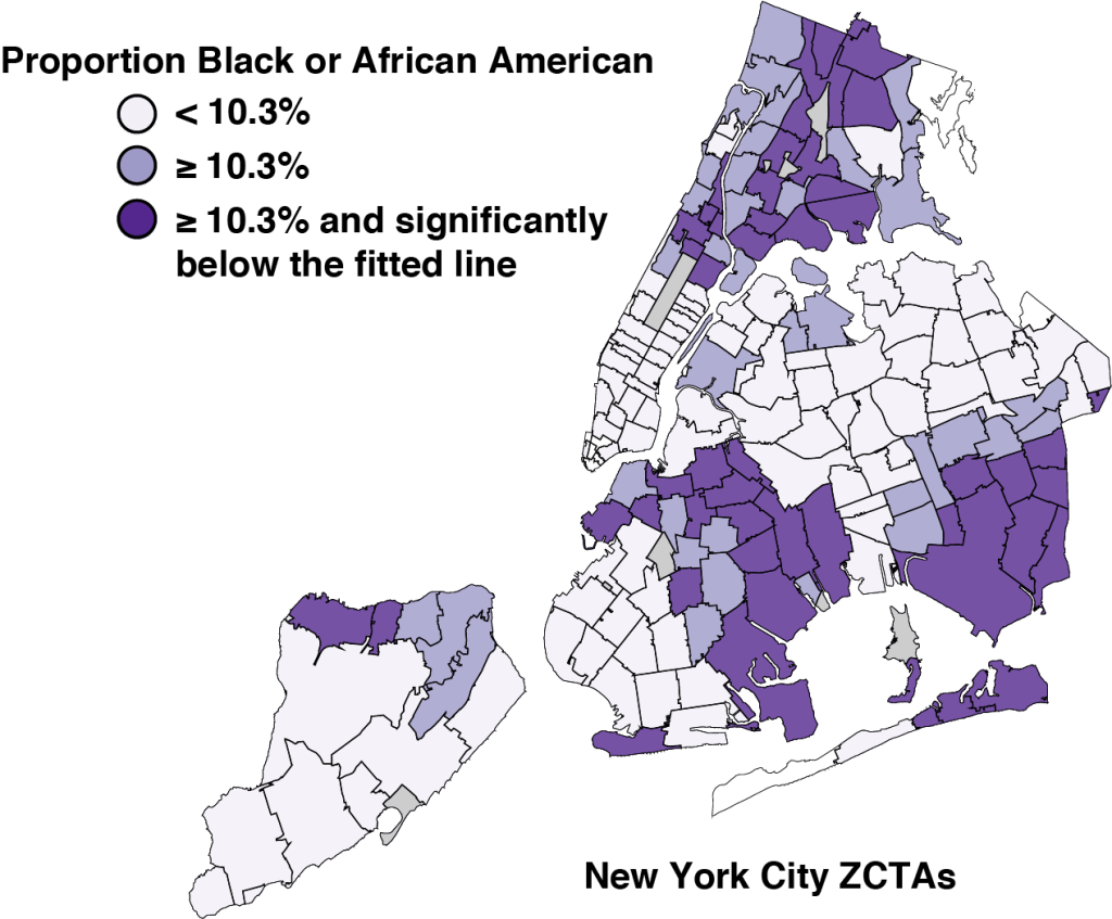
Figure 6 uses this color scheme to identify the corresponding ZCTAs in our map of New York City. As above, the two darker shades identify those neighborhoods with a higher proportion of Black or African American residents. What is most striking is that the very darkest shaded ZCTAs tend to be grouped into clusters of spatially contiguous zones.
Spanish Speakers
Figure 7 repeats the same exercise for the proportion of persons in each ZCTA who describe themselves as Spanish speakers. In contrast to the case of Black and African Americans in Figure 6, a higher proportion of Spanish speakers is associated with a higher vaccination rate. This is particularly the case for the ZCTAs that made up the Queens-Elmhurst hotspot described in Figure 2.
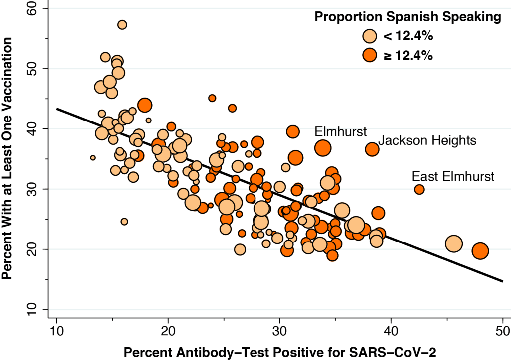
To construct Figure 7, we measured the proportion of individuals in each community describing themselves as Spanish speakers. We saw virtually the same pattern when we instead measured the proportion of individuals in each ZCTA who described themselves as Latino or Hispanic. The only difference was that the median proportion of self-described Latino/Hispanic persons was 19.5 percent.
Statistical Breakdown
Figure 8 shows the results of our statistical breakdown of the influence of all five factors on the likelihood of vaccination to date in New York City. The basic idea is to estimate the effect of each individual factor while holding the remaining four factors constant. The details, which mirror the approach we took for Los Angeles County in A Deeper Look, have been relegated to the Technical Notes below.
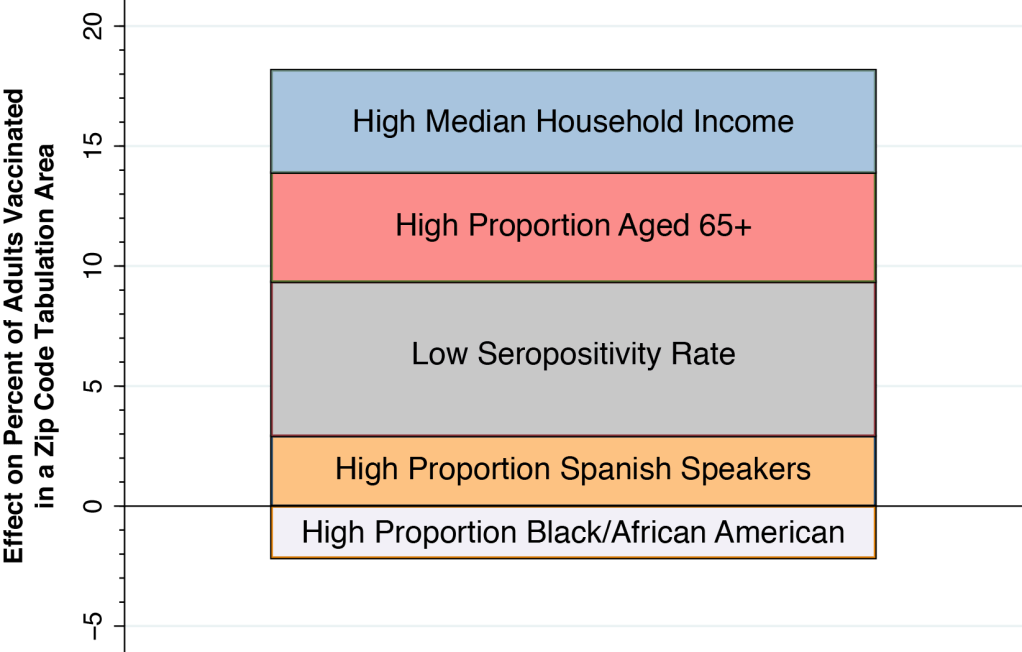
A low seropositivity rate (that is, fewer than 26.4 of adults having tested antibody-positive for coronavirus) was the most important factor. The proportion of adults vaccinated was 6.4 percentage points higher in those ZCTAs with a low seropositivity rate. The next two most important factors were a high median household income (4.6 percentage points) and a high proportion of seniors (4.3 percentage points). A high proportion of Spanish speakers raised the likelihood of vaccination by 2.9 percentage points, while a high proportion of Black/African Americans lowered the likelihood of vaccination by 2.2 percentage points.
A Cautionary Note on Vaccine Hesitancy
It comes as no surprise that the rollout of COVID-19 vaccinations in New York City exhibits significant evidence of economic inequality. What is more unexpected is that the inequality is so highly concentrated in a small area bounding both sides of Central Park in Upper Manhattan.
But that is not the real take-home lesson of this deeper look at vaccination rates in New York City. Once we account of other factors influencing demand or access – prior rates of COVID-19, median household income and proportion of senior citizens– we find that Spanish-speaking individuals have a higher than expected vaccination rate, while Black and African American individuals have a lower than expected rate.
One partial explanation is that the city government’s prioritization of vaccine distribution, in combination with private efforts, is already having an impact – especially in those Latino communities in Queens that were hardest hit by COVID-19 last spring. That may explain why the data points for East Elmhurst (11369), Jackson Heights (11372) and Elmurst (11373) in Queens are so far above the line in Figure 7.
But what about the finding that the data points for predominantly Black and African American communities remain below the line, as we saw in Figure 5? And why do the communities farthest below the line seem to be clustered, as we saw in the map of Figure 6?
Perhaps we’re simply observing a temporary state, a condition of disequilibrium. As vaccines become more plentiful, the divergence between the two groups may disappear. The deeper concern, however, is that we may be confronting a serious problem of persistent vaccine hesitancy.
Spatial Clustering and Peer Effects
As economists well know, the spatial clustering of ZCTAs in the map of Figure 6 has two competing interpretations. On the one hand, the individuals in these clusters may simply share things in common that have nothing to do with the demand for or access to COVID-19 vaccines. On the other hand, there is the distinct possibility of peer effects. That is, individuals in close social proximity learn from each other.
Much has already been written about the drivers of vaccine hesitancy among Black and African Americans. Our findings here suggest that the underlying beliefs driving vaccine hesitancy are learned, shared, and reinforced through highly local, personal interactions.
When a patient tells us, “I just don’t trust those vaccines,” he’s really saying, “We don’t trust those vaccines.” When another patient tells us, “I heard that people have died from the second dose,” she’s really saying, “My core influential group says that people have died from the second shot.”
If so, then our task as physicians and nurses is not simply to factually and dispassionately allay our individual patients’ concerns about vaccine safety and effectiveness.
We need to leave the comfort of our examining rooms and step out into the community.
Technical Details
As in A Deeper Look, we specified a multivariate statistical model of vaccination rates across 167 Zip Code Tabulation Areas (ZCTA), where each of the five explanatory variables was binary, that is, either low or high. For each explanatory variable, the cutoff between low and high was the median value for the sample. Table 1 below shows our detailed results.
| Binary Explanatory Variable | Coefficient | Lower Range | Upper Range |
| Low Confirmed Seropositivity | 6.43 | 4.43 | 8.42 |
| High Median Household Income | 4,55 | 2.64 | 6.46 |
| High Proportion Aged 65+ | 4.26 | 2.38 | 6.14 |
| High Proportion Spanish Speakers | 2.92 | 0.99 | 4.85 |
| High Prop. Black/African American | –2.16 | –4.01 | –0.32 |
The use of binary explanatory variables allowed us to compare the magnitudes of each of the variables’ estimated effects. A high proportion of Spanish speakers in a ZCTA was associated with a 2.92 percentage point increase in the likelihood of vaccination, while a high proportion of Black or African Americans was associated with a 2.16 percentage point decrease. The spread between these coefficients, equal to 5.08 percentage points, was statistically significant.
Table 2 shows the results of an alternative linear multivariate model where each of the explanatory variables is continuous. The estimated coefficient of Percent Seropositivity was –0.38 (95% CI –0.49 to –0.27). That is, once we took all our explanatory factors in account, the impact of prior SARS-CoV-2 infection on vaccination rates was reduced by about half.
| Continuous Explanatory Variable | Coefficient | Lower Range | Upper Range |
| Percent Seropositivity | –0.38 | –0.49 | –0.27 |
| Median Household Income ($000) | 0.11 | 0.08 | 0.14 |
| Percent Aged 65+ | 0.62 | 0.47 | 0.77 |
| Percent Spanish Speakers | 0.13 | 0.09 | 0.17 |
| Percent Black or African American | –0.06 | –0.09 | –004 |