Wisconsin Revisited

We went back and looked at COVID-19 incidence and bar attendance in Dane and Milwaukee counties.

A lot has happened in the state of Wisconsin since we last reviewed its struggles with the continuing COVID-19 epidemic. (Our last review was subsequently published here.)

On October 6, Wisconsin Department of Health Services Secretary-designee Andrea Palm issued Emergency Order #3, restricting indoor gatherings in stores, restaurants, bars and other public venues to 25-percent capacity. “The State of Wisconsin is in the midst of a deadly, uncontrolled, and exponentially growing spike in cases of COVID-19,” noted the order’s preamble. “Some Wisconsin hospitals are already struggling to keep up with care demands – both because of bed space and staffing shortages – and we have to do what we can to slow down the spread of this disease so our health care workers can keep up,” noted the accompanying FAQ. Five days later, on October 11, the weekly state report of the White House Task Force declared, “Wisconsin has seen a sustained peak of epidemic activity in the last week with an ongoing health emergency.

The following day, St. Croix County Circuit Judge R. Michael Waterman upheld Gov. Tony Evers’ August 1 emergency order mandating the use of masks in enclosed public spaces. At least for the moment, it looked like the state government was finally recovering from the aftermath of the Wisconsin Supreme Court’s decision back on May 13 to nullify Secretary Palm’s original statewide safer-at-home order of March 24.

But then on October 14, Sawyer County Circuit Judge John Yackel temporarily blocked Secretary Palm’s October 6 order limiting the indoor capacity of stores, bars and restaurants. That same day, the state opened a field hospital in State Fair Park as the census of hospitalized COVID-19 patients crossed the 1,000 threshold. On Monday, October 19, Secretary Palm was to appear in court to defend her order.

COVID-19 Incidence in Dane and Milwaukee Counties

Figure 1 below shows the daily incidence of newly confirmed COVID-19 cases in Wisconsin’s two most populous counties from March 15 through October 16. When we last took a snapshot on July 24, the incidence of new cases was starting to come back down in the wake of a July 7 local order requiring the use of face masks while taking public transportation in the city of Madison and the rest of Dane County, as well the July 13 adoption by the Milwaukee City Council of the Milwaukee Cares Mask Ordinance.

Figure 1. Daily Incidence of Newly Confirmed COVID-19 Cases per 100,000 Population. Dane and Milwaukee counties, March 15 – October 16, 2020

From the first week of August onward, however, new COVID-19 cases resumed their upward climb. We’re still investigating whether the apparent bump in Dane County cases (purple data points) in early September can be wholly attributed to an outbreak at the University of Wisconsin in Madison. Still, the point is clear, the local mask-related orders of July had at best a temporary effect.

Bar Attendance in Dane and Milwaukee Counties

Figure 2 below shows the daily trends in bar attendance in the two counties through September 30. The graphic is derived from the Patterns database maintained by SafeGraph, which we’ve previously used to study gym attendance in Los Angeles County since February 2020, restaurant attendance in San Antonio around the time of street protests during May 30 – June 11, 2020, and visitors to President Trump’s rally in Tulsa on June 20, 2020.

Figure 2. Daily Index of Visits to Bars in Dane and Milwaukee Counties, March 1 – September 30, 2020. Daily visits have been normalized so that the average fro February 17 – March 13 equals 100.

The database records the movements of holders of smartphones with location-tracking software. For every day from February 17 through September 30, we computed the number of entries into each of 240 Milwaukee County bars and 230 Dane County bars. To make the two series compatible, we normalized the numbers of entries so that the mean for the period February 17 – March 13 was equal to 100. The figure shows the normalized series from March 1 onward.

When we last looked at the bar-attendance data, the gap in attendance between the two counties from mid-March through the end of May had already disappeared, and the number of visits in both counties was hovering around 60 percent of its pre-epidemic baseline. Since then, bar visitation has risen to around 70 percent of baseline, with attendance on some weekends exceeding 90 percent.

What Happened?

The temptation here is simply to assign all the blame to the bars. A fairer interpretation is that the bar-attendance data are no more than an indicator of a broader pattern of increasing social activity in the face of repeated governmental efforts to promote mask wearing and reduce crowding in public venues. At least in the two most populous counties in Wisconsin, the data suggest that these governmental efforts have had only limited, temporary effectiveness, with their impact repeatedly wearing off in a matter of weeks.

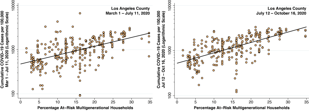
At the peak of the COVID-19 epidemic in Los Angeles County during the first half of July, newly confirmed COVID-19 diagnosis were running at about 210 per 100,000 population per week. Since then, the incidence rate has dropped to about 70 per 100,000 per week. But for the high prevalence of multi-generational families at risk for intra-household transmission, we’ve maintained that the COVID-19 incidence rate in Los Angeles would now be much lower. In Wisconsin, by contrast, the most recent data are running in the range of 225 confirmed cases per 100,000 per week in Dane County and 300 per 100,000 per week in Milwaukee County.

One explanation is that there is so little political consensus in Wisconsin that state and local governments are effectively paralyzed, or at least severely constrained into taking half-measures. Another is that governmental orders to wear masks and stay out of bars are effective only if accompanied by compelling messages. Admonitions to protect yourself or to protect others, we’ve maintained, need to be replaced by messages to protect your family. In any case, our research needs to stop asking whether public policies work and start inquiring when and where they work.

Within-Household Transmission Played a Key Role in the Spread of Coronavirus in Los Angeles County

Public health policy needs to be reoriented from a focus on protecting the individual to a focus on protecting the household.

In our clinical work at a community health center here in downtown Los Angeles, the classic COVID-19 presentation is not that of a single patient, but of an entire household that has come down with the virus within the space of a few days.

With so much variability in the duration of the incubation period from infection to symptoms, it’s not terribly informative which household member happened to get sick first. But if you take a careful medical history, you’ll invariably identify a younger, socially mobile family member with few or no symptoms.

We’ve lost count how many times a fifty-something patient, struggling with body aches, loss of smell and chest tightness, expresses relief that her millennial son seems absolutely fine, even though he has been in constant, direct contact with everyone else from grandpa on down. Ironically, it is painfully clear who imported virus into the household.

Two Maps, Same County

Figure 1 below compares two maps of Los Angeles County. Each map is broken down into countywide statistical areas (CSAs), a hybrid geographic classification of independent municipalities such as the City of Beverly Hills, neighborhoods of Los Angeles such as Hollywood, and unincorporated places such as Hacienda Heights.

Figure 1. Age-Adjusted Cumulative Incidence of COVID-19 Through September 19, 2020 (Left) and Prevalence of At-Risk Multi-Generational Households in 2018 (Right) in Los Angeles County. Source: Understanding the Los Angeles County Coronavirus Epidemic: The Critical Role of Intrahousehold Transmission

On the left, the CSAs are color-coded according to the age-adjusted cumulative incidence of COVID-19 per 100,000 population as of September 19, 2020, which we derived from the surveillance dashboard of the Los Angeles County Department of Public Health. On the right, the same CSAs are coded according to the proportion of households that we’ve identified as at risk for multi-generational transmission, which we derived from the 2018 public use microsample of the U.S. Census Bureau’s American Community Survey. As explained in this detailed report, we classified a household as at risk for multi-generational transmission if it had at least four persons, at least one person 18–34 years of age and another person was at least 50 years of age.

The two maps in Figure 1 show a striking concordance. Those communities with the highest prevalence of at-risk households had the highest cumulative incidence of COVID-19 infection.

Three Phases

Figure 2 below shows the weekly incidence of newly diagnosed COVID-19 cases in Los Angeles County as a whole, running from the week starting March 1 through the week starting October 4, 2020. We have divided the epidemic into three phases. During Phase I, which ran approximately through the week of April 4–10, the epidemic spread radially from initial foci of infection located in relatively affluent communities such as the Brentwood and Beverly Crest neighborhoods of Los Angeles and the City of West Hollywood.

Figure 2. Weekly COVID-19 Cases per 100,000 Population in Los Angeles County, from the Week Starting March 1 through the Week Starting October 4, 2020. Source: Calculated from data posted at the Los Angeles County Surveillance Dashboard

During Phase II, which ran through about the week of July 5-11, COVID-19 incidence rose at slower rate, as COVID-19 infections became increasingly concentrated in areas at higher risk of intrahousehold transmission. Since the week starting July 12, COVID-19 incidence has been gradually declining, while cases continue to accumulate in the same areas where the prevalence of at-risk households remains higher. We can see the evolution of the epidemic from March 28 through September 19 in the color-coded animation in Figure 3 below.

Figure 3. Animation of the Cumulative Incidence of Confirmed COVID-19 Cases per 100,000 Population Among CSAs in Los Angeles County. The frames are in successive weekly intervals, starting on March 28 and ending on September 19. The cities of Pasadena and Long Beach, for which the Los Angeles County Department of Public Health did not report data, remain pale blue. The hot spot in the northwest corner is the unincorporated area of Castaic, site of an outbreak among inmates and employees of a local prison.

Within-Household Transmission Sustained the Epidemic Even As COVID-19 Diagnoses Were Declining.

Figure 4 below shows two graphs. Both relate the cumulative incidence of COVID-19 infection on the vertical axis to the prevalence of at-risk households across some 300 CSAs in Los Angeles County, as measured on the horizontal axis.

Figure 4. Relation Between Cumulative COVID-19 Incidence and Prevalence of At-Risk Multi-generational Households. March 1 – July 11 (Left). July 12 – October 16 (Right). The slope of the fitted line on the left is 0.046 (95% confidence interval, 0.038–0.054). The slope of the fitted line of the right is 0.053 (95% CI, 0.046–0.060), which is significantly higher.

The graph on the left covers cases of COVID-19 diagnosed during Phases I and II, from March 1 through July 11, 2020, when weekly incidence rates were continuing to rise. The graph on the right, by contrast, covers cases diagnosed during Phase III, from July 12 through October 16, when weekly incidence rates have turned around and gradually begun to fall.

During Phases I and II of the epidemic through mid-summer, when weekly case counts were still rising, a 10-percentage-point increase in the prevalence of at-risk households was associated with a 46-percent increase in COVID-19 diagnoses. During Phase III when weekly case counts were declining, the same 10-percentage point increase in the prevalence of at-risk households was associated with a 53-percent increase in COVID-19 diagnoses.

Even as new COVID-19 cases were coming back down, there remained a strong relationship between COVID-19 incidence and the prevalence of at-risk households. In fact, the relationship got stronger. Even as more stringent social distancing measures took effect and the governor launched a wear-a-mask campaign in early July, the epidemic was sustained in Los Angeles County by continued within-household transmission.

Synergy

Figure 5 below maps relative gym attendance during the month of April 2020. As described in our detailed report, we used the SafeGraph Patterns Data on the movements of devices with location-tracking software to count monthly visits to any one of two thousand gyms in relation to the geographic home base of each device. Each CSA is color-coded according to its gym attendance in April 2020 – the month with the largest overall decline in gym visits – as a percentage of the CSA’s baseline gym attendance rate in February 2020.

Figure 5. Gym Attendance in May 2020 as a Percentage of Baseline Gym Attendance in February 2020. Source: SafeGraph Patterns Data.

The gym-attendance map in Figure 5 certainly doesn’t look like the cumulative incidence maps in Figures 1 and 3. While social distancing may still be an important determinant of the overall trend in COVID-19 incidence seen in Figure 2, we can’t explain differences between CSAs solely on the basis of gym attendance. It turns out, however, that the strong relationship between at-risk household prevalence and COVID-19 incidence, seen in Figure 4, is even stronger among those CSAs with higher gym attendance. That is, there appears to be a synergy between the rate of gym attendance and the prevalence of at-risk households in determining COVID-19 case counts.

The story underlying this synergy is straightforward. Gym attendance is an indicator of social mobility of younger persons. Higher social mobility means a higher risk of contracting COVID-19. When a younger person, having contracted COVID-19 outside the household, brings his or her infection back home, the impact is magnified by the presence of cohabitants of multiple generations.

A Skeptical Note on Selective Social Distancing Policies

Our findings cast a pessimistic shadow on proposed policies to selectively relax restrictions on lower-risk, younger persons while seeking to protect more vulnerable older persons. Variously labeled targeted social distancing, age-specific deconfinement and focused protection, such policies have received serious attention from social scientists, public health specialists, mathematical modelers and bioethicists. Selective social distancing is also a central element of the recently promulgated Great Barrington Declaration.

Things would be a lot simpler if older persons were all sequestered in retirement communities or assisted living facilities. But the data here demonstrate that this is not the reality of Los Angeles County. The overall, countywide prevalence of at-risk households is 13.8 percent. With an estimated 3.3 million households in the county, we’re talking about 455,000 multi-generation households where an asymptomatic or mild SARS-CoV-2 infection in a younger household member would put older household members at significant risk.

A New Focus for Public Health Policy

Our findings require us to view the household rather than the individual as the foremost target of healthcare policy. The message “protect yourself” (protégete in Spanish) needs to be reconfigured as “protect your family” (protege a tu familia). Protecting your family is a far more immediate and personal concept than “protecting others” (proteger a los demás).

When a healthcare provider encounters a new patient with suspected or established COVID-19, the clinical interview needs to turn quickly to questions about other household members. “Who do you live with?” “Is anyone else sick?” “How old are they?” “Do they have other medical problems?” “Do they have their own doctor? Or a health plan?” The widely recognized model of the patient-centered medical home needs to be replaced by the family- and household-centered medical home.

New York City COVID-19 Cases Are Rising. But Why?

Corrected for reporting delays, the daily incidence of newly confirmed cases appears to have doubled.

Figure 1. Arrow at upper right points to our projection of 748 cases for Sept. 30, based upon 353 cases reported as of Oct. 2 and our estimate that only 47.2 percent of cases are reported within 2 days.

As noted in COVID-19 Reporting Delays: Whither New York City?, we’ve been following the daily counts of newly confirmed cases of COVID-19 as they are regularly reported by the New York City health department. As a result of delays in reporting, we’ve observed, the most recent counts routinely fall below the actual number of cases to date. In fact, the health department cautions on its COVID-19 data dashboard, “Due to delays in reporting, which can take as long as a week, recent data are incomplete.”

Using a statistical method first applied to reporting delays of AIDS cases in the 1990s and recently updated in a technical report, we have filled in the missing data and projected the actual number of cases diagnosed to date. Our statistical approach cannot predict any single individual’s pending test result, but it can give us a reasonably accurate estimate of recent, new COVID-19 cases at the population level.

In Figure 1 above, the gray data points show the numbers of cases so far reported as diagnosed on each day from June 21 through October 2. The periodic dips in the data arise from reduced testing over the weekends. As a result of reporting delays, the most recent gray data points give the false impression that the epidemic has petered out. The pink data points show that, once all the case reports come in, the number of cases is expected to be at least double – if not triple – the approximately 300 cases per day seen during the past 2–3 months.

Reduced Reporting Delays, But Still Not Enough

Figure 2. Among all positive tests, 47.% are reported within 2 days of testing, and 96.6% are reported within 10 days of testing.

Figure 2 shows the updated cumulative distribution of reporting delays, based on data over the most recent two months. These new data show a significant reduction in reporting times. When we last checked on August 15, only 81.3 percent of test results had been reported by 10 days, compared to 96.6 percent during the last two months. The mean reporting time is now 3.44 days, compared to 5.43 days as of August 15.

The problem, however, is that by just two days after testing, only 47.2 percent of the results – less than half – are reported. When it comes to a rapid public health response to an outbreak, two days can be an eternity. As of our cutoff date of October 2, the health department reported that 353 newly confirmed cases had been diagnosed two days earlier on September 30. That would mean 353 ÷ 47.2% = 748 cases will eventually be reported for September 30. This projection has been marked by the arrow in the upper right corner of Figure 1.

Why Our Projections Might Be Wrong

The main reason why our projections could be wrong is that the health department has abruptly reduced its reporting delays, but this improvement is not captured in our analysis of its reporting patterns during the past two months. The most likely possibility would be a substantial, recent increase in the demand for rapid testing, perhaps related to the recent reopening of schools. Thus far, we cannot find any data to support this speculation.

Nonetheless, the increase projected in Figure 1 is so substantial that we think it’s appropriate now to post our findings. When we add up the projected counts over the past 10 days, we’re talking about 2,500 excess cases above baseline.

What Might Be Happening

Alarms have been raised about newly emerging foci of infection in Brooklyn and Queens. The new data, however, suggest that something else may be happening on a larger scale.

Figure 3. Daily Incidence of Newly Confirmed COVID-19 Cases by Age Group in Relation to Date of Report

Figure 3 is an update of a graphic we’ve already displayed, but now with two more months of data. This figure does not incorporate any of our projections. It’s simply a rendering of data buried in the health department’s archive in multiple daily files named by-age.csv. The incidence of COVID-19 in the younger adult age group, ages 18–44, has now clearly overtaken the incidence in the older group. In the period through June 20, as we previously noted, younger adults had an incidence that was on average 40 percent lower than that of their older counterparts. At our last report, the incidence among younger New Yorkers after June 20 was about 20 percent greater. Now it’s more than 30 percent greater.

This shift in age distribution is not likely to be the result of the emergence of a recent hot spot, or the reopening of schools in the last two weeks. While we have no data on the age distribution of those who fled the city when the epidemic was raging, we doubt that we’re now witnessing a novel twist on the Return of the Native.

.