We correct for case reporting delays using a statistical method first applied to the AIDS epidemic in the 1980s.

Under our current system of voluntary testing in the United States, it takes time before the results of a COVID-19 test are communicated to the patient and reported by the public health authority. Shown above is our reconstruction of the distribution of reporting delays in New York City, computed from successive database updates issued by the health department. To that end, we used a statistical method first applied to reporting delays of AIDS cases in the 1990s. The graphic above is an update of a recently issued technical report, and incorporates the latest data through August 15, 2020. The mean delay in reporting is now 5.43 days.

The second graphic above shows the cumulative distribution of reporting delays, derived directly from the first graph. Reading off the dashed green lines, we see that 81.3 percent of all positive COVID-19 tests are reported within 10 days of the date the test was performed. That means 18.7 percent (almost one in five) take longer than 10 days from testing to reporting. These two updated graphs show some further slowing in reporting times compared to our technical report, based on data from June 21 through only August 1, 2020, which gave a mean delay of 4.95 days and 85.2 percent reported by 10 days. A critical difference is the emergence of a second mode in the distribution, shown in the first graph at 12–13 days. It’s telling us that there is a second, distinct population of tests that take a lot longer to be reported.
Recent Incidence of New COVID-19 Cases, Corrected for Reporting Delays
As the New York City department of health acknowledges on its COVID-19 data dashboard, “Due to delays in reporting, recent data are incomplete.” But we can use the above estimate of the distribution of reporting delays to fill in the missing data. While we cannot predict any single individual’s pending test result, we can still get a reasonably accurate estimate of recent, new COVID-19 cases at the population level.

The graphic above shows the number of new, daily COVID-19 cases in New York City from June 21 through our cutoff date August 15. (As above, this graphic is updated from the corresponding figure in our technical report.) The gray data points show the numbers of cases so far reported as diagnosed on each day. As a result of reporting delays, the most recent gray data points give the false impression that the epidemic has petered out. The pink data points show that, once all the case reports come in, the counts of new daily cases are expected to continue to run in the range of 100 – 500 per day, with dips during the weekends.
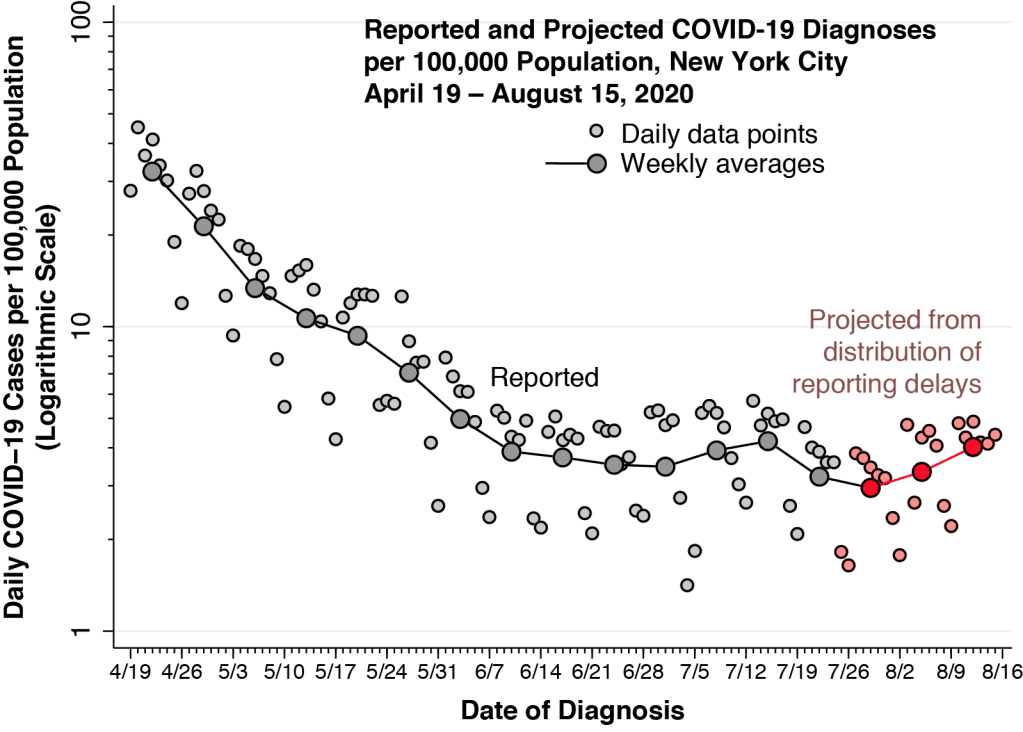
The additional graphic above offers a longer-term perspective on our projections of new COVID-19 diagnoses. We have converted the numbers of daily diagnoses into incidence rates per 100,000 population and then graphed the overall trend from April 19 onward. The incidence rates are plotted on a logarithmic scale, gauged by the left-hand axis. As above, the gray-shaded points correspond to the reported cases to date, while the pink-shaded points represent the projected cases projected from the distribution of reporting delays. In addition, the larger connected points represent the weekly averages, computed as the geometric means.
While the average weekly incidence since the week of June 7 remains in the range of 2.95 – 4.21 cases per 100,000 population per day, there is a suggestion of a recent renewed increase in incidence. Continued monitoring will reveal whether this more recent trend is fleeting or permanent.
How Long Is Too Long to Wait?
This question admits two answers – one from the individual decision-making perspective, and the other from the public health perspective. In both cases, however, the answer is that even two days is too long to wait.
Here’s a story typical of those we routinely encounter in our clinical work. Your patient, a single mother of an 11-year-old and a 13-year-old, took her two children to her sister’s place for dinner last Friday. On Sunday, the sister calls to say that she has fever, body aches, and a stuffed nose. She’s going to get tested. Your patient also lives with her two parents, who are in their mid 60’s but fortunately could not make it to last Friday’s dinner. Your patient calls you, her primary healthcare provider, inquiring whether she should get tested.
Unless you can obtain a reliable, rapid test for your patient and her two children that same day – and, if it’s negative, the following 2, 3, 4 or even 5 days – you have no choice but to advise your patient to immediately isolate herself from her parents. Your might also advise the patient and her two children to get tested on Sunday or Monday, but they would still have to remain isolated at least until their COVID-19 tests came back. And even then, you’d be concerned that the tests would have be repeated, as it could take a couple of days before your patient and her children shed enough virus to convert to positive.
When it comes to your immediate clinical decision, even a two-day delay makes testing irrelevant.
By Monday, as it turns out, your patient felt really tired and noticed that food tasted like cardboard. The 13-year-old had a fever. Her two elderly parents, holed up in their bedroom for the next two weeks, never got sick. Like so many other things in primary care, you may – without fanfare – have saved their lives.
From the public health standpoint, even a two-day delay could be quite costly. As an official closely monitoring the course of the epidemic, you might be missing an incipient outbreak. Just look at the above graph of daily incidence. Relying on the pink data points to estimate of recent incidence corrected for reporting delays, you might have a chance of detecting the outbreak. But without an estimate of case incidence corrected for reporting delays, how easy would it be to miss an abrupt jump over to 600 cases per day, or more?
Whither New York City?

Let’s put aside the early detection of an outbreak and ask: How stable is the city’s current incidence of 3 – 4 cases per 100,000 population per day? If the current incidence in fact represents an unstable balancing between opposing trends, what are the underlying trends?
Our final graphic gives us a clue. Shown is the daily incidence of new COVID-19 cases per 100,000 population in New York City among two broad age groups: persons aged 18–44 years; and those aged 45 or more years. The calculated incidence rates in this graph are based upon the dates each case was reported, and not the dates of diagnosis. Hence, there is already a two-to-three week lag built into the graph.
Even with the delay, we can see that the incidence in the younger adult group, ages 18–44, is beginning to overtake the incidence in the older group. In the period through June 20, the younger adults had an incidence that was on average 40 percent lower than that of their older counterparts. After June 20, COVID-19 incidence among younger New Yorkers was about 20 percent greater.
As public health analysts, we will be watching the numbers closely in New York City during the days to come. As clinicians, we will be waiting impatiently for the rapid turnaround tests we desperately need.
Commentary (Prof. Lawrence Gostin):
