No significant long-term change in smartphone-tracking indicators can be detected since the Los Angeles Mayor’s order of December 2 or the California public health officer’s regional orders of December 3 and 6.
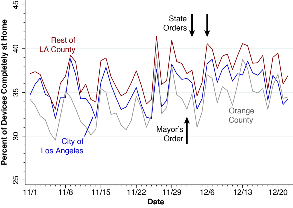
Figure 1 below shows the average time spent at home by smartphones located within the City of Los Angeles, within the remainder of Los Angeles County, and within Orange County before and after the issuance of city- and statewide stay-at-home orders at the beginning of December.
Figure 1. Mean Home Dwell Time Among Devices in the City of Los Angeles (Blue), the Remainder of Los Angeles County (Red), and Orange County (Gray), November 1 – December 22, 2020. The arrows show the December 2 data of Los Angeles Mayor Garcetti’s Stay-at-Home Order, as well as the December 3 and 6 dates of the state public health officer’s regional order and supplemental order.
Mayor Eric Garcetti’s December 2 order applied only to the City of Los Angeles, which is contained within Los Angeles County. The state public health officer’s order of December 3, followed by a supplemental order on December 6, applied to the entire Southern California region, including all of Orange and Los Angeles counties. (Municipalities within Los Angeles County but outside the City of Los Angeles include the cities of Beverly Hills, West Hollywood, Pasadena, Long Beach and Santa Monica, to name a few.)
Figure 2 below shows the corresponding trends in the percentage of devices staying completely at home.
Figure 2. Percent of Devices Staying Completely at Home Among All Candidate Devices, Including Those with No Activity., November 1 – December 22, 2020. As in Figure 1, the devices are classified according to their home location: the City of Los Angeles (blue), the remainder of Los Angeles County (red), and Orange County (gray). Also shown are the dates of recent city- and statewide stay-at-home orders.
Let’s look first at the trends outside the City of Los Angeles. Comparing Sunday November 29 with the following Sunday December 6 in Figure 1, we see that the December 2 and 3 orders may have been associated with about a half-hour increase in average stay-at-home time. But this short-term effect appears to have been dissipated during the subsequent two weeks. What’s more, Figure 2 suggests that if there was indeed a decrease in social mobility in Orange County or the rest of Los Angeles County, it started before the orders were issued.
Examining the blue trend lines for the City of Los Angeles in both Figures 1 and 2, we find it even harder to discern an impact. Again, if there was indeed a small short-term effect after the orders were issued, it appears to be gone two weeks later.
These two graphs do not show impressive drops in social mobility after the city- and statewide orders. There may have been some minor short-term reductions in out-of-home movement, but they have not been persistent.
Why So Little Impact?
The December 2-6 orders did more than require people to stay at home. Mayor Garcetti’s order, for example, prohibited “all public and private gatherings of any number of people from more than one household,” except for outdoor faith-based services and outdoor protests while wearing a mask. Acting State Public Health Officer Eric Pan’s order, for example, provided that “all retailers may operate indoors at no more than 20% capacity.” Perhaps these accompanying provisions have had a favorable effect in reducing coronavirus transmission.
Still, Garcetti’s order was entitled Targeted Safer at Home Order. Right off the bat, the order reads, “Subject only to the exceptions outlined in this Order, all persons living within the City of Los Angeles are hereby ordered to remain in their homes.” Pan’s order was entitled Regional Stay At Home Order. Paragraph #2 reads, “All individuals living in the Region shall stay home or at their place of residence except as necessary to conduct activities associated with the operation, maintenance, or usage of critical infrastructure.” Yet the evidence is that residents of Los Angeles and Orange counties did not stay at home any more or less than did before these stay-at-home orders.
The reflex interpretation of these findings is that they are simply one more manifestation of COVID-19 burnout and pandemic fatigue. Our own view is that there is now a serious problem of signal versus noise.
There have been so many orders and revised orders and supplemental orders that it has become nearly impossible to ascertain what restrictions on mobility are actually in effect. If we could have performed a focused survey of public awareness or an analysis of social media content, we’d want to know how many Southern Californians were even aware that the new stay-at-home orders were in effect.
Whatever the interpretation, these findings reinforce a critical conclusion.
Los Angeles is rapidly becoming the epicenter of the United States COVID-19 pandemic. Los Angeles County authorities need to start thinking beyond their standard public health toolbox.
What used to be right is wrong.
Technical Details
Our calculations are derived from the SafeGraph Social Distancing database, which follows the GPS pings of an anonymous panel of smartphones equipped with location-tracking software. Each mobile device is assigned a home or origin based on the census block group (CBG) where it commonly spends the night. All CBG codes in Orange County begin with the 6-character string 06059, while all CBG codes in Los Angeles County begin with the 6-character code 06037. For example, the CBG codes for the three census block groups within census tract 1011.10 in the City of Los Angeles would be: 060371011101, 060371011102, and 060371011103. We can thus use census tracts to distinguish CBGs belonging to the City of Los Angeles from other municipalities within Los Angeles County.
For each calendar day from November 1 through December 22 and each CBG in Los Angeles and Orange counties, we extracted a record showing the total number of devices (device_count), the number of devices staying completely at home (completely_home_device_count), and the mean in-home dwell time (mean_home_dwell_time). For each calendar date and each of the three major geographic subdivisions (City of Los Angeles, rest of Los Angeles County, Orange County), we computed the overall mean time staying at home (Figure 1) and the overall percentage of devices staying completely at home (Figure 2).
Los Angeles County is fast becoming the epicenter of the pandemic in the United States. ⦿ Multi-generational households remain the principal pathway for coronavirus transmission. ⦿ Community health centers will be critical to getting through the hard winter to come.
Go Where the Virus Is.
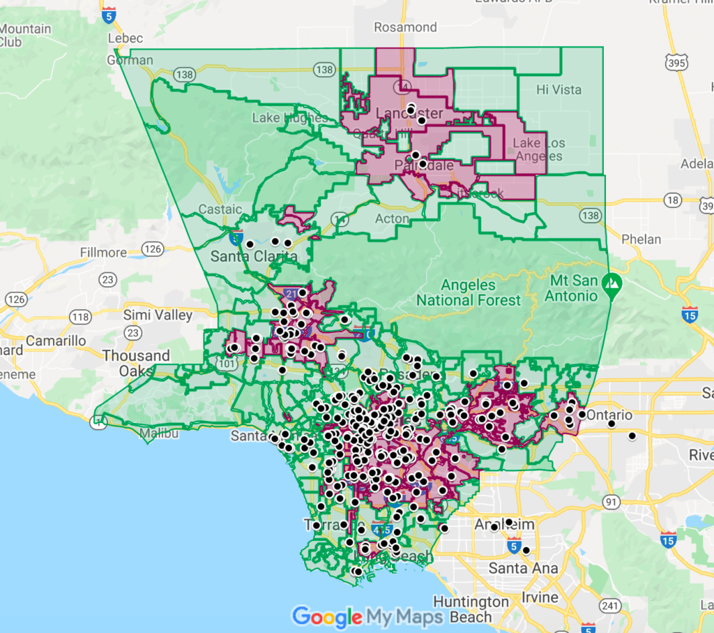
The map below captures the main message of this article: Go where the virus is.
The rose-shaded areas are the Los Angeles County communities where the per-capita incidence of newly confirmed COVID-19 cases grew the fastest during the three weeks ending December 17. While these communities together contain half of the population of the county, their residents now make up nearly two-thirds of all newly diagnosed infections.
Figure 1. Screenshot of Google Map of Los Angeles County. The rose-shaded areas are communities where newly confirmed COVID-19 cases exceeded 1,885 per 100,000 during November 27–December 17, 2020. The black points are the locations of 353 member clinics of the Community Clinic Association of Los Angeles County. See below for a navigable map.
The black circles mark the locations of 353 member clinics of the Community Clinic Association of Los Angeles County (CCALAC). These community health centers are uniquely situated to confront the epidemic surge that is already overwhelming the county’s acute-care hospital capacity.
Actually, these health centers don’t have to move an inch to go where the virus is. They’re already there.
The Winter Surge Has Arrived.
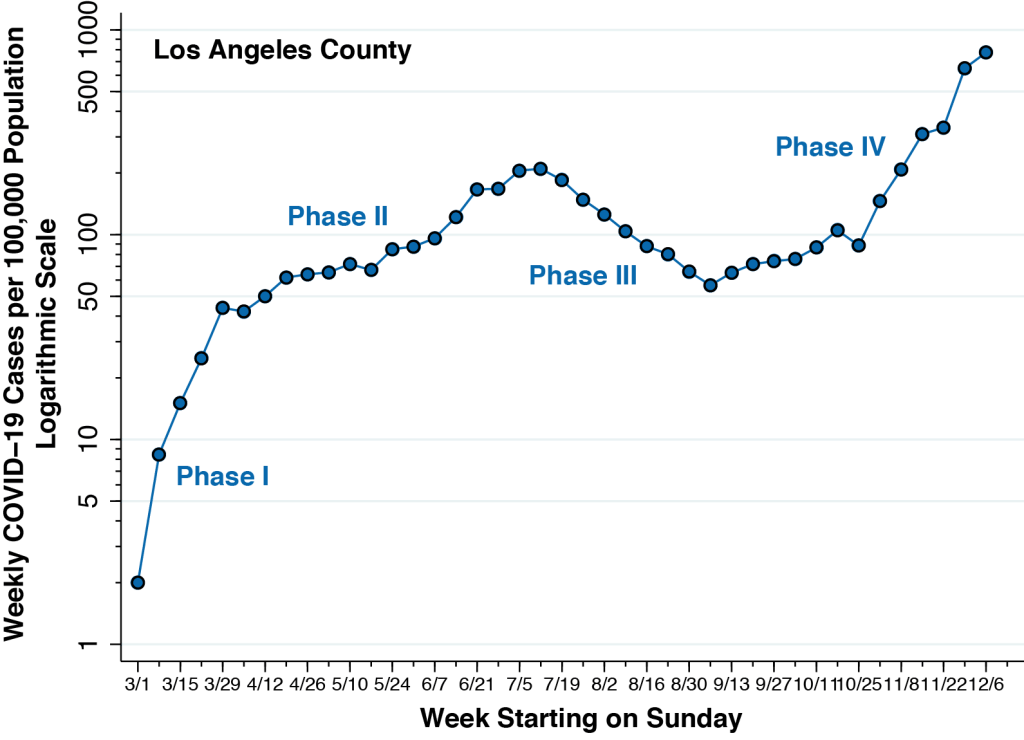
Figure 2 below updates the weekly incidence of newly diagnosed COVID-19 cases in Los Angeles County, running from the week starting March 1 through the week starting December 6, 2020. When we last studied the Los Angeles County epidemic, we could see the emergence of a fourth phase during September. Now, the Phase IV surge is obvious. The incidence of newly confirmed COVID-19 cases per 100,000 during the week of December 6 is nearly four-fold the peak incidence seen during the week of July 12.
Figure 1. Weekly COVID-19 Cases per 100,000 Population in Los Angeles County, from the Week Starting March 1 through the Week Starting December 6, 2020. Calculated from data posted at the Los Angeles County Surveillance Dashboard. We have omitted the most recent week’s data, which remain incomplete as a result of lags in case reporting. The recorded incidence of 775 newly confirmed COVID-19 cases per 100,000 during the week of December 6 is nearly four-fold the peak incidence seen during the week of July 12.
Los Angeles Mayor Eric Garcetti’s recent stay-at-home order may indeed retard the growth of new cases in the weeks to come. But it will not change the fundamentals of SARS-CoV-2 transmission. Herd immunity from mass vaccination is likely to be several months off.
There is, to put it graphically, no easy way to extinguish the virus-flames that will rage during the winter months to come.
Multi-Generational Household Transmission
Figure 3 compares two maps of Los Angeles County. Each map is broken down into countywide statistical areas (CSAs), a hybrid geographic classification of independent municipalities such as the City of Beverly Hills, neighborhoods of Los Angeles such as Hollywood, and unincorporated places such as Hacienda Heights.
Figure 3. New COVID-19 Cases per 100,000 From November 27 – December 17, 2020 (Left) and Prevalence of At-Risk Multi-Generational Households in 2018 (Right) in Los Angeles County. Case incidence computed from data posted at the Los Angeles County Surveillance Dashboard. Prevalence of multi-generational households computed from the 2018 public use microsample of the U.S. Census Bureau’s American Community Survey.
On the left, the CSAs are color-coded according to the number of newly confirmed COVID-19 cases per 100,000 recorded during November 27 – December 17, 2000. On the right, the same CSAs are coded according to the proportion of households that we’ve identified as at risk for multi-generational transmission. As explained in this detailed report (which, for those who care, remains under peer review), we classified a household as at risk for multi-generational transmission if it had at least four persons, at least one person 18–34 years of age and another person was at least 50 years of age.
The two maps in Figure 3 show striking a concordance. Those communities with the highest prevalence of at-risk households, as depicted on the right, had the highest incidence of recent COVID-19 infection, as shown on the left. While we’ve previously noted the concordance with cumulative incidence through September 19 and through November 26, the comparison here is with the number of newly incident cases during the last three weeks of Phase IV.
In short, transmission within multi-generational households continues to dominate the Los Angeles County pandemic.
For those who don’t see the straight visual comparison of two maps as convincing, the technical section below offers a more rigorous demonstration.
The Data Fit With What We See on the Battlefield.
There isn’t the remotest doubt at this juncture that the numbers of confirmed cases reported through voluntary testing substantially understate the actual numbers of incident SARS-CoV-2 infections. Asymptomatic persons, we now know, are responsible for at least 40-45 percent of cases and play a dominant role in disease transmission. Still, the official public statistics fit with what we’re now seeing, as they say, en el campo de batalla.
The clinical histories, one by one, are remarkably the same. One person – usually an asymptomatic or pre-symptomatic young adult – has unknowingly imported the infection into the household. By the time the first member of the household displays any symptoms, all of them – children, adolescents, parents, aunts, uncles, grandparents – have already been infected.
In one household, a woman in her 40’s, having just come down with body aches, fever, and loss of smell, isolated her daughter and her mother in one bedroom and her son and father in another bedroom. The 23-year-old son, who turned out to be patient zero in this particular family, infected his 83-year-old grandfather roommate, who naturally became the focus of considerable clinical attention. (I have intentionally altered the ages of family members.)
The supreme irony of this and so many other cases is that nearly everyone in the household was taking special care to avoid contagion. The parents would make limited trips to the market, always wearing masks. Many grandparents would never go out at all.
Are the young adults who unintentionally import their infections into their multi-generational families simply being careless or ignorant? Not exactly. A young adult who turned out to be patient zero in his own family always wore his mask at work. When he went jogging with his buddies after work, they kept their distance. After one run, they all went for some cold refreshments.
One of the friends ordered hot tea. He just had allergies, he said.
But that can’t possibly be the dynamic underlying the emergence of Los Angeles as the new North American epicenter. Los Angeles does not have a monopoly on wedding receptions, scientific meetings, political rallies, or church choir practices.
It’s all in the math. Multi-generational households at risk for viral transmission make up 13.8 percent of all households in Los Angeles County. With an estimated 3.3 million households in the county, we’re talking about 455,000 multi-generation households where an asymptomatic or mild SARS-CoV-2 infection in a younger household member would put older household members at significant risk.
Let’s round off the size of the average multi-generation household to just 5 members. During the last three weeks, well over 1 percent of these households were infected. And let’s say the typical super-spreader event generates 100 cases, at least during the first round of transmission. The rest is arithmetic.
During the past three weeks, propagation of the virus through multi-generational households in Los Angeles County has been the equivalent of 200 so-called super-spreader events.
Community Health Centers Are the Key.
The Google Map below is a navigable version of the screenshot shown at the beginning of this article. It is worth repeating that the hot spots with the highest incidence of new infection are precisely the places where multi-generational families are most prevalent.
What’s more, the members of those multi-generational families at highest risk for transmission are, by and large, already patients of nearby community health centers.
Here Are Some of the Things Health Centers Could Do.
Here is an abbreviated list of the things that these community health centers could do – if only they were immediately given adequate resources.
Community health centers need to be equipped to perform high-volume SARS-CoV-2 testing of their patients, with a focus on bringing in all household members at the same time.
It is widely acknowledged that testing needs to be more proactive. We can’t continue to sit back and wait for symptomatic people to come through the door. Workplaces and educational institutions have engaged in routine testing of asymptomatic people. Community health centers need to be the next locus of routine testing. Health centers know who are their high-risk patients. They are ideally positioned to bring in the entire families of these high-risk patients for routine testing.
Community health centers need to be equipped with telemedicine technology, so that providers can rapidly respond to patients’ inquiries and concerns.
Surveys give us only an incomplete picture of the public’s knowledge of such basic issues as how COVID-19 is spread. The plain fact is that patients have an abundance of unanswered questions that apply to their specific circumstances.
Intelligent, useful answers to these questions require detailed knowledge of the incubation period of the virus, the time profile of viral shedding before and after symptoms appear, the likelihood of false-positive or false-negative tests, and the emergence of serious complications in the second critical week . Meaningful answers require clinical knowledge of whether COVID-19 can cause diarrhea, earache, body rashes, back pain. and anxiety due to a low oxygen level. Healthcare providers at community health centers are ideally positioned to answer these questions.
Healthcare providers at community health centers are uniquely positioned to respond rapidly to patients who are at risk of deterioration.
If any reader has the remotest doubt where people in the United States turn when they feel really sick from COVID-19, here is the answer. They call 911.
And this is by no means an abuse of the public safety system. In a December 16 news release announcing that Los Angeles County now had more than 5,000 COVID-19 hospitalizations, the Department of Public Health stated in plain English: “If you are having difficulty breathing, go to an emergency room or call 911.” A December 22 news release announcing another 1,000 COVID-19-related deaths in the past two weeks stated in plain Spanish: “Si tiene dificultad para respirar, vaya a la sala de emergencias o llame al 911.”
Healthcare providers in community health centers are ideally positioned to address patients’ concerns. Who else is going to tell a COVID-19-stricken patient who can hardly eat anything whether she should still take her blood pressure or her diabetes pills? Who else is going to intelligently advise a patient when chest tightness becomes so severe that it’s time to go to the ER? The Department of Public Health has urged providers: “Do not send patients to emergency departments unless absolutely medically necessary.” Physicians, nurse practitioners, physicians’ assistants, and nurses know their patients. They can respond to the challenge if given the resources to do so.
Community health centers could distribute pulse oximeters to their patients and instruct them on their use.
The pulse oximeter is now widely acknowledged as a critical tool in the outpatient evaluation of a patient acutely ill with COVID-19. Community health centers are ideally situated to distribute these devices to patients most in need. New York City is distributing oximeters to healthcare providers, and Los Angeles County health centers should get them, too. In abundance.
Community health centers are well situated to provide timely outpatient treatment to high-risk COVID-19 patients.
There is growing evidence that monoclonal antibody infusions need to be given as early as possible to high-risk patients during the initial viremic phase of their illness. Recent controlled trials suggest that these medications may be ineffective if we wait until the patient is so ill as to need hospitalization. The same may be true for the antiviral drug remdesivir.
We need to identify high-risk patients at the onset of symptoms and establish outpatient facilities where trained personnel can administer these therapies. When it comes to Los Angeles County, community health centers could serve as the ideal locus for this new model of care. It is not difficult to imagine a health center-based nurse administering an infusion to a 70-year-old diabetic with a history heart and kidney problems within a couple of days of symptoms.
What About Social Distancing Measures?
How does this fit in with the now-enormous literature on the effectiveness of the social distancing measures? No one disputes that a great many of the emergency measures enacted by governments worldwide have substantially reduced the propagation of the virus. But the time has come to realize that these now-conventional measures – stay-at-home orders, closures of bars, restaurants, gyms, hair salons, movie theaters, restrictions on large gatherings – are no longer enough. And what’s worse, their enforcement may represent a misallocation of limited resources.
Los Angeles County authorities need to start thinking beyond their standard public health toolbox. They need to adapt their policies to the unique facts on the ground.
If public authorities in Los Angeles County diverted substantial additional resources to community health centers, we’d still have a real chance at putting out the virus-flames.
Technical Details on Multi-Generational Household Transmission
Figure 4 offers another way visualize the critical role of intra-household transmission in the Los Angeles epidemic. We’ve graphed the number of newly recorded cases per 100,000 during November 17 – December 17 against the corresponding number of new COVID-19 cases recorded during October 17 – November 26, 2000. Each data point represents a CSA. The larger the circle, the higher proportion of at-risk multi-generational households in the community.
Figure 4. New COVID-19 Cases per 100,000 Reported During November 17 – December 17 (Vertical Axis) Versus New COVID-19 Cases per 100,000 Reported During October 17 – November 26, 2000 (Horizontal Axis). Each data point represents a CSA. The larger the data point, the higher is the prevalence of at-risk multi-generational households in the community.
The linear relationship in the figure is striking. It tells us that those communities recording the most new cases at the start of the recent surge continue to serve as foci of new COVID-19 cases as the surge continues. And the fact that the data points at the upper right are the fattest, while those at the lower left are the skinniest, confirms that CSAs with lots of multi-generational households continue to drive the epidemic.
Figure 5 below displays an updated version of the graphs that we showed in our October 17 and November 28 posts. The graph relates the recent incidence of COVID-19 infection on the vertical axis to the prevalence of at-risk households across some 300 CSAs in Los Angeles County, as measured on the horizontal axis. The graph tells us that a 10-percentage point increase in the prevalence of at-risk households is associated with a 51-percent increase in COVID-19 diagnoses. This relationship has not let up since the days of Phase II, when the epidemic began to concentrate in specific communities.
Figure 5. Relation Between Cumulative COVID-19 Incidence and Prevalence of At-Risk Multi-generational Households. November 27 –December 17 . The slope of the fitted line is 0.051 (95% CI, 0.044–0.058)..
These findings for Los Angeles County should come as no surprise. The importance of inter-generational transmission has been established specifically in Florida’s most populous counties, and in the US and EU generally.
The TPR is uninformative in an epidemic dominated by asymptomatic transmission. And it doesn’t give us a clue what to do in Philadelphia during the hard winter ahead.
During the ongoing COVID-19 epidemic, public health practitioners and policymakers have increasingly relied on the test positivity rate (TPR) to decide whether to impose or relax constraints on social mobility and how much to expand testing capacity. Yet there is a genuine question whether the TPR – which basically gauges the number of positive cases as a percent of all persons tested – may be steering us off course.
During an epidemic where testing for infection is non-random and voluntary, the TPR may indeed tell us how well our testing program is identifying more severe, symptomatic cases. But in the current COVID-19 epidemic where asymptomatic persons are responsible for at least 40-45 percent of cases and play a dominant role in disease transmission, the TPR may not tell us how well we’re identifying infectious individuals.
When Testing Is Mandatory and Random
When testing is mandatory and random – for example, when the University of Wisconsin-Madison required all on-campus students to be tested regularly during an outbreak – the TPR may indeed accurately gauge the infection rate. If, say, one percent of all persons randomly tested during the past week come out positive, then we can reasonably estimate the current incidence rate per week to be about one percent. To be sure, there can still be false positives and false negatives, and there can be retesting of the same individuals. And we certainly don’t want to mix tests for active infection with antibody tests. While these concerns are valid, they are not fundamental.
When Testing is Voluntary and Non-Random
When testing is voluntary and non-random, however, it is widely acknowledged that the sickest, most symptomatic individuals will queue up for testing first. This behavioral observation has led to the conclusion that as testing capacity is expanded, the TPR will decline. If only the individuals in the first row in Figure 1 are tested, the TPR will be 40 percent (that is, 4 out of 10). If we expanded out capacity to test both rows, the TPR will be down to 30 percent (that is, 6 out of 20). This straightforward syllogism seems to imply that a low TPR is a favorable sign that our testing program “is casting a wide enough net.” Most authorities, including the World Health Organization (WHO), put the cutoff for a sufficiently low TPR at 5 percent, but some analysts peg the cutoff at 3 percent. Whatever cutoff is designated, the TPR is to be interpreted as “a measure of whether we’re doing enough testing.”
Figure 1. Positive (Magenta) and Negative (Cyan) Individuals Queued Up to be Tested
The Catch: A Large (and Growing) Pool of Asymptomatic Infected Persons
But there’s a catch. In the current COVID-19 epidemic, a lower TPR means our testing program is adequately identifying the sick people who are voluntarily queuing up to be tested. A further expansion of voluntary testing capacity may indeed lower the TPR, but it will not necessarily identify asymptomatic infectious individuals because they’re not even getting in line.
In Figure 2, we’ve included another group of 20 such asymptomatic people. Eight of them are positive and they don’t know it. If we really could test everyone, the TPR would be back up to 35 percent (that is, 14 out of 40).
Figure 2. Individuals in Line to be Tested (Above) and Asymptomatic Individuals Not in Line to be Tested (Below)
In more technical terms, the critical assumption of a declining marginal yield to expanded testing breaks down when there is a significant pool of asymptomatic infected individuals with an extremely low propensity to get tested voluntarily. And as we’ll see shortly, the continued growth of this pool of asymptomatic infected individuals is the principal challenge underlying the hard winter months ahead.
Some Real Data from Philadelphia
Some real data from the city of Philadelphia in the United States, recently downloaded from its online dashboard, will clarify the point. At issue here is not whether Philadelphia’s current caseload is representative of other cities, but whether the problems in interpreting Philadelphia’s TPR are typical.
Figure 3 shows the weekly incidence of test-positive COVID-19 cases per 100,000 population in the city. To facilitate the presentation, we have partitioned the graph into four phases. (We’ve similarly partitioned the COVID-19 epidemic in Los Angeles County into four phases.)
Figure 3. Weekly COVID-19 Cases per 100,000 Population, Philadelphia, Pennsylvania, U.S.A. Week of March 9 to Week of November 16, 2020
In Phase I, from the week starting March 9 through the week starting March 30, 2020, highlighted in burgundy red, cases were rising rapidly from 3 to 178 per 100,000, equivalent to an average doubling time of 4.7 days. In Phase II, from the week starting April 6 through the week starting May 25, highlighted in green, the case incidence rate fell as emergency social distancing measures enacted in mid-March took effect.
During Phase III, from the week starting June 1 through the week starting September 14, highlighted in orange, the case incidence rate remained stable at about 50 per 100,000. Since then, with the arrival of Phase IV, highlighted in navy blue, the case incidence rate has topped 400 per 100, rising with an average doubling time of about 18 days. While reporting delays temporarily render the data for the last week in November unreliable, the case incidence has surely continued to rise.
The One-Case-per-Thousand-per-Week Threshold
Figure 3 includes an additional, horizontal dashed line at the level of 100 per 100,000 cases per week, equivalent to 1 case per 1,000 per week. This line crosses the epidemic curve during the week of March 23 (Phase I), the weeks of May 11 and May 18 (Phase II), and the week of October 12 (Phase IV). At each crossing point, the case incidence rate was the same, but the underlying dynamics of the city’s epidemic were different. Crossing the threshold from above (Phase II) is not the same as crossing from below, and crossing the threshold during the early surge of cases (Phase I) is not the same as a re-crossing when previously relaxed social distancing measures have proved insufficient (Phase IV).
Dynamic Pueyo Plot
Figure 4 plots the case incidence rate against the TPR, once again calculated on a weekly basis. The data points have been color-coded to correspond to the four phases identified in Figure 3. With the exception of a few points tightly clustered together in Phase III, the corresponding week is noted beside each point. (For visual clarity, the data point for the week of March 9 has been omitted.) The area of each point (not the diameter) is proportional to the total number of tests performed during each week, ranging from 2,147 tests during the week of March 16 to 60,980 tests during the week of November 16.
We’re calling Figure 4 a dynamic Pueyo plot because Tomas Pueyo appears to be the first analyst to plot case incidence against TPR. Pueyo’s version of the plot, however, was a static, cross-sectional comparison of different countries at a particular point in time, and not a dynamic rendering of the course of the epidemic in a single locality.
Figure 4. Weekly COVID-19 Cases per 100,000 Population Versus Weekly Percent Test Positivity Rate, Philadelphia, Pennsylvania, U.S.A., Week of March 16 to Week of November 16, 2020
The Critical Question
The critical question is: What, precisely, does the additional information on the TPR in Figure 4 add to our knowledge of the dynamics of the disease propagation, the adequacy of testing, or the most appropriate epidemic-control measures in Philadelphia during the hard winter ahead?
Figure 4 tells us that the first time the epidemic curve crossed the 100-cases-per-100,000 threshold during the week of March 23, the TPR was 28 percent, far above the WHO’s acceptable level of 5 percent. The second time, during the weeks of May 11 and May 18, the TPR was 12 percent, still beyond the acceptable range. The implication is that the observed decline in case incidence during Phase II in the weeks after the mid-March declaration of emergency may have been an artifact of inadequate testing. Such a conclusion would defy the now-enormous literature on the effectiveness of the social distancing measures put into effect during Phase II.
The fact that the orange data points in Figure 4 are situated at or near the 5-percent TPR threshold would seem to imply that Philadelphia had adequate testing during Phase III. But if that conclusion has any substantive meaning at all, then it must apply as well to the first four weeks of Phase IV, when the number of cases per week more than doubled. Does this mean that no additional aggressive testing measures were required?
It is now evident that during the week of September 21, Philadelphia was on the verge of a new and more deadly resurgence of infections, yet its TPR of 2.5 percent was telling us everything was just fine.
Counterarguments
The raw number of positives indeed obscures the number of negatives or the number tested. And there isn’t the remotest doubt that current counts of positive test results substantially understate the actual incidence of infection. Still, when it comes to assessing the dynamic state of the epidemic in Philadelphia or anywhere else, the number tested may be a more misleading denominator than the standard population count.
One might argue that the Philadelphia data are entirely consistent with the TPR paradigm. The expansion in testing seen in the last two months – as indicated by the enlarging blue data points in Figure 4 – was accompanied by an increase in the TPR. This observation, some analysts may contend, precisely illustrates the value of the TPR in identifying a dangerous outbreak. The problem with this logic is that both the number of positive tests and the number of total tests are endogenous variables. Without a natural experiment, we can’t tell whether new positive cases were pushing total testing, or whether expanded testing was pulling the number of case counts. Another analyst might observe, “The percent positive will be high if the number of positive tests is too high, or if the number of total tests is too low.” But that’s just having it both ways.
The Hard Winter Ahead
The first equation of the classic SIR model of epidemics teaches us that the incidence of new cases is a product of two basic factors: (1) the number of contagious individuals and (2) the rate at which these contagious individuals transmit their infections to other susceptible individuals.
During Phase I of the epidemic in Philadelphia, Los Angeles, New York City, San Antonio,Broward County, Florida, and countless other metropolitan areas throughout the world, the surge in cases was driven by factor #2. At the very start, after all, we had no social distancing measures, so that a relatively small number of contagious persons could propagate their infections widely.
During this Phase IV of the epidemic – which appears to be continuing into the cold, hard winter to come – the new surge in cases is being driven by factor #1. The growing number of asymptomatic individuals has now overwhelmed what social distancing measures we have put in place. Despite marginal improvements in testing capacity of the order of magnitude seen in Philadelphia, we haven’t come anywhere near the level of testing we need.
Without routine, repeated testing of asymptomatic carriers through widespread rapid testing on a far more massive scale than we’ve seen so far, we’ll continue to be “operating in the dark,” no matter what the test positivity rate is.
Comments and Responses
In response to the thoughtful comment below by Prof. Raphael Thomadsen. As an indicator of the adequacy of testing, the TPR appears to have little or no informative value. When it comes to gauging the severity of the epidemic, the TPR might serve as a proxy for the case incidence rate. But that just begs the question: What does the graph of TPR in Figure 4 tell us that we haven’t already learned from the graph of the case incidence rate in Figure 3? As to whether there were different test regimes, take a look at the graph below. There was clearly a different regime during Phase I, when the CDC was still struggling to come up with a reliable PCR test for coronavirus infection. After that, the total number of tests has climbed steadily at about 5 percent per week.
Total Number of COVID-19 Tests Performed Weekly in Philadelphia, March 9 – November 16, 2020
"Without routine, repeated testing of asymptomatic carriers through widespread rapid testing on a far more massive scale than we’ve seen so far, we’ll continue to be “operating in the dark,” no matter what the test positivity rate is" https://t.co/GJGcv9upqL#covid19#pandemic