Reported COVID-19 Cases in Los Angeles County Have Already Broken the 6,000-a-Day Barrier

We used an established statistical method to “now-cast” cases that have already been diagnosed but have yet to be reported.

*Reported cases downloaded on 5/27/2022 at 6:17PM PST from LAC DPH Dashboard. Dashboard notes: “Data do not include the cities of Long Beach and Pavsadena. Cases reported by Episode Date which is the earliest existing value of: Date of Onset, Date of Diagnosis, Date of Death, Date Received, Specimen Collection Date. Recent dates are incomplete due to lags in reporting.” Projected cases based upon Harris JE. BMC Public Health 2022; 22:871.

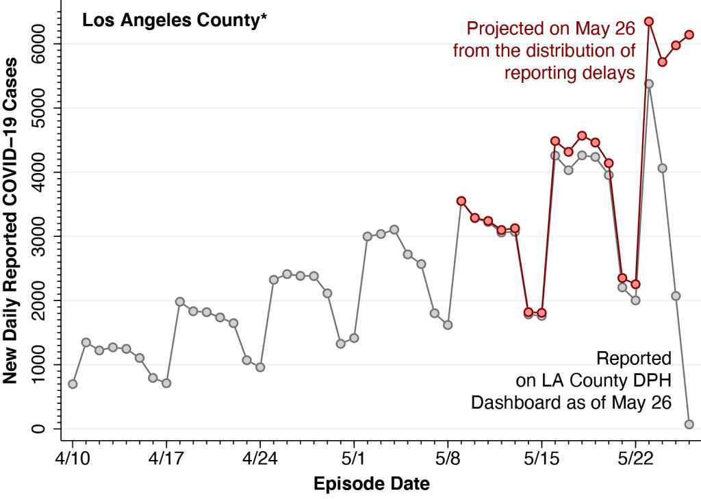
The gray data points in the figure show the numbers of daily reported COVID-19 cases in Los Angeles County, where the “episode date” essentially represents the date that each case was diagnosed. The number of cases trails off markedly during the most recent week as a result of delays in reporting. While the Department of Public Health acknowledges this data limitation, it has not taken advantage of established statistical methods to project the actual number of cases, based upon the distribution of reporting delays.

The pink data points in the figure show the case projections that the DPH has yet to include in its reports. These projections were based on a statistical method, vetted in the peer-reviewed scientific literature, which has already been applied to COVID-19 reporting delays in New York City and to AIDS reporting delays nationwide.

Date of Diagnosis versus Date of Report

The figure above was constructed from detailed tables posted on the DPH Dashboard. (See “Table: Cases/Death by Date” here.) In a separate press release, the DPH acknowledged that reports of 6,245 cases had been received on May 26. The gray data points in the figure, however, fall well below the 6,000 mark. How do we resolve the apparent contradiction?

DPH’s detailed tables classify each reported case according to the date of diagnosis. Although there can be a lag of 2 or more days between the moment of infection and the date of testing, such date-of-diagnosis-based reporting still gives a more accurate picture of COVID-19 trends. The Department’s press release, by contrast, tallies cases according to the date that the case was reported, even though nearly all such reported cases were diagnosed earlier. In fact, all but 79 of those 6,245 reported cases were diagnosed before May 26.

The tabulation in the press release, accordingly, is playing catch-up on past cases. But it is still not capturing cases that have already been diagnosed but have yet to be reported. In fact, by our estimates, about 13,200 cases were already diagnosed but yet to be reported during the 7 days from May 20-26. That’s the area between the pink and gray curves.

Under-reporting: What it means

It is widely acknowledged that reported COVID-19 cases now substantially understate actual incident cases, as many infections diagnosed by home rapid antigen tests go unreported and still other asymptomatic cases go unnoticed without any testing at all. However, there is every reason to believe that the actual incidence of COVID-19, including both reported and unreported cases, is following the same markedly upward trend seen in the figure.

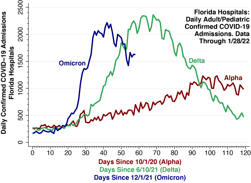
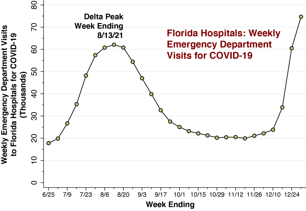
In fact, reported daily COVID-19 cases in Los Angeles County have already broken the 4,000-a-day peak seen during the Delta wave of July-August-2021, when under-reporting of cases was far less prevalent.

Cautions

The projections in the figure rely on the critical assumption that the estimated distribution of reporting delays remains stable. In particular, based on the timing of case reports during May 9 – 26, we have estimated that only about 1.2% of all cases were reported on the same day as they were diagnosed, while another 33.5% were reported with a one-day delay, another 36.4% were reported with a 2-day delay, another 13.6% reported with a 3-day delay, another 4.3% reported with a 4-day delay, after which the distribution of reporting delays exhibits a long tail up to 17 days.

Whether this estimated delay distribution continues to hold up during the long Memorial Day holiday weekend is hardly obvious. Our figure shows that Sundays have tended to be quiet days, while Mondays typically bring a spike in new diagnoses. But the Monday May 30 holiday may alter that pattern and thus extend the reporting delay.

On the other hand, the upcoming holiday weekend may have incentivized some symptomatic individuals to seek testing earlier on May 25 – 26, thus resulting in a one-time spike in diagnoses. In either case, we may need to wait more than a week or two before assessing whether the projections in the figure turn out to be accurate.

Technical Notes

All underlying data, programs and output have been posted on a public repository in the Open Science Framework.

Por aquí en el corazón de Los Ángeles – Tuits por @jeffEconomist

@jeffEconomist

@jeffEconomist on Twitter:

Admissions for COVID-19 in Sentinel Hospitals Now Declining, Still Lag Behind Precipitous Drop in Emergency Department Visits

Emergency department visits peaked during the week ending 12/31/21 and have since dropped rapidly. Hospital admissions peaked one week later and are declining gradually.

Weekly Emergency Department Visits for COVID-19 (Left Axis) and Weekly Hospital Admissions (Right Axis) in a Cohort of 250 Sentinel Hospitals. Our cohort consists of the 250 hospitals with the highest volume of emergency department visits for COVID-19 during the weeks ending June 25 – December 10, 2021. As shown in the Technical Notes below, these sentinel hospitals are located in 164 counties in 41 states and territories throughout the United States.

Trend in Hospital Admissions Has Lagged 1 Week Behind ED Visits.

We continue to follow a cohort of 250 hospitals treating a high volume of COVID-19 patients, located in 164 counties in the United States. Within this cohort, emergency department visits for COVID-19 began to rise rapidly by the week ending 12/17/21 and reached a peak of 230.5 thousand during the week ending 12/31/21. Since then, ED visits have declined precipitously, with 140.6 thousand reported during the most recent week ending 1/21/22.

The trend in hospital admissions for COVID-19 has lagged about 1 week behind ED visits, reaching a peak of 29.3 thousand during the week ending 1/7/22. Since then, hospital admissions for COVID-19 have declined more gradually, with 24.2 thousand reported during the week ending 1/21/22.

Interpreting the Data

During the recent wave dominated by the Omicron variant of SARS-CoV-2, new infections have been vastly underreported. As a result of a surge in home-based rapid testing and the rapid growth in asymptomatic cases, only 1 in 4 cases of COVID-19 are now being reported by public authorities. While ED visits represent an even smaller fraction of all COVID-19 cases, the rapid rise and fall seen above likely mirrors the underlying trend in disease incidence.

Since it takes time before the initial symptoms of COVID-19 become severe enough to require hospitalization, we would expect to see a lag between ED visits and hospital admissions. The fact that hospital admissions have been declining more slowly suggests that the lag-time between initial symptoms and subsequent hospitalization is quite variable.

The Evidence Does Not Support the Incidental Admissions Hypothesis.

A number of reports have suggested that as many as one-half of all hospital inpatients identified as COVID-positive are incidental cases who were admitted for reasons other than their viral infections. If these reports were accurate, we would have expected the hospital admissions curve to look a lot more like the ED visits curve.

The observed lag in the hospital admissions curve provides strong evidence that the large majority of such admissions are not incidental.

We will continue to follow ED visits and hospitalizations for COVID-19 in our cohort of 250 sentinel hospitals.

Technical Notes: Sentinel Hospital Cohort

We are following a cohort of 250 high-volume hospitals located in 164 counties throughout the U.S. Our focus on a cohort of hospitals known to have treated large numbers of COVID-19 patients avoids problems of sampling variability and inconsistent reporting among smaller, lower-volume hospitals. The data were derived from COVID-19 Reported Patient Impact and Hospital Capacity by Facility, posted by the U.S. Department of Health and Human Services (HHS). The database is updated weekly. The most recent update, on which this article is based, covers the week ending 1/21/22.

The data on emergency department visits for COVID-19 are based upon the variable previous_day_covid_ED_visits_7_day_sum, defined as “Sum of total number of ED visits who were seen on the previous calendar day who had a visit related to COVID-19 (meets suspected or confirmed definition or presents for COVID diagnostic testing – do not count patients who present for pre-procedure screening) reported in 7-day period.”

We calculated hospital admissions for COVID-19 as the sum of two variables:

  • previous_day_admission_adult_covid_confirmed_7_day_sum, defined as “Sum of number of patients who were admitted to an adult inpatient bed on the previous calendar day who had confirmed COVID-19 at the time of admission reported in the 7-day period.”
  • previous_day_admission_pediatric_covid_confirmed_7_day_sum, defined as “Sum of number of pediatric patients who were admitted to an inpatient bed, including NICU, PICU, newborn, and nursery, on the previous calendar day who had confirmed COVID-19 at the time of admission.”

Both of these definitions are confined to admitted patients who were diagnosed with confirmed COVID-19 at the time of admission, and thus tend to attenuate the potential problem of so-called incidental admissions.

The locations of 249 of the 250 sentinel hospitals are mapped below.

U.S. continental map showing locations of 249 of the 250 sentinel hospitals in the cohort. Hospital Menonita de Cayey, Cayey, Puerto Rico, not shown. State and county boundaries are indicated.

Florida COVID-19 Hospital Admissions: Each Wave Has Had a Distinct Signature

There is still no widely accepted theory to explain why one wave triggered by a variant of SARS-CoV-2 has different dynamics than any other, or even why each wave should only have just a single peak.

We relied on data from the U.S. Department of Health and Human Services to track combined adult and pediatric hospital admissions for confirmed COVID-19 among all Florida hospitals. The horizontal time axis is measured in days from the estimated first appearance of each variant. See Technical Notes below for details.

We continue our comparison of the hospitalization curves for the Delta and Omicron waves in Florida, this time adding the curve for the Alpha wave that began in early October 2020 and peaked in the first half of January 2021.

While statewide daily hospital admissions initially accelerated much more rapidly during the current Omicron wave, the curve now appears to have peaked at about 2,200 on January 12 , just below the high point seen during this past summer’s Delta wave. Since then, Omicron hospital admissions appear to be trending downward.

Empirical Curve-Fitting

While the three curves are distinct, they do share two common features. First, they all appear to reach a single peak. Second, the faster is the acceleration phase leading up to the peak, the faster is the deceleration phase after the peak.

Based upon these observed regularities, many commentators anticipate that the Omicron wave in the U.S. will be over soon, and some have gone so far as to predict that Omicron will be the beginning of the endgame.

The main problem with these forecasts is that they are basically exercises in empirical curve-fitting. They are not derived from a widely accepted, rigorously verified theory of the epidemic waves of SARS-CoV-2. If case counts rose up and then came down last time, so the logic goes, they’ll presumably do it again, even if we don’t really know why.

SIR and Other Compartmental Models: Do They Fit the Facts?

Far and away the leading theory has been the SIR model and its numerous variations. We have been as guilty of applying this model to data on COVID-19 cases as anyone else.

The basic idea is to divide the population conceptually into compartments, such as Susceptible, Infected, and Resistant. When Susceptible people get infected, they move from the S to the I compartment, and when they recover (or die), they transition to the R compartment. What makes the epidemic curve peak and come down is the depletion of the S compartment.

The idea behind the SIR and other compartmental models, in the most fundamental terms, is that the wave subsides because the virus has run out of new susceptible people to infect.

But We Don’t Have a Closed Population.

The SIR and similar compartmental models do appear to work well when they are applied to data from isolated outbreaks in well-defined, closed populations. If our susceptible group is all the students in a university residence hall, then it makes to think about the numbers of resident students who have been infected or remain susceptible.

The problem with the application of these compartmental models to the SARS-CoV-2 global pandemic is that we’re not really dealing with closed populations. The idea that we’re somehow running out of susceptible individuals doesn’t comfortably fit the facts.

And Then There’s the Problem of Immune Escape.

What’s more, it’s become abundantly clear that the resistant people supposedly filling up the R compartment aren’t really resistant (unless they’re dead). To the contrary, they’re getting reinfected. The phenomenon of immune escape, it has now become apparent, is a fundamental characteristic of SARS-CoV-2 and other coronaviruses.

Network-Percolation Models as an Alternative

Rather than think about a closed population of susceptible, infected and resistant individuals, a better approach is to conceptualize a network.

Let’s travel back in time to March 2020, when cases first began to surge in New York City, a hub that rapidly became the epicenter of COVID-19 in the Western hemisphere. There is now substantial accumulated evidence that SARS-CoV-2 was initially propagated throughout the city via its extensive public transportation network. The New York City subways, in particular, formed an interconnected system more than 10 times larger than the next largest subway system in the U.S.

Once the virus had been dispersed throughout the 8-million-person metropolis, the evidence suggests, infections began to concentrate in specific hot spots such as the Elmhurst neighborhood of Queens, a phenomenon known as percolation.

The idea is that the initial upswing of an epidemic wave corresponds to the initial diffusion of the infectious agent throughout the network, while the peaking of cases and the reversal of the curve reflect subsequent percolation processes.

Ultimately, within the local branch of the network in the Elmhurst-Queens hot spot in New York City, the virus began to run out of susceptible cases to infect.

Partly Open, Partly Closed Populations

We need to abandon the fiction that populations are closed and begin to think about communities that are partly open and partly closed. Later on , in the fall of 2020, then-New York State Governor Cuomo, faced with a new COVID-19 outbreak in South Brooklyn, imposed graded restrictions on access to restaurants and other establishments in three concentric zones: red, orange, and yellow. Observing movements of mobile devices over a 3-week period, we found that slightly more than half of red-zone residents stayed within their zone, while nearly a quarter moved out of the regulated three-zone area entirely. The governor’s scheme ultimately failed in great part because some neighborhoods within the red zone continued to serve as foci for increased transmission in the orange and yellow zones as well.

Don’t Be Surprised by a Double Peak.

The Omicron wave indeed seems to have peaked in many places in the U.S., and the trend in Florida hospitalizations, shown above, so far does not seem to be an exception. But the reality is that we know relatively little about the dynamics underlying successive waves of SARS-CoV-2 and its numerous variants. We should not be surprised if we encounter a double peak.

We will continue to follow the Omicron wave in Florida

Technical Notes

The calculations in the figure are derived from COVID-19 Reported Patient Impact and Hospital Capacity by State Timeseries, maintained by the U.S. Department of Health and Human Services. The daily counts represent the daily sums of two variables for all Florida hospitals combined:

  • previous_day_admission_adult_covid_confirmed: Number of patients who were admitted to an adult inpatient bed on the previous calendar day who had confirmed COVID-19 at the time of admission in this state
  • previous_day_admission_pediatric_covid_confirmed: Number of pediatric patients who were admitted to an inpatient bed, including NICU, PICU, newborn, and nursery, on the previous calendar day who had confirmed COVID-19 at the time of admission in this state

Scattered reports have suggested that as many as one-half of all hospital inpatients identified as COVID-positive are incidental cases who were admitted primarily for reasons other than their viral infections. In a nationwide cohort of 250 hospitals located in 164 counties throughout the U.S., we have estimated that only 15 percent of COVID-positive hospitalizations are incidental.

Estimated Fraction of Incidental COVID Hospitalizations in a Cohort of 250 High-Volume Hospitals Located in 164 Counties

Incidental COVID infections appear to be a nontrivial fraction of all COVID-positive hospitalized patients. In the aggregate, however, the burden of patients admitted for complications of their viral infections appears to be far greater.

Estimated Fraction of Incidental COVID Hospitalizations in a Cohort of 250 High-Volume Hospitals Located in 164 Counties
Whiskers-on-Box Plots of Weekly Confirmed COVID Incidence per 100,000 Population in the 164 Counties Containing the 250 Study Hospitals, Weeks Ending December 19, 2021 Through January 9, 2022. For each week, the 5th, 25th, 50th, 75th, and 95th percentiles are superimposed upon the individual county-specific datapoints. A total of 11 datapoints with zero incident cases are omitted from the first two weeks. Source: https://www.medrxiv.org/content/10.1101/2022.01.22.22269700v1

New Pre-Print Posted on MedRxiv.

Scattered reports have suggested that as many as one-half of all hospital inpatients identified as COVID-positive are incidental cases who were admitted primarily for reasons other than their viral infections. To date, however, there are no systematic studies of a representative panel of hospitals based on pre-established criteria for determining whether an individual patient was in fact admitted as a result of the disease. To fill this gap, we developed a formula to estimate the fraction of incidental COVID hospitalizations that relies upon measurable, population-based parameters.

Among COVID-positive hospitalized patients, 15.2% were estimated to be incidental infections. Across individual counties, the median fraction of incidental COVID hospitalizations was 13.7%, with an interquartile range of 9.5 to 18.4%

Florida COVID-19 Hospital Admissions may Have Reached a Peak, or Maybe Not

There is still no widely accepted theory that explains why a wave triggered by a new variant of SARS-CoV-2 should have only a single peak.

We relied on data from the U.S. Department of Health and Human Services to track combined adult and pediatric hospital admissions for confirmed COVID-19 among all Florida hospitals. The horizontal time axis is measured in days from the estimated first appearance of each variant. See Technical Notes below for details.

We further update our ongoing comparison of the hospitalization curves for the Delta and Omicron waves in Florida. While statewide daily hospital admissions accelerated much more rapidly during the current Omicron wave, the Omicron curve appears to have reached a peak and may be trending downward.

Admissions appear to have peaked at about 2,200 on January 12 , just below the high point seen during this past summer’s Delta wave.

We stress that this is purely an empirical observation. There is no widely accepted theory that explains why a wave of infections triggered by the emergence of a new variant of SARS-CoV-2 should have only a single peak.

We will continue monitor trends in Florida COVID-19 hospital admissions.

Technical Notes

As we’ve repeatedly noted, we do not have data on the variant underlying each hospital admission. Still, according to the most recent CDC report on state-specific variant proportions, 99.7% of recent SARS-CoV-2 samples sequenced in the U.S. region covering Florida were attributable to the Omicron variant.

We have estimated the initial appearance of the Delta variant as June 10, 2021. There are reports that the variant was in fact detected by late May. If we translated the time axis for Delta to the right, however, the Omicron-related hospitalization curve would be running even further ahead of its predecessor.

The calculations in the figure are derived from COVID-19 Reported Patient Impact and Hospital Capacity by State Timeseries, maintained by the U.S. Department of Health and Human Services. The daily counts represent the daily sums of two variables for all Florida hospitals combined:

  • previous_day_admission_adult_covid_confirmed: Number of patients who were admitted to an adult inpatient bed on the previous calendar day who had confirmed COVID-19 at the time of admission in this state
  • previous_day_admission_pediatric_covid_confirmed: Number of pediatric patients who were admitted to an inpatient bed, including NICU, PICU, newborn, and nursery, on the previous calendar day who had confirmed COVID-19 at the time of admission in this state

Some commentators have expressed a general concern that COVID-19 hospitalization counts include patients admitted for unrelated reasons who incidentally tested positive. We are now preparing an article on this important issue.

Florida COVID-19 Hospital Admissions may be Approaching a Peak

Statewide admissions are now hovering at about 2,150 per day, just below the high point seen during this past summer’s Delta wave.

We relied on data from the U.S. Department of Health and Human Services to track combined adult and pediatric hospital admissions for confirmed COVID-19 among all Florida hospitals. The horizontal time axis is measured in days from the estimated first appearance of each variant. See Technical Notes below for details.

We further update our ongoing comparison of the hospitalization curves for the Delta and Omicron waves in Florida. While daily hospital admissions have accelerated much more rapidly during the current Omicron wave, the Omicron curve appears to be decelerating.

We will continue monitor trends in Florida COVID-19 hospital admissions.

Technical Notes

As we’ve repeatedly noted, we do not have data on the variant underlying each hospital admission. Still, according to the most recent CDC report on state-specific variant proportions, 99.0% of recent SARS-CoV-2 samples sequenced in the U.S. region covering Florida were attributable to the Omicron variant.

We have estimated the initial appearance of the Delta variant as June 10, 2021. There are reports that the variant was in fact detected by late May. If we translated the time axis for Delta to the right, however, the Omicron-related hospitalization curve would be running even further ahead of its predecessor.

The calculations in the figure are derived from COVID-19 Reported Patient Impact and Hospital Capacity by State Timeseries, maintained by the U.S. Department of Health and Human Services. The daily counts represent the daily sums of two variables for all Florida hospitals combined:

  • previous_day_admission_adult_covid_confirmed: Number of patients who were admitted to an adult inpatient bed on the previous calendar day who had confirmed COVID-19 at the time of admission in this state
  • previous_day_admission_pediatric_covid_confirmed: Number of pediatric patients who were admitted to an inpatient bed, including NICU, PICU, newborn, and nursery, on the previous calendar day who had confirmed COVID-19 at the time of admission in this state

Some commentators have expressed a general concern that COVID-19 hospitalization counts include patients admitted for unrelated reasons who incidentally tested positive. We will have more to say about the issue of incidental COVID-19 hospitalizations in a future article.

Florida Hospital Emergency Department Visits for COVID-19 Surpass Last Summer’s Delta Peak

Hospital ED visits for COVID-19 are a more informative indicator of disease burden than total reported cases.

Weekly Florida Hospital Emergency Department Visits for COVID-19. Each frame of the animation shows one week with the indicated ending date. Each data point is a hospital. The size of the data point reflects the number of emergency department visits for COVID-19. Source: COVID-19 Reported Patient Impact and Hospital Capacity by Facility (HHS).

The above animation shows the evolution of emergency department visits for COVID-19 during five successive weeks, from the week ending 12/3/21 to the week ending 12/31/21. Each data point represents one hospital, and its size reflects the number of reported ED visits.

Florida Hospital Emergency Department Visits for COVID-19 During the Week Ending 12/31/21. The five hospitals with the highest volume of ED visits are specifically identified, along with the number of reported visits. For further details, see animation above.

The map above is an annotated version of the last frame of the animation, corresponding to ED visit for COVID-19 during week ending 12/31/21. Specifically indicated are the five hospitals with the highest number of ED visits.

Hospital ED visits for COVID-19 approached 75,000 during the week ending 12/31/21, overtaking the Delta peak of 62,100 during the week ending 8/13/21.

Weekly Emergency Department Visits for COVID-19 for All Florida Hospitals. Source: COVID-19 Reported Patient Impact and Hospital Capacity by Facility (HHS).

The graph above charts ED visits to Florida hospitals for COVID-19 for each week from the week ending 6/25/21 through the week ending 12/31/21. We see a marked surge during December with the emergence of the Omicron variant. The total volume of 74,660 ED visits for COVID-19 during the week ending 12/31/21 has surpassed the peak volume of 60,777 ED visits attained during the Delta wave of last summer.

For every 100 ED visits for COVID-19, there are now 15 hospital admissions.

Hospital Admissions for COVID-10 per 100 ED Visits for COVID-19 for All Florida Hospitals. Source: COVID-19 Reported Patient Impact and Hospital Capacity by Facility (HHS).

This graph shows the number of hospital admissions for COVID-19 per 100 ED visits for COVID-19. As discussed in an earlier article, we regard this ratio as one indicator of disease severity. While the week ending 12/31/21 saw 15.5 hospital admissions for COVID-19 per 100 ED visits, this indicator remains below the peak of 25.0 admissions per 100 ED visits seen for the week ending 8/13/21 during the Delta wave.

Why ED Visits Are a More Informative Indicator Than Total Reported COVID-19 Cases

The widespread use of home-based rapid tests has raised doubts about the adequacy of publicly reported case counts. There is a growing sentiment that we need new sentinel indicators of disease burden. Emergency department visits may be just the indicator we’re looking for.

When it comes to the detailed geography of COVID-19 spread throughout the state, our maps of hospital-specific ED visit volume are more informative than the coarse, county-based maps that are frequently posted.

What’s more, the under-reporting bias in case-based indicators of COVID-19 burden has become increasingly correlated with income. As the demand for rapid home-based tests expands in the face of a limited supply, the market price of a rapid tests rises. As the market price continues to rise, rapid tests become a luxury good. They are consumed disproportionately by higher income consumers. That means those areas with higher incomes will suffer from even more under-counting.

As an indicator of the evolution of Omicron in the state, ED visits for COVID-19 do have their own potential biases. Florida has a notably high concentration of uninsured individuals, who may preferentially seek the ED simply to get tested. Large hospitals with emergency departments may serve wide geographic areas. Residents from outside Orange County may travel to the two Orlando-based hospital EDs identified in our map.

Still, emergency department visits quite likely track cases of Omicron infection that are more severe than the self-limited syndrome of sore throat, stuff nose, headache, fever, chills, body aches and fatigue. At the very least, they capture patients who are more seriously concerned about their symptoms.

Technical Notes

The data were derived from COVID-19 Reported Patient Impact and Hospital Capacity by Facility, posted by the U.S. Department of Health and Human Services (HHS). The database is updated weekly. The most recent update, on which this article is based, covers the week ending 12/31/21. An obvious disadvantage of this data source is the 11-day lag between the end of the reporting period and the date of posting.

The data on emergency department visits for COVID-19 are based upon the variable previous_day_covid_ED_visits_7_day_sum, defined as “Sum of total number of ED visits who were seen on the previous calendar day who had a visit related to COVID-19 (meets suspected or confirmed definition or presents for COVID diagnostic testing – do not count patients who present for pre-procedure screening) reported in 7-day period.”

We calculated hospital admissions for COVID-19 as the sum of two variables:

  • previous_day_admission_adult_covid_confirmed_7_day_sum, defined as “Sum of number of patients who were admitted to an adult inpatient bed on the previous calendar day who had confirmed COVID-19 at the time of admission reported in the 7-day period.”
  • previous_day_admission_pediatric_covid_confirmed_7_day_sum, defined as “Sum of number of pediatric patients who were admitted to an inpatient bed, including NICU, PICU, newborn, and nursery, on the previous calendar day who had confirmed COVID-19 at the time of admission.”

Both of these definitions are confined to admitted patients who were diagnosed with confirmed COVID-19 at the time of admission, and thus tend to attenuate the potential problem of so-called incidental admissions.

The maps were based upon the geocodes (longitude and latitude) of each hospital, which were already included in the HHS database. We relied on the Texas A&M interactive geocoding website to fill in the missing geocodes for 18 hospitals. The size of each point was based upon the weighting scheme built into the Stata scatter command.