Daily New COVID-19 Cases in Tulsa, Oklahoma through July 8, 2020

“Coronavirus Surge in Tulsa ‘More Than Likely’ Linked to Trump Rally: Dr. Bruce Dart, the director of the Tulsa Health Department, said Tulsa County had reported nearly 500 new cases of Covid-19 in the past two days.” So read the headline in a July 8 report in the New York Times.

Plotted in the graphic above are the daily counts of new COVID-19 cases reported by the Tulsa Health Department through July 8, each date represented by a sky-blue-filled circle. The counts are measured on a logarithmic scale, as indicated on the left-hand vertical axis. The arrow indicates the timing of the June 20 rally.

In a separate report on the same date, entitled “Tulsa health official: Trump rally ‘likely’ source of virus surge,” Politico noted, “Tulsa County reported 261 confirmed new cases on Monday, a one-day record high, and another 206 cases on Tuesday. By comparison, during the week before the June 20 Trump rally, there were 76 cases on Monday and 96 on Tuesday.”

The graphic below reproduces the first data plot with some annotations. The orange-filled circles highlight the four data points mentioned in the Politico report. While there has been considerable day-to-day variation, counts of new COVID-19 cases were increasing for about one month before the rally, and continued to increase after the rally. Superimposed on the plot is the ordinary least squares regression line for the data from May 10 through July 8. The slope of the blue line (0.0543/day, St. Err. = 0.0042, P < 0.001) implies a significant exponential doubling time of 12.75 days during this period.

In the third graphic below, the counts of new daily COVID-19 cases in Tulsa are overlaid by the trend in the Google Mobility index for retail and recreational activity in Tulsa County during the same time period. This social mobility indicator, graphed as a connected red line, is measured along the right-hand vertical axis as a percentage change from baseline, which Google calculates as the median value for the 5-week period from January 3 – February 6, 2020.

In the fourth and final graphic below, the counts of new daily COVID-19 cases in Tulsa are superimposed on the combined daily census of COVID-19 patients in Tulsa hospitals. The patient counts are restricted to Tulsa County residents.

The data show that over the past two months, Tulsa has been confronting exponential growth of confirmed COVID-19 cases with an estimated doubling time of 12.75 days. The observed growth of COVID-19 case counts is paralleled by an increase in at least one indicator of social mobility. The growth in newly diagnosed cases is further consistent with the rising census of patients hospitalized with complications of COVID-19, a more sensitive indicator of the demand for high-level healthcare resources. The latter rise in hospitalizations contradicts the hypothesis that the observed surge in cases is merely the result of increased testing among individuals with mild, self-limited disease.

The above-cited press reports relied upon a news conference given by Dr. Bruce Dart, the director of the Tulsa Health Department. Dr. Dart did not explicitly identify President Trump’s rally as a contributing cause of the epidemic surge. It appears that the Tulsa Health Department has been engaged in extensive tracking of the hundreds of newly diagnosed cases. The results of such case tracking could be highly informative about the contribution of the June 20 rally to the continuing rise in new infections in Tulsa.

Rising Hospital Census of Diagnosed or Suspected COVID-19 Patients, Orange County, California, April 1 – July 6, 2020

The graphic plots the combined number of beds in all Orange County, California hospitals that have been occupied by patients diagnosed with or suspected of having COVID-19 during each day from April 1 – July 6, 2020. These hospital daily census counts, depicted as green data points and measured on a logarithmic scale along the left-hand vertical axis, are reported by the California Open Data Portal. This state-issued data series appears to be more comprehensive than the series earlier reported by the local Orange County Health Care Agency and relied upon in Reopening Under COVID-19: What To Watch For.

Overlapping the hospital census data is a red connected line showing changes from March 1 onward in one particular dimension of the Google Mobility index, namely, the relative number of visits to retail stores and entertainment venues. This index, measured along the right-hand axis, is gauged as a percentage of the baseline level of activity, which is calculated in relation to the median value for the 5-week period from January 3 – February 6, 2020. For example, a value of –20 would correspond to a 20 percent decline compared to baseline. For other examples of the overlaying of social mobility indices on COVID-19 incidence and morbidity data, see Daily New COVID-19 Cases and Google Mobility Index of Retail Visits and Recreational Activity, Los Angeles County, March 1 – June 28, 2020, as well as Data From the COVID-19 Epidemic in Florida Suggest That Younger Cohorts Have Been Transmitting Their Infections to Less Socially Mobile Older Adults.

The Back Story

The story behind the trends shown in the graphic is a saga of public policy flip-flops. As the weather improved during the spring in Southern California, people from all over began flocking to beaches in Orange County, culminating in the arrival of an estimated 40 thousand beach goers at Newport Beach on the April 25-26 weekend. A few days later, on April 30, California Gov. Newsom ordered the county’s beaches closed. Two cities in the county sought preliminary injunctions in court to block the governor’s orders, but ultimately without success. Yet on May 23, the state government issued a variance to Orange County, permitting accelerated reopening of local businesses.

To enforce the state-issued variance, then County Health Officer Dr. Nicole Quick issued an order expanding the requirement for residents and visitors to wear face coverings in public places, in businesses such as retail stores, restaurants and hair salons, and at work when 6-foot distancing was infeasible. Quick’s order was apparently met with vociferous local disapproval, and on June 9, she resigned her post. On June 11, the County rescinded the mask requirement, converting it into a “strong recommendation.” Since then, the acting Health Officer’s orders have undergone several additional updates, most recently in a version issued July 3, which mandates the use of face coverings in certain high-risk situations enumerated by the California Department of Public Health, which in turn appear even more restrictive than Dr. Quick’s ill-fated order.

Non-Linearity

What is so striking about the graphic is the apparent acceleration in the COVID-19 hospital census starting in the week of June 21, but without a corresponding acceleration in the index of social mobility. Both diagnosed and suspected cases have been accelerating during this time period. So, the so-called suspected cases are, in all likelihood, no more than genuine cases with a delay in diagnostic confirmation. The rise in hospital census could in principle reflect increasingly delayed discharge of COVID-19 patients. But that would go against the general trend to send not-too-sick COVID-19 patients home earlier with portable oxygen, prophylactic anticoagulants, and a tapering dose of steroids.

We would ordinarily expect a delay between increases in social contact and consequent changes in hospitalization rates. Once an individual is infected, there will be an incubation period – about 5 days on average – followed by an additional week or so before the patient develops complications warranting hospital admission. Still, a lagged response does not alone explain the recent acceleration in the graphic.

The evidence here raises the possibility of non-linearity in the relation between social contact rates and disease incidence. In terms of the graphic above, once the frequency of visits to retail stores and entertainment venues reaches a threshold, transmission takes off. A model an infectious individual who can transmit the virus only to those within a certain radius would readily predict such non-linearity. A more interesting explanation is that younger individuals, having acquired their infections through increasingly lax compliance with social distancing measures, are now bringing their infections home to older, less mobile persons. And those elderly individuals are now ending up in the hospital.

Daily New COVID-19 Cases and Google Mobility Index of Retail Visits and Recreational Activity, Los Angeles County, March 1 – June 28, 2020

This graphic displays the daily number of new COVID-19 cases, reported by the Los Angeles County Department of Public Health, along with the corresponding index of visits to retail stores and recreational activities, reported by Google Community Mobility Reports, for Los Angeles County during March 1 – June 28, 2020.

The smaller sky-blue data points show the daily counts of COVID-19 cases, measured along the left-hand vertical axis on a logarithmic scale. The larger blue data points show the corresponding weekly averages, calculated as the geometric mean.

The connected red line segments show the Google Mobility index, measured along the right-hand axis. The index is shown as a percentage of the baseline level of activity, which is calculated in relation to the median value for the 5-week period from January 3 – February 6, 2020. For example, a value of –20 would correspond to a 20 percent decline compared to baseline.

For a similar graphic relating COVID-19 case incidence to the same Google Mobility index for Broward County, Florida, see Data From the COVID-19 Epidemic in Florida Suggest That Younger Cohorts Have Been Transmitting Their Infections to Less Socially Mobile Older Adults (July 5, 2020).

The graphic should not be interpreted to mean that visits to retail stores or recreational activities are specific causes of the renewed increase in COVID-19 case counts since the week of May 17. However, the data do support the hypothesis that the upswing in case incidence is correlated with at least one indicator of social mobility.

Lovers Bound by Joint Martyrdom Under Lockdown

“How to Ensure a Coronavirus Lockdown With Your Partner Doesn’t End in Divorce,” ran a feature headline in the March 17, 2020 issue of Newsweek. When restrictions were recently eased in the Xi’an, where more than 10 million people were under lockdown, “the city’s divorce rate spiked,” as the March 23 issue of the New Yorker reported. Said one Chinese official, “Many couples have been bound with each other at home for over a month, which evoked the underlying conflicts.”

Of course, a fairer interpretation is that the stress of quarantine can solidify couples with already strong relationships and rend apart those with weak ties. Still, we have a different take on the couple-quarantine story.

Balcony Scene, Romeo and Juliet, by Ford Maddox Brown

Here we are, sharing a relatively small space (about 1,600 square feet) not too far from Hollywood’s famous Pink’s Hotdogs, which we can’t go to because Gov. Newsom has ordered us to stay at home for now. If coronavirus enters the premises — say, from a contaminated delivery — we’ll both be exposed. Even if one of us somehow gets the virus first, that person will be shedding it — and thus infecting the other — days before symptoms become apparent. In its instructions on home isolation for people with COVID-19 infections, the LA County Department of Public Health counsels patients, “Stay in a specific room and away from other people in your home as much as possible.” Yet we know that if either one of us first comes down with fever, cough and shortness of breath, the other one will be the caretaker. In short, if one of us gets IT, both of us will get IT.

It all started with Tawq ul-hamamah fil-ulfah wal-ullaf (The Dove’s Neck-Ring About Love and Lovers), the famous treatise written by the Andalusian philosopher Ibn Hazm around 1022. (“There is no stopping place for my eye except upon you.” When we were undergraduates, we knew this stuff cold.) That was almost six centuries before Romeo and Juliet (1595). And nine-and-a-half centuries before Masahiro Shinoda’s Double Suicide (1969) and Gabriel García Márquez’s El Amor en los Tiempos de Cólera (1985), which was really more about the blossoming of love in old age rather than about cholera.

Now, in 2020, we have the newest twist on lovers bound by joint martyrdom.

Numbers of Newly Diagnosed COVID-19 Cases and Millions of Subway Turnstile Entries, New York City, March 1 – April 10, 2020

This graphic is an update of Figure 1 in Harris, J.E. The Subways Seeded the Massive Coronavirus Epidemic in New York City, April 24, 2020.

The figure simultaneously tracks the daily movements of two variables from March 1 through April 10, 2020. The pink-filled circles show the numbers of new coronavirus infections reported each day by the New York City Department of Health. For this variable, the vertical axis on the left is rendered on a logarithmic scale. That way, a straight-line trend would represent the exponential growth typically seen during the initial upsurge of an epidemic where everyone in the population is naïve to the infectious agent. (See Harris, J.E., The Coronavirus Epidemic Curve Is Already Flattening in New York City, NBER Working Paper 26917, April 6, 2020.)

For the same variable of newly reported cases, the horizontal axis at the bottom ticks off the date that the coronavirus test was performed. By contrast, in Figure 1 of The Coronavirus Epidemic Curve Is Already Flattening in New York City, we tracked newly reported infections in relation to the date the test results were received. The new reporting convention, which has been recently adopted by the city’s health department, has the advantage that it cuts out the delay between the date that a healthcare worker swabbed a sample from a patient’s nose and the date that the laboratory notified the department of the test result.

The second variable tracked in the figure above represents the total numbers of entries every day into any of the approximately 4,600 turnstiles located throughout New York City’s 496 subway stations. These counts are reported each week by the Metropolitan Transportation Authority (MTA). This variable is represented as sky-colored vertical bars, measured in millions of entries tallied along the vertical axis on the right side of the figure. For this variable, the horizontal axis measures the dates on which riders passed through the system’s turnstiles. While the MTA also reports turnstile exits, the data do not allow an analyst to link a particular rider’s station of entry with that rider’s station of exit.

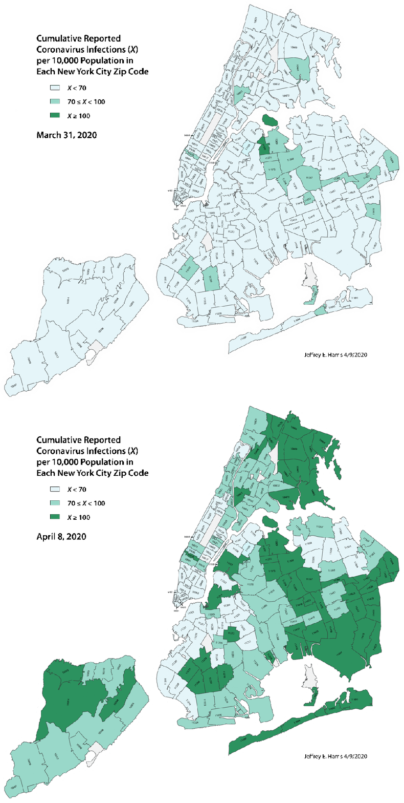
Animated Map of the Cumulative Incidence of Reported Coronavirus Infections in New York City by Zip Code, March 31 and April 8, 2020

Cumulative incidence of coronavirus infections was computed from zip code-specific data, reported by the New York Department of Public Health, and census data on zip code-specific populations. Incidence rates were rendered visually in a three-class color scheme, where light green represents less than 70 cases per 10,000, medium green corresponds to at least 70 but less than 100 cases per 10,000, an dark green corresponds to at least 100 cases per 10,000. The two images represent the cumulative incidence as of March 31 and April 8, 2020, respectively. See Harris, J.E. The Subways Seeded the Massive Coronavirus Epidemic in New York City, April 13, 2020, to appear as National Bureau of Economic Research Working Paper 27021.