There is still no widely accepted theory to explain why one wave triggered by a variant of SARS-CoV-2 has different dynamics than any other, or even why each wave should only have just a single peak.
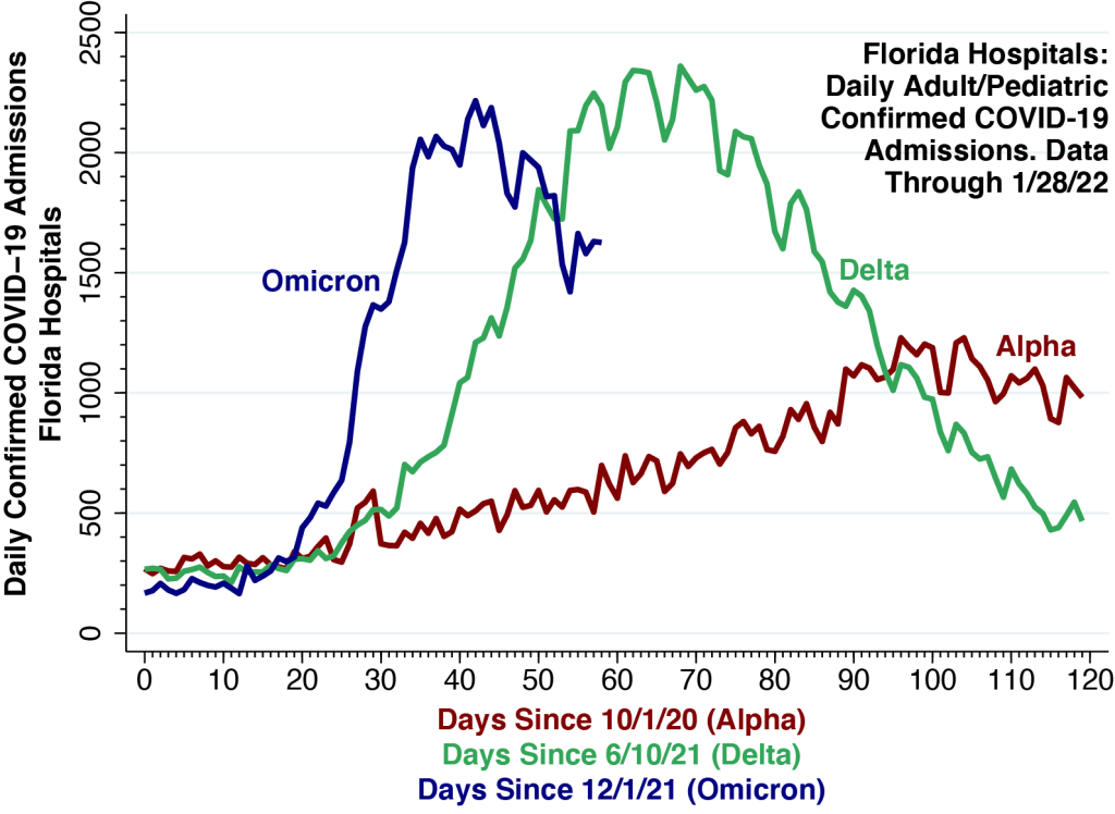
We continue our comparison of the hospitalization curves for the Delta and Omicron waves in Florida, this time adding the curve for the Alpha wave that began in early October 2020 and peaked in the first half of January 2021.
While statewide daily hospital admissions initially accelerated much more rapidly during the current Omicron wave, the curve now appears to have peaked at about 2,200 on January 12 , just below the high point seen during this past summer’s Delta wave. Since then, Omicron hospital admissions appear to be trending downward.
Empirical Curve-Fitting
While the three curves are distinct, they do share two common features. First, they all appear to reach a single peak. Second, the faster is the acceleration phase leading up to the peak, the faster is the deceleration phase after the peak.
Based upon these observed regularities, many commentators anticipate that the Omicron wave in the U.S. will be over soon, and some have gone so far as to predict that Omicron will be the beginning of the endgame.
The main problem with these forecasts is that they are basically exercises in empirical curve-fitting. They are not derived from a widely accepted, rigorously verified theory of the epidemic waves of SARS-CoV-2. If case counts rose up and then came down last time, so the logic goes, they’ll presumably do it again, even if we don’t really know why.
SIR and Other Compartmental Models: Do They Fit the Facts?
Far and away the leading theory has been the SIR model and its numerous variations. We have been as guilty of applying this model to data on COVID-19 cases as anyone else.
The basic idea is to divide the population conceptually into compartments, such as Susceptible, Infected, and Resistant. When Susceptible people get infected, they move from the S to the I compartment, and when they recover (or die), they transition to the R compartment. What makes the epidemic curve peak and come down is the depletion of the S compartment.
The idea behind the SIR and other compartmental models, in the most fundamental terms, is that the wave subsides because the virus has run out of new susceptible people to infect.
But We Don’t Have a Closed Population.
The SIR and similar compartmental models do appear to work well when they are applied to data from isolated outbreaks in well-defined, closed populations. If our susceptible group is all the students in a university residence hall, then it makes to think about the numbers of resident students who have been infected or remain susceptible.
The problem with the application of these compartmental models to the SARS-CoV-2 global pandemic is that we’re not really dealing with closed populations. The idea that we’re somehow running out of susceptible individuals doesn’t comfortably fit the facts.
And Then There’s the Problem of Immune Escape.
What’s more, it’s become abundantly clear that the resistant people supposedly filling up the R compartment aren’t really resistant (unless they’re dead). To the contrary, they’re getting reinfected. The phenomenon of immune escape, it has now become apparent, is a fundamental characteristic of SARS-CoV-2 and other coronaviruses.
Network-Percolation Models as an Alternative
Rather than think about a closed population of susceptible, infected and resistant individuals, a better approach is to conceptualize a network.
Let’s travel back in time to March 2020, when cases first began to surge in New York City, a hub that rapidly became the epicenter of COVID-19 in the Western hemisphere. There is now substantial accumulated evidence that SARS-CoV-2 was initially propagated throughout the city via its extensive public transportation network. The New York City subways, in particular, formed an interconnected system more than 10 times larger than the next largest subway system in the U.S.
Once the virus had been dispersed throughout the 8-million-person metropolis, the evidence suggests, infections began to concentrate in specific hot spots such as the Elmhurst neighborhood of Queens, a phenomenon known as percolation.
The idea is that the initial upswing of an epidemic wave corresponds to the initial diffusion of the infectious agent throughout the network, while the peaking of cases and the reversal of the curve reflect subsequent percolation processes.
Ultimately, within the local branch of the network in the Elmhurst-Queens hot spot in New York City, the virus began to run out of susceptible cases to infect.
Partly Open, Partly Closed Populations
We need to abandon the fiction that populations are closed and begin to think about communities that are partly open and partly closed. Later on , in the fall of 2020, then-New York State Governor Cuomo, faced with a new COVID-19 outbreak in South Brooklyn, imposed graded restrictions on access to restaurants and other establishments in three concentric zones: red, orange, and yellow. Observing movements of mobile devices over a 3-week period, we found that slightly more than half of red-zone residents stayed within their zone, while nearly a quarter moved out of the regulated three-zone area entirely. The governor’s scheme ultimately failed in great part because some neighborhoods within the red zone continued to serve as foci for increased transmission in the orange and yellow zones as well.
Don’t Be Surprised by a Double Peak.
The Omicron wave indeed seems to have peaked in many places in the U.S., and the trend in Florida hospitalizations, shown above, so far does not seem to be an exception. But the reality is that we know relatively little about the dynamics underlying successive waves of SARS-CoV-2 and its numerous variants. We should not be surprised if we encounter a double peak.
We will continue to follow the Omicron wave in Florida
Technical Notes
The calculations in the figure are derived from COVID-19 Reported Patient Impact and Hospital Capacity by State Timeseries, maintained by the U.S. Department of Health and Human Services. The daily counts represent the daily sums of two variables for all Florida hospitals combined:
- previous_day_admission_adult_covid_confirmed: Number of patients who were admitted to an adult inpatient bed on the previous calendar day who had confirmed COVID-19 at the time of admission in this state
- previous_day_admission_pediatric_covid_confirmed: Number of pediatric patients who were admitted to an inpatient bed, including NICU, PICU, newborn, and nursery, on the previous calendar day who had confirmed COVID-19 at the time of admission in this state
Scattered reports have suggested that as many as one-half of all hospital inpatients identified as COVID-positive are incidental cases who were admitted primarily for reasons other than their viral infections. In a nationwide cohort of 250 hospitals located in 164 counties throughout the U.S., we have estimated that only 15 percent of COVID-positive hospitalizations are incidental.
