Lovers Bound by Joint Martyrdom Under Lockdown

“How to Ensure a Coronavirus Lockdown With Your Partner Doesn’t End in Divorce,” ran a feature headline in the March 17, 2020 issue of Newsweek. When restrictions were recently eased in the Xi’an, where more than 10 million people were under lockdown, “the city’s divorce rate spiked,” as the March 23 issue of the New Yorker reported. Said one Chinese official, “Many couples have been bound with each other at home for over a month, which evoked the underlying conflicts.”

Of course, a fairer interpretation is that the stress of quarantine can solidify couples with already strong relationships and rend apart those with weak ties. Still, we have a different take on the couple-quarantine story.

Balcony Scene, Romeo and Juliet, by Ford Maddox Brown

Here we are, sharing a relatively small space (about 1,600 square feet) not too far from Hollywood’s famous Pink’s Hotdogs, which we can’t go to because Gov. Newsom has ordered us to stay at home for now. If coronavirus enters the premises — say, from a contaminated delivery — we’ll both be exposed. Even if one of us somehow gets the virus first, that person will be shedding it — and thus infecting the other — days before symptoms become apparent. In its instructions on home isolation for people with COVID-19 infections, the LA County Department of Public Health counsels patients, “Stay in a specific room and away from other people in your home as much as possible.” Yet we know that if either one of us first comes down with fever, cough and shortness of breath, the other one will be the caretaker. In short, if one of us gets IT, both of us will get IT.

It all started with Tawq ul-hamamah fil-ulfah wal-ullaf (The Dove’s Neck-Ring About Love and Lovers), the famous treatise written by the Andalusian philosopher Ibn Hazm around 1022. (“There is no stopping place for my eye except upon you.” When we were undergraduates, we knew this stuff cold.) That was almost six centuries before Romeo and Juliet (1595). And nine-and-a-half centuries before Masahiro Shinoda’s Double Suicide (1969) and Gabriel García Márquez’s El Amor en los Tiempos de Cólera (1985), which was really more about the blossoming of love in old age rather than about cholera.

Now, in 2020, we have the newest twist on lovers bound by joint martyrdom.

Numbers of Newly Diagnosed COVID-19 Cases and Millions of Subway Turnstile Entries, New York City, March 1 – April 10, 2020

This graphic is an update of Figure 1 in Harris, J.E. The Subways Seeded the Massive Coronavirus Epidemic in New York City, April 24, 2020.

The figure simultaneously tracks the daily movements of two variables from March 1 through April 10, 2020. The pink-filled circles show the numbers of new coronavirus infections reported each day by the New York City Department of Health. For this variable, the vertical axis on the left is rendered on a logarithmic scale. That way, a straight-line trend would represent the exponential growth typically seen during the initial upsurge of an epidemic where everyone in the population is naïve to the infectious agent. (See Harris, J.E., The Coronavirus Epidemic Curve Is Already Flattening in New York City, NBER Working Paper 26917, April 6, 2020.)

For the same variable of newly reported cases, the horizontal axis at the bottom ticks off the date that the coronavirus test was performed. By contrast, in Figure 1 of The Coronavirus Epidemic Curve Is Already Flattening in New York City, we tracked newly reported infections in relation to the date the test results were received. The new reporting convention, which has been recently adopted by the city’s health department, has the advantage that it cuts out the delay between the date that a healthcare worker swabbed a sample from a patient’s nose and the date that the laboratory notified the department of the test result.

The second variable tracked in the figure above represents the total numbers of entries every day into any of the approximately 4,600 turnstiles located throughout New York City’s 496 subway stations. These counts are reported each week by the Metropolitan Transportation Authority (MTA). This variable is represented as sky-colored vertical bars, measured in millions of entries tallied along the vertical axis on the right side of the figure. For this variable, the horizontal axis measures the dates on which riders passed through the system’s turnstiles. While the MTA also reports turnstile exits, the data do not allow an analyst to link a particular rider’s station of entry with that rider’s station of exit.

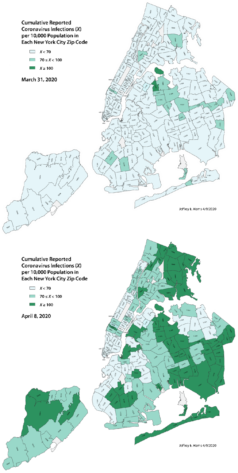
Animated Map of the Cumulative Incidence of Reported Coronavirus Infections in New York City by Zip Code, March 31 and April 8, 2020

Cumulative incidence of coronavirus infections was computed from zip code-specific data, reported by the New York Department of Public Health, and census data on zip code-specific populations. Incidence rates were rendered visually in a three-class color scheme, where light green represents less than 70 cases per 10,000, medium green corresponds to at least 70 but less than 100 cases per 10,000, an dark green corresponds to at least 100 cases per 10,000. The two images represent the cumulative incidence as of March 31 and April 8, 2020, respectively. See Harris, J.E. The Subways Seeded the Massive Coronavirus Epidemic in New York City, April 13, 2020, to appear as National Bureau of Economic Research Working Paper 27021.