COVID-19, Bar Crowding, and the Wisconsin Supreme Court

A Non-Linear Tale of Two Counties

Daily Incidence of Confirmed COVID-19 Cases per 100,000 Population in Milwaukee and Dane Counties, Wisconsin, March 15 – July 24, 2020

We begin with a comparison of the incidence of confirmed daily COVID-19 cases in Wisconsin’s two most populous counties: Milwaukee County, which includes the City of Milwaukee; and Dane County, which includes the City of Madison. Raw counts of positive COVID-19 cases in these two counties are regularly reported by the Wisconsin Department of Health Services. We rely here on the data posted on July 23, 2020. In the graphic above, we have converted the raw case counts into daily incidence rates per 100,000 population, based on 2019 populations of 945,726 for Milwaukee County and 546,695 for Dane County. The orange-colored points are the Milwaukee County data, while the purple-colored points are the Dane County data. As in earlier articles, we have plotted the incidence rates on a logarithmic scale, shown at the left. That way, a straight line in the graph corresponds to exponential epidemic growth.

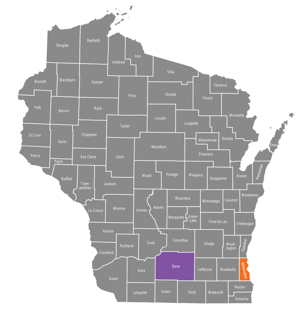
The two counties are situated in the same state. They share the same governor, the same state legislature, the same state supreme court, and the same state department of health. They have been subject to the same statewide policies. Yet they show distinct patterns of evolution of COVID-19 cases during nearly five months that the United States has endured the pandemic. Our task here is to inquire why.

No Excuses

What is so striking about the above graphic is the strange interlude between the end of March and the end of June when the Dane County data points drop an order of magnitude below the Milwaukee County data points – almost as if a purple cable had come loose from its orange trestle. One could argue that these divergent trends are simply meaningless noise, inasmuch as counts of confirmed COVID-19 cases are thought to vastly understate the actual number of infections. But there’s a limit to how much one can rely on this pat excuse for dodging what appears to be genuine evidence.

The March 24 Safer at Home Order

Like many populous areas in the United States, coronavirus infections in Milwaukee and Dane Counties were surging in early March 2020. The two counties’ incidence curves began to flatten only after Secretary-Designee of Health Services Andrea Palm issued her Safer At Home Order on March 24, which kept non-essential businesses closed throughout the state for an entire month. For some reason, however, the statewide wide order had a much more pronounced effect in Dane County, bending the epidemic curve downward, while in Milwaukee County, there was at best a flattening of the curve.

Statewide “Safer At Home” Order Entered Into Effect on March 24, 2020.

The April 7 Primary Elections

One possible explanation for the initial divergence of the two epidemic curves is the differential response of the two counties to the statewide primary elections. In an attempt to minimize in-person turnout at the polls, Gov. Tony Evers on March 27 called on the legislature to send an absentee ballot to every voter in Wisconsin. When the legislature rejected the proposal, the governor issued an executive order postponing in-person voting in the election for two months. That order, however,was blocked by the Wisconsin Supreme Court, and the spring primary elections went forward on April 7, as marked in the graphic below.

In-Person Voting for the Statewide Spring Primary Elections Took Place on April 7.

The severe shortage of poll workers on primary election day had a much greater impact on the density of voting in Milwaukee County than in Dane County. To accommodate the shortage, only 22 percent of Milwaukee County voting locations were allowed to open, compared to 78 percent of Dane County locations. The consolidation was even more severe within the city of Milwaukee, where 325 polling sites were collapsed into just five. According to one press report, voters in some Milwaukee precincts had to wait in line up to 2 1/2 hours to cast their ballots. “Now, over two weeks later,” wrote the newly elected justice to the Wisconsin Supreme Court in a follow-up opinion piece, “we have an uptick in Covid-19 cases, especially in dense urban centers like Milwaukee and Waukesha, where few polling places were open and citizens were forced to stand in long lines to cast a ballot.”

The hypothesis that the long lines at Milwaukee’s primary polling places served as a seed for an upswing in COVID-19 cases has been subject to more than passing investigation. In a case tracking study, the Milwaukee County COVID-19 Epidemiology Intel Team identified numerous individuals who were diagnosed as COVID-19 positive during the three weeks after the primary election, but the team could not reach any definitive conclusions from the interview evidence alone. An econometric study of Wisconsin counties found that the proportion of cases testing positive in the three weeks after the primary was directly related to the number of in-person voters and inversely related to the number of absentee voters.

We’re left with the disturbing fact that Dane County, which felt little impact from the consolidation of polling places, continued to flatten its epidemic curve during the three weeks after the primary. Meanwhile, Milwaukee County’s epidemic curve began to reverse itself one week after the election. As we noted in San Antonio Conundrum, the timing fits with the evidence on the 5-day incubation of the disease. What’s more, the serial interval between the time the infector gets sick and the time the infectee gets sick is only about 5 or 6 days. That would give enough time for people infected at the primary to transmit the virus to others.

The Wisconsin Supreme Court Intervenes Again

On April 20, Gov. Evers announced his Badger Bounce Back plan to gradually reopen the Wisconsin economy. Adhering to the recent White House guidelines for Opening Up America Again, Evers’ plan continued the state’s Safer At Home restrictions, requiring that non-essential businesses remain closed until there was a sustained 14-day decline in COVID-19 cases. Golf courses, however, were allowed open, and exterior lawn care was permitted. A week later, Secretary-Designee Palm announced an Interim Order to Turn the Dial, allowing non-essential businesses to make curbside drop-offs and opening up outdoor recreational rentals and self-service car washes, so long as social distancing measures remained in place.

The governor’s carefully crafted regulatory scheme, however, would not stay in place for long. On May 13, upon petition of the legislature, the Wisconsin Supreme Court ruled that Palm’s Safer at Home order did not adhere to established rule-making procedures and was therefore unenforceable. While Palm indeed had some power to act in the face of the pandemic, her order to confine people to their homes and close non-essential businesses exceeded her authority.

Wisconsin Supreme Court Nullifies Statewide Stay At Home Order on May 13.

Madison & Dane County Respond

With the court’s nullification of the statewide Safer at Home order, Wisconsin’s public health policy toward the COVID-19 epidemic devolved into a collection of variegated, asynchronous, substitute measures taken at the county and municipal level.

On the same day as the Supreme Court order, Janel Heinrich, Public Health Officer for Madison and Dane County, issued her own order adopting essentially all of the governor’s regulatory scheme – Safer at Home, Badger Bounces Back, and the Interim Order to Turn the Dial – but with reduced restrictions on religious entities. “Data and science will guide our decision making,” announced Madison Mayor Satya Rhodes-Conway. Five days later, the county set in motion its own Forward Dane Plan, which implemented a cascade of emergency orders – on May 18, May 22, June 5, June 12, and June 25, gradually loosening restrictions on social distancing. The May 22 order, in particular, allowed the opening of businesses, including salons, indoor restaurant and bar operations, to 25 percent capacity. The June 12 order increased the allowable threshold to 50 percent capacity.

The July 1 order, however, took a very different position. COVID-19 incidence had been rising in Dane County since the week after the Wisconsin Supreme Court nullified the statewide plan. “An emerging pattern in Dane County confirms that bars and mass gatherings create particularly challenging environments for the COVID-19 pandemic,” the order’s preamble noted. With the new order, indoor seating in restaurants was cut back to 25 percent of capacity. Bars – which technically entailed any business earning more than half of its revenues from alcoholic beverages – were again restricted to pickup and takeout. The most recent July 7 order required the wearing of a face covering while taking public transportation, waiting in line, and remaining indoors with non-family members.

City of Milwaukee & Milwaukee County Suburbs Respond

When it came to public health, the City of Madison and Dane County operated essentially as a unified entity. But that was hardly the case in Milwaukee County.

Back on March 25, City of Milwaukee Commissioner of Health Jean Kowalik had already issued her own stay-at-home order that pretty much paralleled Safer At Home. So, when the Wisconsin Supreme Court decision came down on May 13, Commissioner Kowalik initially elected to keep the existing local order in place. That apparently did not sit well with the 18 suburban communities constituting the rest of Milwaukee County, who issued their own new order. Starting May 22, according to their new Phase A/B/C/D plan, restaurants and bars could reopen with a recommended capacity of 50 percent, while salons and gyms could open up with a recommended 25 percent capacity. The very next day, the city’s Mayor Tom Barrett, aligning himself more closely with the suburban Milwaukee communities, decided to issue his own Moving Milwaukee Forward order allowing salons and playgrounds to reopen.

From that point onward, the City of Milwaukee adhered to its own phase 1/2/3 plan, while the suburban Milwaukee communities continued to follow their phase A/B/C/D plan. On June 12, the communities entered into Phase C, allowing mass gatherings of up to 50 persons and relaxing capacity constraints for restaurants and bars to 75 percent and gyms to 50 percent. But with COVID-19 case counts on the rise in early July, the communities held back on scheduled Phase D, which would have reopened restaurants, bars, salons and gyms to full capacity. Meanwhile, the City of Milwaukee moved forward with its Phase 4, allowing retail stores, restaurants and bars to open at 50 percent. Salons were to be held to a capacity of one customer per stylist, while faith-based gatherings and gyms were restricted to the lesser of 50 percent capacity or one person every 30 square feet.

By July 13, with COVID-19 counts continuing to rise both in the city and suburbs, the Milwaukee Common Council adopted the Milwaukee Cares Mask Ordinance.

The Bars

There is simply no way we can assign each blip and dip of the COVID-19 incidence curve to a particular event along the timeline of successive regulatory actions taken by the two counties. We need an overarching theme – a common underlying mechanism – to bring all the facts together. To that goal we now turn.

Daily Indices of Entry Into Bars in Milwaukee and Dane Counties, March 1 – June 30, 2020, Based Upon SafeGraph Patterns Data.

The graphic above displays the daily indices of visits to bars located in Milwaukee and Dane Counties during March 1 – June 30, 2020. The graphic is derived from the Patterns database maintained by SafeGraph, which we have already used in San Antonio Conundrum and TETRIS for Tulsa. The database follows the movements of a cohort of smart phone users who have consented to leave their location trackers activated. For every day from February 17 through June 30, we computed the number of entries into each of 240 Milwaukee County bars and 230 Dane County bars. We selected bars first on the basis of the business name, including Bar, Tap, Tavern, Pub, Lounge, Speakeasy, Cocktail, Ale, Saloon, and Brew. We then added specific businesses in each county based on lists of bars maintained by Yelp. To make the two series compatible, we normalized the numbers of entries so that the mean for the period February 17 – March 13 was equal to 100.

After entries into bars plummeted in March, there was a persistent difference in the volume of visits between Milwaukee and Dane counties. For example, during the week starting Monday, April 6, the geometric mean values for the two indices were 27 for Milwaukee County and 17 for Dane County. By mid May, the indices had begun to rise for both counties, but more rapidly for Dane County. By the week starting Monday, June 8, the indices were 53 for Milwaukee and 52 for Dane, respectively – in other words, about half of pre-epidemic activity levels.

While it is difficult to line up the dates precisely, the gap between the two counties in the index of visits to bars tracks the corresponding gap in the COVID-19 incidence. To interpret the relationship between the two graphs, one needs to understand that the two measured phenomena involve very different time constants. The number of visits to a bar on a given day can abruptly turn on a dime. The resulting change in COVID-19 incidence will take at least two weeks to play out, and even longer when one considers secondary spread.

How Non-Linearity Works

In early April – even before the spring primary election – the bar-entry indices averaged 27 for Milwaukee County and 17 for Dane County. That’s a ratio of 27/17 = 1.6. Yet at the same time, COVID-19 incidence in Milwaukee County was already about 6 times that in Dane County. The magnitudes, it would seem, don’t line up.

But they do. And the reason is the inherent non-linearity in the relationship between social distancing indices and disease transmission outcomes.

Computer Simulation of the Effect of Density in an Enclosed Space on the Risk of COVID-19 Transmission

The graphic here displays a computer simulation that addresses this question. Each square represents an enclosed space – it could be a bar room, but it doesn’t have to be – in which a specified number of patrons are randomly and uniformly distributed. On the left, there are 17 patrons, each represented by a solid purple dot. On the right, there are 27 patrons. The first 17 patrons, colored purple, are in exactly the same locations as their counterparts on the left. The additional 10 patrons have been colored in orange to distinguish them. The left and right panels are intended to capture the differences in density between a Dane County bar and a Milwaukee County bar in early April. Strictly speaking, the density within the bar room at any point in time is not necessarily equal to the flow of patrons into the bar, as gauged by our social mobility indices above. But at least it’s a start at capturing the idea.

Surrounding each patron is a gray circle with the same radius. Focusing sharply on the droplet mode of transition, we are trying to capture the maximum distance between an infector and infectee patron. Transmission occurs only if one of the patrons is inside the radius of the other.

Let’s see what happens as the number of patrons increases. On the left, with 17 patrons, patrons A and B are just within each other’s radius. Everyone else is too far apart to get infected. Now move to the right, where there are 10 new patrons. C and D are paired – C was there from the start and D has entered the bar room and C’s radius. But that’s just one new pairing. Altogether, a total of 12 patrons are now at risk of transmitting and receiving an infection. That’s a six-fold increase in transmission risk for a 60-percent increase in capacity.

We hope the point is clear. Epidemic containment could be going along just fine at a capacity limit of (say) 25 percent. What might appear to be an incremental relaxation to (say) 50 percent could be an invitation to disaster.

Why This Is Really Important

The non-linearity arises here from the fact that the risk of transmission from one person to another falls off abruptly when the two are separated by a distance exceeding the size of infected person’s contaminated droplet cloud. That is the critical mechanism that permits us to explain why strict social separation initially works, but then fails to contain the spread of coronavirus as the relaxation of distancing measures proceeds.

One might counter that the index of bar visits is interesting but wildly over-interpreted. After all, during the initial Safer At Home phase, the bars were closed to all service but pickup and takeout. We wonder how well those restrictions were enforced, especially in a world where a bar with a food menu can at least maintain the pretense that less than half its revenues are from alcoholic beverages. In any event, we need to think of the index of bar visits as an overall indicator of the extent of social distancing. We are not asserting that all or even most coronavirus transmission occurs in that venue.

When we studied the sixteen most populous counties in Florida, we found that incidence trends ran pretty much in parallel. COVID-19 cases fell together and then rose together. Younger persons came down with the virus first, and then they gave it to socially less mobile older persons. Here, we have a unique opportunity to study a divergence in trends between two counties whose major urban centers are only about 80 miles apart. We have confirmed that a social distancing indicator still holds up as the key intermediate variable in explaining the widening and narrowing of the epidemic gap between the two counties.

We cannot broadly conclude that the Wisconsin Supreme Court decision on May 13 to nullify the statewide Safer At Home order was the but-for cause of the COVID-19 rebound in Madison and Dade Counties. For we do not know what social distancing measures would have prevailed in a counterfactual world with Safer At Home still in place. But we can more narrowly conclude that the Court’s decision triggered the replacement of Safer At Home with a motley collection of uncoordinated, asynchronous local measures that ultimately opened the door to a debacle.

Acknowledgments: Thanks to Prof. Chad Cotti for supplying the data on the consolidation of polling locations in Milwaukee and Dane Counties during the April 7, 2020 primary elections.

Addendum: Prof. Martin Andersen and Dr. Paul Cieslak have both drawn attention to the dismissal of approximately 7,800 University of Wisconsin students who were living in dormitories at the start of spring break on March 14. Could this massive exodus alone have accounted for the substantial divergence in COVID-19 incidence rates between Dane and Milwaukee Counties ? Yes. But only under the extreme assumption that the dismissal staved off a major outbreak of 50 cases in the dorms. That would come to a rate of 640 per 100,000 students, comparable to that seen among front-line Metropolitan Transit Authority workers in New York City during March and April.

Addendum: In the computer simulation above, we focused on the number of patrons who were located within the infectious radius of at least one other patron. Prof. Dan Spielman has suggested a better indicator of overall transmission risk, in particular, the number of pairs of individuals within the infectious radius. After all, patron M in the bar room with 27 patrons (at the right above) is at higher risk than the others because she’s in three distinct pairs with patrons K, L, and N. Prof. Spielman’s approach leads to a general formula that applies to any bar room, including a rectangle, an ell, or an oval. For a particular shaped room, let p_r denote that probability that any two randomly located patrons are within a distance r > 0 of each other. If a total of n > 1 patrons are randomly located in the bar room, then the mean number of pairs of patrons within the infectious radius r is p_r \frac{n(n-1)}{2}. For any given shaped bar room and any fixed infectious radius r, this risk indicator goes up non-linearly with the number n of patrons.

Addendum: This article has been accepted for publication in Research in International Business and Finance.

Florida: Coronavirus Infections Push Tests, Testing Does Not Pull Infections

A massive statewide surge of 55,500 tests on May 20 had no effect on the number of positive tests.

The graphic above plots two data series on coronavirus testing in the entire state of Florida from April 19 to July 18, based on the nationwide monitoring efforts of the COVID Tracking Project. The first data series, rendered as the connected blue line and measured on along the left-hand vertical axis, shows the total number of test results reported on each day. The second data series, rendered as the connected burgundy line and measured along the right-hand vertical axis, shows the number of positive test results on the same day. The two data series are measured on different scales – with the positive tests magnified four-fold compared to total tests – so that both series can be readily visualized on the same graph.

The question posed by the graphic appears straightforward: Did the number of COVID-19 infections, as captured in the positive-test data series, push ahead the total amount of testing? Or did the total number of tests performed pull on the detected number of COVID-19 infections? Put more succinctly, did the movements in the burgundy line cause the movements in the blue line? Or was the causation the other way around?

In reality, the question is improperly framed. There is no reason that the direction of causation goes only one way. It’s entirely possible that the forces of both push and pull have been operating simultaneously. On the push side, it is possible that a surge in infections has increased the demand for testing. On the pull side, it is possible that enhanced testing has resulted in the detection of COVID-19 infections that would otherwise have gone undetected. The more precise question is: Which of the two forces, if any, was more important?

To resolve the question, we would ideally perform two experiments, which we can describe in the context of the push-pull diagram above. Experiment #1: We’ll have the pusher let up and have the puller keep pulling, and then see if the pusher and cargo move. To make sure, we could have the puller exert maximum effort while the pusher just holds onto the cargo and takes it easy. Experiment #2: We’ll have the pusher exert maximum force while the puller goes along for the ride, and once again see whether the puller and cargo budge.

Fortunately, Florida has performed both experiments for us. To see how, we’ve annotated the opening graphic. On May 14, 2020, Gov. Ron DeSantis issued Executive Order 20-123, Full Phase 1: Safe. Smart. Step-by-Step. Plan for Florida’s Recovery. The order, which took effect on May 18, allowed restaurants, retail establishments, and gyms to operate at 50 percent capacity, opened professional sports events and training camps, and permitted amusement parks and vacation rentals to operate subject to prior approval.

As part of the Full Phase 1 effort, the state massively expanded its COVID-19 testing capacity. On May 19, the day after Full Phase 1 went into effect, the governor held a press conference discussing in part the state’s expanded COVID-19 testing efforts. As documented in the Florida Department of Health press release for that day, the governor took the following steps:

  • FLNG [Florida National Guard] has expanded its support to mobile testing teams and the community-based and walk-up test sites. To date, the FLNG has assisted in the testing of more than 227,000 individuals for the COVID-19 virus.
  • In an effort to increase testing, Governor DeSantis has directed Surgeon General Dr. Scott Rivkees on an emergency temporary basis to allow licensed pharmacists in Florida to order and administer COVID-19 tests.
  • At the direction of Governor DeSantis, the state has established 15 drive-thru and 10 walk-up testing sites across the state, with more coming online. More than 100,000 people have been tested at these sites. Floridians can find a site near them here.
  • At the direction of Governor DeSantis, AHCA [Agency for Health Care Administration] issued Emergency Rule 59AER20-1 on May 5 requiring COVID-19 testing by hospitals of all patients, regardless of symptoms, prior to discharge to long-term care facilities.

The graphic confirms a massive increase in testing after Full Phase 1 went into effect. The following day, on May 20, 2020, a total of 55,493 test results were reported, of which only 527 (or 0.95%) were positive and 54,966 were negative. (While the massive increase could have reflected the clearing of a huge backlog of recently performed but as yet unreported tests, we still can’t get around the fact that less than 1 percent of those tests were positive.) The green dashed lines in the graphic highlight the step-up in testing. Before Full Phase 1, from April 19 through May 17, an average of 13,975 test results were reported daily. In the month immediately after Full Phase 1 went into effect, from May 28 through June 24, an average of 26,751 tests results were reported daily. That’s nearly double the amount of testing.

When testing massively increased on May 20, positive tests did not change. When the puller pulled with maximum effort, the pusher and cargo didn’t budge. During the month after Full Phase 1, while total testing on average had nearly doubled, positive tests began to move upward but only with a delay of couple of weeks. As a result of the state’s Full Phase 1 reopening, the pusher was starting to push.

As documented in Data From the COVID-19 Epidemic in Florida Suggest That Younger Cohorts Have Been Transmitting Their Infections to Less Socially Mobile Older Adults, the initiation of Full Phase 1 was soon followed by an increase in COVID-19 incidence. In parallel with gains in social mobility indicators – such as the number of diners at sit-down restaurants – COVID-19 infections surged among younger adults and also increased substantially among older individuals. By about June 25, as shown in the above graphic, COVID-19 infections had increased to the point where they were forcing further expansion of total testing.

The pusher was pushing hard, and the puller was going along for the ride.

Thus far, we have avoided the technical jargon of policy evaluation. For the record, we’ll translate here. In natural experiment #1, an exogenous increase in testing driven by an abrupt change in public policy had no observable effect on the number of positive tests. By contrast, in natural experiment #2, when the exogenous policy relaxed social distancing restrictions, enhanced social mobility and thus drove up COVID-19 infections, the observable effect on total tests was substantial.

The above graphic, which is directed to specialists in policy evaluation, communicates the same conclusions in the form of an X-Y plot. The vertical axis (or Y-axis, in mathematical jargon) measures the number of positive tests. The horizontal axis (or X-axis), measures the total number of tests. During the period from April 19 through June 24, 2020, as indicated by the green data points, the relation between positive tests (Y-axis) and total tests (X-axis) was basically flat. After the surge in COVID-19 cases, which we’ve pegged here as starting on June 25, there is a direct relationship between the two variables. Positive tests (the Y variable) have been driving up total tests (the X variable).

The evidence from Florida strongly supports the conclusion that the recent surge in COVID-19 cases has pushed up the total amount of testing. The observed rise in testing did not pull along the number of positive tests.

Acknowledgments: Thanks to A. Marm Kilpatrick for pointing out that the massive bump in reported tests on May 20 could have represented the clearing of a huge backlog of recently performed but as yet unreported tests.

San Antonio Conundrum

New COVID-19 cases have spiked, while social mobility indices have fallen. Did the protests have a role?

The graphic above shows the daily counts of newly confirmed daily COVID-19 cases in San Antonio, Texas from March 20 through July 14, 2020, as reported by the City of San Antonio’s COVID-19 Dashboard Data. As in earlier posts, we have plotted the case counts on a logarithmic scale, marked off along the left-hand vertical axis. The logarithmic scale has the advantage that an upward straight-line trend represents exponential growth.

While the San Antonio Dashboard doesn’t show the initial takeoff phase of the city’s COVID-19 epidemic, we can at least see the case counts rising during the end of March. After the week of Sunday, April 5, the epidemic curve flattens out and remains that way until the weeks of May 31 and June 7. At that point, the incidence of new cases turns upward exponentially, with a doubling time of 7.5 days. Beginning with the week of July 5, we see what may turn out to be a deceleration in the upward trend.

Above, we’ve annotated our opening graph of new daily COVID-19 cases in San Antonio. Superimposed on the original daily counts, which we’ve faded into the background, are larger purple data points, connected by line segments. These larger points show the weekly averages, computed as geometric means. These weekly averages help us distinguish the period of flattening of the incidence curve from the more recent, exponential rise in new COVID-19 cases.

The Protests

George Floyd died on May 25. Protests began in San Antonio on May 30 and continued to take place through at least June 11. We’ve marked this interval as a yellow band on our graphic above. The positioning of this band raises an important question: Does the new surge in COVID-19 cases have anything to do with the protests?

As we’ve noted in earlier posts, the incubation period between infection and initial symptoms is about 5 days. After that, there is a further variable delay until the affected individual seeks testing and the test results are reported by the health department. Still, data on symptom onset issued by city’s health department suggest that this additional delay may be only a couple of days. That would mean a time lag of about a week between the onset of an outbreak and the subsequent rise in reported cases. So the timing shown in the graph wouldn’t be too far off. What’s more, it’s at least conceivable that the continuing exponential rise in new cases after the protests was the result of secondary spread from those initially infected during the protests to still other persons. After all, the serial interval between the time the infector gets sick and the time the infectee gets sick is only about 5 or 6 days.

Numerous press write-ups suggest that the vast majority of participants in the protests were younger persons. And the San Antonio Dashboard tells us that to date about half of all confirmed cases of COVID-19 to date have occurred in people aged 18–40 years. But those facts don’t really help us narrow down the possible causes of the recent surge, since young persons could have contracted and transmitted the virus in many different settings, including restaurants, bars, and entertainment venues.

Contact Tracing

According to one press report, the city health department has purportedly asserted that there was no evidence of a link between the protests and the subsequent surge in cases. However, the standard form developed by the Texas Health Department to trace the contacts of infected persons does not ask about protests, family gatherings, or bars. The city’s Dashboard tells us only that 57% of infected persons had a close personal contact, while 37% were infected via “community transmission,” which basically means that no specific personal contact was identified. In other words, community transmission could include contact with an unidentified infected person during a mass gathering such as a protest.

We’re right back to the problem identified in TETRIS for Tulsa. Contact tracing in real life is a different ball game than contact tracing in theory.

Social Mobility Indicators

We relied on two sources of data to produce the graphic above. The first, corresponding to the blue line, comes from the Google Mobility index, which we relied upon in earlier posts on Tulsa, Orange County CA, Los Angeles, and Florida counties. It measures the percentage change in visits to retail stores and entertainment venues from the 5-week baseline period January 3 – February 6, 2020. The percentages are measured on the left-hand vertical axis.

The second source, corresponding to the red line, comes from the Patterns database maintained by SafeGraph, which we used in TETRIS for Tulsa to study visitors to Pres. Trump’s BOK Center rally on June 20. Here, we identified 1,661 San Antonio restaurants within SafeGraph’s nationwide master list of places of interest. The list included sit-down restaurants, fast food and takeout, chains like MacDonald’s, Arby’s, Wendy’s, Jack in the Box, Chipotle, KFC, and numerous other taquerías, tortillas, sub shops, burger, ramen noodle, pizza, pollo frito, shakes, barbecue, and various well known venues in the area. We aggregated the visits to these restaurants into a single daily index, where each visit is a movement of an Android or iOS user from the SafeGraph panel into a place of interest. The numbers of visits, which exceeded 30 thousand per day in February, are measured on the right-hand vertical axis.

From the point of view of an empirical social science researcher who routinely works with noisy data, the coincidence of these two indicators of social mobility – one focused on retail stores and entertainment venues, the other focused on restaurants – is remarkable. The precipitous drop in both data series in the second and third weeks of March reproduces a pattern we’ve seen in many other locations. The gradual but partial rebound during April and May is also a familial finding. What is strikingly different is the concurrent reversal of both social mobility indices some time during the first week of June.

Now that we’ve displayed the social mobility data series, we can again superimpose the time band corresponding to the protests, as shown above.

Finally, we show the relationship between the incidence of COVID-19 cases and the trends in a third social mobility indicator, derived from the Open Table data base on sit-down restaurants. The indicator gauges the change in the number of seated diners from online, phone, and walk-in reservations. Measured on the right-hand vertical axis, it is computed as a percentage of the corresponding number of diners one year earlier. Thus, the flat portion of the curve at –100 percent represents sit-down restaurants that were closed during March and April. With the exception of a spike on Father’s Day, Sunday, June 21, the Open Table data once again reproduce the pattern of social mobility seen in the Google and SafeGraph data.

What Brought the Mobility Indices Back Down?

It is not obvious how the protests by themselves could have caused the massive and lasting reversal of visits to restaurants, retail stores, an entertainment facilities. On Sunday, May 31, after a reported vandalism spree on Houston Street, San Antonio Mayor Ron Nirenberg issued a curfew order covering Alamo Plaza and the downtown business district. The curfew was subsequently extended until June 7 for Alamo Plaza and the downtown business district, but lifted after several days of peaceful demonstrations. While there were some initial reports of chaos, we can find no reports of property damage so vast as to continue to deter social activity once the protests ended. In any event, the locations covered in the three data bases extended far beyond the Alamo and downtown business district.

Perhaps the city’s response to the growing number of cases in early June was a contributory factor. On June 13, the mayor reminded the public to practice safe behaviors. On June 17, the mayor endorsed the Bexar County administrator’s executive order requiring businesses to develop policies mandating mask use when distancing is infeasible. On June 24, the mayor barred outdoor gatherings of more than 100 people, and on June 26, the mayor closed bars and some park facilities.

Still, the best explanation for the reversal may simply be the public’s perception that going out to shop and eat was just too dangerous.

Where Does the Epidemic Curve Go From Here?

We’re left more than a few unsolved puzzles. We don’t seem to have enough evidence to exclude the possibility that the May 30 – June 11 protests triggered a new wave of infections, and convincing data from contact tracing don’t appear to be forthcoming. We don’t really know why social mobility indices underwent a striking reversal in San Antonio – a phenomenon not seen in Tulsa, Orange County CA, Los Angeles, and the most populous Florida counties.

What’s more, we’re left wondering why the reversal in social mobility has not so far resulted in a deceleration in COVID-19 incidence rates in San Antonio. Perhaps the best explanation is that in some environments, it may take extra time – perhaps a month or more – before enhanced social distancing effectively retards viral propagation. If so, we’d like to know what makes those environments so resistant to epidemic control.

In the meantime, we’ll be watching those daily COVID-19 case counts.

Acknowledgments: Thanks to Dr. Gil Brodsky for pointing out that the spike on Sunday, June 21 in the Open Table data corresponds to Father’s Day.

TETRIS For Tulsa

Only 40 percent of the visitors to President Trump’s June 20 rally at the BOK Center were from Tulsa County.

Updating a recent post, the graphic above shows the daily counts of new COVID-19 cases reported by the Tulsa Health Department through July 11, 2020. The daily case counts, represented by burgundy filled circles, are measured on a logarithmic scale, as indicated on the left-hand vertical axis. The arrow indicates the timing of President Trump’s rally at the BOK Center in Tulsa on June 20.

The Tulsa Health Department, we noted in the same post, has apparently been engaged in extensive contact tracing of hundreds of newly diagnosed cases. The results of such contact tracing, we pointed out, could be highly informative about the contribution of the June 20 rally to the continuing rise in new infections in Tulsa.

In this post, we suggest that systematically tracking down COVID-19 sufferers who were exposed at the Tulsa rally is likely to prove quite difficult.

TETRIS: Testing, Tracing and Isolation

Since April, a number of think tanks, foundations, academic institutions and other authorities have issued their own formal plans to guide the reopening of the U.S. economy in the face of the ongoing COVID-19 epidemic. These white papers, for the most part, have envisioned widespread if not universal testing, contact tracing, and isolation of infected individuals (or TETRIS) as fundamental to the nation’s recovery. Much has already been written about the benefits and costs of widespread testing of asymptomatic individuals, as opposed to the current system of voluntary, symptom-based testing now prevalent in the United States. And much has likewise been said about the ethics and feasibility of compulsory isolation, as opposed to our current system of voluntary, self-imposed quarantine. The issue here is real-world task of contact tracing.

Where Did The Attendees Come From?

The map above displays a partial enumeration of the counties of origin of attendees at the president’s rally on June 20. The map is based on our analysis of the Patterns database maintained by SafeGraph, which has been following a panel of Android and iOS device users as they enter and exit numerous points of interest throughout the United States, including – it just so happens – the BOK Center in Tulsa during the month of June 2020.

The burgundy shaded county at the center of the map is Tulsa, which was the origin of 40 percent of the recorded visitors. We have divided the remaining counties of origin into those with relatively high attendance, shaded in orange, and those with relative low attendance, shaded in mango. The orange shaded, high-attendance counties, taken together, covered 31 percent of the attendees, while the mango shaded, low-attendance counties covered the remaining 29 percent. The latter group included three remote counties not shown on the map: Seminole County FL, Cabarrus County NC, and Calvert County MD, the latter a suburb of Washington DC. As we discuss in the Technical Details below, there is good reason to believe that these estimates overstate the proportion of attendees from Tulsa County and understate the proportional attendance from the other counties.

The graphic above shows the daily counts of newly reported COVID-19 cases in the same three groups of counties, computed from the New York Times database. The three groups are color-coded to correspond to the Oklahoma counties of BOK Center attendees shown in the map above. The burgundy data points correspond to Tulsa County. The orange data points correspond to the combined daily cases in the high-attendance counties in the map within Oklahoma, while the mango points correspond to the combined daily cases in the low-attendance counties within Oklahoma.

The graphic shows that case counts have been surging exponentially, at least since the end of May 2020, in all three groups of Oklahoma attendee counties. We haven’t graphed the remaining Oklahoma counties, as we cannot be sure that they weren’t the home to some BOK Center attendees. Still, the trend in the remaining counties is parallel to that seen in the graphic.

Barriers to Contact Tracing

The data show that at least 60 percent of the attendees to President Trump’s June 20, 2020 at the BOK Center in Tulsa, Oklahoma came from outside Tulsa County. To ascertain the full extent that the rally contributed to the recent rise in COVID-19 cases – if the rally indeed did so – the Health Department will have to track down cases in surrounding counties. This will nearly triple the Department’s caseload. Failure to expand the scope of contact tracing may result in quantitative findings with too little statistical power to detect an effect, what statisticians call a Type II error.

When it comes to barriers to contact tracing, the BOK Center rally is by no means an anomaly. Unless the investigators are fortunate enough to have a restricted list of attendees, tracking down potentially infected participants in any mass gathering will have to confront significant problems of scope.

Contact tracing requires skill. You can’t just give a neophyte a battery of standard questions and expect him to come up with a reliable enumeration of contacts any more than you can give a first-year medical student the standard review of systems –Do you have headaches? swollen ankles? blurred vision? no energy?– and expect him to come up with a reliable diagnosis. It would be a profound error to assume that the “TR” in TETRIS is going to be a trivial task.

During the past four months, I have personally taken the medical history of dozens of patients who have come down with COVID-19. Occasionally, a patient will recall that her workplace has been closed because one of her coworkers tested positive. Sometimes, another will recall attending a birthday party. But a substantial proportion live in a household where multiple family members are sick and, because nearly everyone came down with symptoms at about the same time, no one is sure who gave it to whom. Some older patients will conjecture that their adult children in their 20s and 30s may have brought the virus home, but without interviewing the children, we don’t really know.

Technical Details

We have characterized the enumeration of counties of origin as partial because the SafeShare Patterns database covered only a sample of the full universe of attendees to the rally or, for that matter, to any of the points of interest in the database. Of the 1,434 visits to the BOK Center included in the data record for the month of June 2020, a total of 891 (62%) occurred on June 20, leaving an average of 19 daily visits for each of the remaining 29 days of the month. For the entire month of June, but not for each individual day, the database gave a breakdown of visitors by census block group of origin. These data were then aggregated into counties of origin for the construction of the map above.

Accordingly, one limitation of the analysis is that we have data on the origins of visitors for the entire month, and not just for June 20, the day of the rally. However, location exposure (LEX) data from PlaceIQ indicate that, on ordinary non-rally days, only about 4.8 percent of the devices pinging from Tulsa County did not originate from that county, while the corresponding proportion of “foreign” devices was 7.3 percent on June 20. (More precisely, other than the day when the Tulsa-based ping was detected, a “foreign” device emitted no pings from Tulsa during the prior two weeks.) This observation suggests that the inclusion of non-rally days in the construction of the map has resulted in an upward bias in the proportion of rally attendees from within Tulsa County.

Daily New COVID-19 Cases in Tulsa, Oklahoma through July 8, 2020

“Coronavirus Surge in Tulsa ‘More Than Likely’ Linked to Trump Rally: Dr. Bruce Dart, the director of the Tulsa Health Department, said Tulsa County had reported nearly 500 new cases of Covid-19 in the past two days.” So read the headline in a July 8 report in the New York Times.

Plotted in the graphic above are the daily counts of new COVID-19 cases reported by the Tulsa Health Department through July 8, each date represented by a sky-blue-filled circle. The counts are measured on a logarithmic scale, as indicated on the left-hand vertical axis. The arrow indicates the timing of the June 20 rally.

In a separate report on the same date, entitled “Tulsa health official: Trump rally ‘likely’ source of virus surge,” Politico noted, “Tulsa County reported 261 confirmed new cases on Monday, a one-day record high, and another 206 cases on Tuesday. By comparison, during the week before the June 20 Trump rally, there were 76 cases on Monday and 96 on Tuesday.”

The graphic below reproduces the first data plot with some annotations. The orange-filled circles highlight the four data points mentioned in the Politico report. While there has been considerable day-to-day variation, counts of new COVID-19 cases were increasing for about one month before the rally, and continued to increase after the rally. Superimposed on the plot is the ordinary least squares regression line for the data from May 10 through July 8. The slope of the blue line (0.0543/day, St. Err. = 0.0042, P < 0.001) implies a significant exponential doubling time of 12.75 days during this period.

In the third graphic below, the counts of new daily COVID-19 cases in Tulsa are overlaid by the trend in the Google Mobility index for retail and recreational activity in Tulsa County during the same time period. This social mobility indicator, graphed as a connected red line, is measured along the right-hand vertical axis as a percentage change from baseline, which Google calculates as the median value for the 5-week period from January 3 – February 6, 2020.

In the fourth and final graphic below, the counts of new daily COVID-19 cases in Tulsa are superimposed on the combined daily census of COVID-19 patients in Tulsa hospitals. The patient counts are restricted to Tulsa County residents.

The data show that over the past two months, Tulsa has been confronting exponential growth of confirmed COVID-19 cases with an estimated doubling time of 12.75 days. The observed growth of COVID-19 case counts is paralleled by an increase in at least one indicator of social mobility. The growth in newly diagnosed cases is further consistent with the rising census of patients hospitalized with complications of COVID-19, a more sensitive indicator of the demand for high-level healthcare resources. The latter rise in hospitalizations contradicts the hypothesis that the observed surge in cases is merely the result of increased testing among individuals with mild, self-limited disease.

The above-cited press reports relied upon a news conference given by Dr. Bruce Dart, the director of the Tulsa Health Department. Dr. Dart did not explicitly identify President Trump’s rally as a contributing cause of the epidemic surge. It appears that the Tulsa Health Department has been engaged in extensive tracking of the hundreds of newly diagnosed cases. The results of such case tracking could be highly informative about the contribution of the June 20 rally to the continuing rise in new infections in Tulsa.

Rising Hospital Census of Diagnosed or Suspected COVID-19 Patients, Orange County, California, April 1 – July 6, 2020

The graphic plots the combined number of beds in all Orange County, California hospitals that have been occupied by patients diagnosed with or suspected of having COVID-19 during each day from April 1 – July 6, 2020. These hospital daily census counts, depicted as green data points and measured on a logarithmic scale along the left-hand vertical axis, are reported by the California Open Data Portal. This state-issued data series appears to be more comprehensive than the series earlier reported by the local Orange County Health Care Agency and relied upon in Reopening Under COVID-19: What To Watch For.

Overlapping the hospital census data is a red connected line showing changes from March 1 onward in one particular dimension of the Google Mobility index, namely, the relative number of visits to retail stores and entertainment venues. This index, measured along the right-hand axis, is gauged as a percentage of the baseline level of activity, which is calculated in relation to the median value for the 5-week period from January 3 – February 6, 2020. For example, a value of –20 would correspond to a 20 percent decline compared to baseline. For other examples of the overlaying of social mobility indices on COVID-19 incidence and morbidity data, see Daily New COVID-19 Cases and Google Mobility Index of Retail Visits and Recreational Activity, Los Angeles County, March 1 – June 28, 2020, as well as Data From the COVID-19 Epidemic in Florida Suggest That Younger Cohorts Have Been Transmitting Their Infections to Less Socially Mobile Older Adults.

The Back Story

The story behind the trends shown in the graphic is a saga of public policy flip-flops. As the weather improved during the spring in Southern California, people from all over began flocking to beaches in Orange County, culminating in the arrival of an estimated 40 thousand beach goers at Newport Beach on the April 25-26 weekend. A few days later, on April 30, California Gov. Newsom ordered the county’s beaches closed. Two cities in the county sought preliminary injunctions in court to block the governor’s orders, but ultimately without success. Yet on May 23, the state government issued a variance to Orange County, permitting accelerated reopening of local businesses.

To enforce the state-issued variance, then County Health Officer Dr. Nicole Quick issued an order expanding the requirement for residents and visitors to wear face coverings in public places, in businesses such as retail stores, restaurants and hair salons, and at work when 6-foot distancing was infeasible. Quick’s order was apparently met with vociferous local disapproval, and on June 9, she resigned her post. On June 11, the County rescinded the mask requirement, converting it into a “strong recommendation.” Since then, the acting Health Officer’s orders have undergone several additional updates, most recently in a version issued July 3, which mandates the use of face coverings in certain high-risk situations enumerated by the California Department of Public Health, which in turn appear even more restrictive than Dr. Quick’s ill-fated order.

Non-Linearity

What is so striking about the graphic is the apparent acceleration in the COVID-19 hospital census starting in the week of June 21, but without a corresponding acceleration in the index of social mobility. Both diagnosed and suspected cases have been accelerating during this time period. So, the so-called suspected cases are, in all likelihood, no more than genuine cases with a delay in diagnostic confirmation. The rise in hospital census could in principle reflect increasingly delayed discharge of COVID-19 patients. But that would go against the general trend to send not-too-sick COVID-19 patients home earlier with portable oxygen, prophylactic anticoagulants, and a tapering dose of steroids.

We would ordinarily expect a delay between increases in social contact and consequent changes in hospitalization rates. Once an individual is infected, there will be an incubation period – about 5 days on average – followed by an additional week or so before the patient develops complications warranting hospital admission. Still, a lagged response does not alone explain the recent acceleration in the graphic.

The evidence here raises the possibility of non-linearity in the relation between social contact rates and disease incidence. In terms of the graphic above, once the frequency of visits to retail stores and entertainment venues reaches a threshold, transmission takes off. A model an infectious individual who can transmit the virus only to those within a certain radius would readily predict such non-linearity. A more interesting explanation is that younger individuals, having acquired their infections through increasingly lax compliance with social distancing measures, are now bringing their infections home to older, less mobile persons. And those elderly individuals are now ending up in the hospital.

Daily New COVID-19 Cases and Google Mobility Index of Retail Visits and Recreational Activity, Los Angeles County, March 1 – June 28, 2020

This graphic displays the daily number of new COVID-19 cases, reported by the Los Angeles County Department of Public Health, along with the corresponding index of visits to retail stores and recreational activities, reported by Google Community Mobility Reports, for Los Angeles County during March 1 – June 28, 2020.

The smaller sky-blue data points show the daily counts of COVID-19 cases, measured along the left-hand vertical axis on a logarithmic scale. The larger blue data points show the corresponding weekly averages, calculated as the geometric mean.

The connected red line segments show the Google Mobility index, measured along the right-hand axis. The index is shown as a percentage of the baseline level of activity, which is calculated in relation to the median value for the 5-week period from January 3 – February 6, 2020. For example, a value of –20 would correspond to a 20 percent decline compared to baseline.

For a similar graphic relating COVID-19 case incidence to the same Google Mobility index for Broward County, Florida, see Data From the COVID-19 Epidemic in Florida Suggest That Younger Cohorts Have Been Transmitting Their Infections to Less Socially Mobile Older Adults (July 5, 2020).

The graphic should not be interpreted to mean that visits to retail stores or recreational activities are specific causes of the renewed increase in COVID-19 case counts since the week of May 17. However, the data do support the hypothesis that the upswing in case incidence is correlated with at least one indicator of social mobility.