New COVID-19 cases have spiked, while social mobility indices have fallen. Did the protests have a role?

The graphic above shows the daily counts of newly confirmed daily COVID-19 cases in San Antonio, Texas from March 20 through July 14, 2020, as reported by the City of San Antonio’s COVID-19 Dashboard Data. As in earlier posts, we have plotted the case counts on a logarithmic scale, marked off along the left-hand vertical axis. The logarithmic scale has the advantage that an upward straight-line trend represents exponential growth.
While the San Antonio Dashboard doesn’t show the initial takeoff phase of the city’s COVID-19 epidemic, we can at least see the case counts rising during the end of March. After the week of Sunday, April 5, the epidemic curve flattens out and remains that way until the weeks of May 31 and June 7. At that point, the incidence of new cases turns upward exponentially, with a doubling time of 7.5 days. Beginning with the week of July 5, we see what may turn out to be a deceleration in the upward trend.
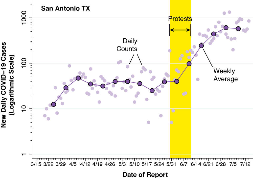
Above, we’ve annotated our opening graph of new daily COVID-19 cases in San Antonio. Superimposed on the original daily counts, which we’ve faded into the background, are larger purple data points, connected by line segments. These larger points show the weekly averages, computed as geometric means. These weekly averages help us distinguish the period of flattening of the incidence curve from the more recent, exponential rise in new COVID-19 cases.
The Protests
George Floyd died on May 25. Protests began in San Antonio on May 30 and continued to take place through at least June 11. We’ve marked this interval as a yellow band on our graphic above. The positioning of this band raises an important question: Does the new surge in COVID-19 cases have anything to do with the protests?
As we’ve noted in earlier posts, the incubation period between infection and initial symptoms is about 5 days. After that, there is a further variable delay until the affected individual seeks testing and the test results are reported by the health department. Still, data on symptom onset issued by city’s health department suggest that this additional delay may be only a couple of days. That would mean a time lag of about a week between the onset of an outbreak and the subsequent rise in reported cases. So the timing shown in the graph wouldn’t be too far off. What’s more, it’s at least conceivable that the continuing exponential rise in new cases after the protests was the result of secondary spread from those initially infected during the protests to still other persons. After all, the serial interval between the time the infector gets sick and the time the infectee gets sick is only about 5 or 6 days.
Numerous press write-ups suggest that the vast majority of participants in the protests were younger persons. And the San Antonio Dashboard tells us that to date about half of all confirmed cases of COVID-19 to date have occurred in people aged 18–40 years. But those facts don’t really help us narrow down the possible causes of the recent surge, since young persons could have contracted and transmitted the virus in many different settings, including restaurants, bars, and entertainment venues.
Contact Tracing
According to one press report, the city health department has purportedly asserted that there was no evidence of a link between the protests and the subsequent surge in cases. However, the standard form developed by the Texas Health Department to trace the contacts of infected persons does not ask about protests, family gatherings, or bars. The city’s Dashboard tells us only that 57% of infected persons had a close personal contact, while 37% were infected via “community transmission,” which basically means that no specific personal contact was identified. In other words, community transmission could include contact with an unidentified infected person during a mass gathering such as a protest.
We’re right back to the problem identified in TETRIS for Tulsa. Contact tracing in real life is a different ball game than contact tracing in theory.
Social Mobility Indicators

We relied on two sources of data to produce the graphic above. The first, corresponding to the blue line, comes from the Google Mobility index, which we relied upon in earlier posts on Tulsa, Orange County CA, Los Angeles, and Florida counties. It measures the percentage change in visits to retail stores and entertainment venues from the 5-week baseline period January 3 – February 6, 2020. The percentages are measured on the left-hand vertical axis.
The second source, corresponding to the red line, comes from the Patterns database maintained by SafeGraph, which we used in TETRIS for Tulsa to study visitors to Pres. Trump’s BOK Center rally on June 20. Here, we identified 1,661 San Antonio restaurants within SafeGraph’s nationwide master list of places of interest. The list included sit-down restaurants, fast food and takeout, chains like MacDonald’s, Arby’s, Wendy’s, Jack in the Box, Chipotle, KFC, and numerous other taquerías, tortillas, sub shops, burger, ramen noodle, pizza, pollo frito, shakes, barbecue, and various well known venues in the area. We aggregated the visits to these restaurants into a single daily index, where each visit is a movement of an Android or iOS user from the SafeGraph panel into a place of interest. The numbers of visits, which exceeded 30 thousand per day in February, are measured on the right-hand vertical axis.
From the point of view of an empirical social science researcher who routinely works with noisy data, the coincidence of these two indicators of social mobility – one focused on retail stores and entertainment venues, the other focused on restaurants – is remarkable. The precipitous drop in both data series in the second and third weeks of March reproduces a pattern we’ve seen in many other locations. The gradual but partial rebound during April and May is also a familial finding. What is strikingly different is the concurrent reversal of both social mobility indices some time during the first week of June.
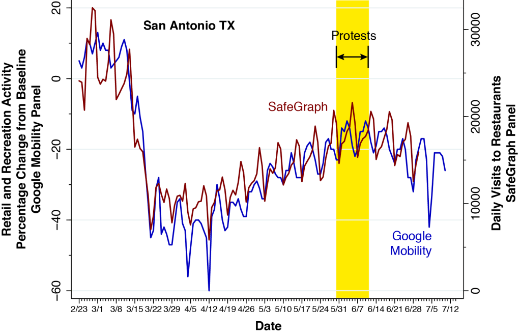
Now that we’ve displayed the social mobility data series, we can again superimpose the time band corresponding to the protests, as shown above.

Finally, we show the relationship between the incidence of COVID-19 cases and the trends in a third social mobility indicator, derived from the Open Table data base on sit-down restaurants. The indicator gauges the change in the number of seated diners from online, phone, and walk-in reservations. Measured on the right-hand vertical axis, it is computed as a percentage of the corresponding number of diners one year earlier. Thus, the flat portion of the curve at –100 percent represents sit-down restaurants that were closed during March and April. With the exception of a spike on Father’s Day, Sunday, June 21, the Open Table data once again reproduce the pattern of social mobility seen in the Google and SafeGraph data.
What Brought the Mobility Indices Back Down?
It is not obvious how the protests by themselves could have caused the massive and lasting reversal of visits to restaurants, retail stores, an entertainment facilities. On Sunday, May 31, after a reported vandalism spree on Houston Street, San Antonio Mayor Ron Nirenberg issued a curfew order covering Alamo Plaza and the downtown business district. The curfew was subsequently extended until June 7 for Alamo Plaza and the downtown business district, but lifted after several days of peaceful demonstrations. While there were some initial reports of chaos, we can find no reports of property damage so vast as to continue to deter social activity once the protests ended. In any event, the locations covered in the three data bases extended far beyond the Alamo and downtown business district.
Perhaps the city’s response to the growing number of cases in early June was a contributory factor. On June 13, the mayor reminded the public to practice safe behaviors. On June 17, the mayor endorsed the Bexar County administrator’s executive order requiring businesses to develop policies mandating mask use when distancing is infeasible. On June 24, the mayor barred outdoor gatherings of more than 100 people, and on June 26, the mayor closed bars and some park facilities.
Still, the best explanation for the reversal may simply be the public’s perception that going out to shop and eat was just too dangerous.
Where Does the Epidemic Curve Go From Here?
We’re left more than a few unsolved puzzles. We don’t seem to have enough evidence to exclude the possibility that the May 30 – June 11 protests triggered a new wave of infections, and convincing data from contact tracing don’t appear to be forthcoming. We don’t really know why social mobility indices underwent a striking reversal in San Antonio – a phenomenon not seen in Tulsa, Orange County CA, Los Angeles, and the most populous Florida counties.
What’s more, we’re left wondering why the reversal in social mobility has not so far resulted in a deceleration in COVID-19 incidence rates in San Antonio. Perhaps the best explanation is that in some environments, it may take extra time – perhaps a month or more – before enhanced social distancing effectively retards viral propagation. If so, we’d like to know what makes those environments so resistant to epidemic control.
In the meantime, we’ll be watching those daily COVID-19 case counts.
Acknowledgments: Thanks to Dr. Gil Brodsky for pointing out that the spike on Sunday, June 21 in the Open Table data corresponds to Father’s Day.
