There’s more to the story than a simple comparison of two maps. The sources of inequity are systemic.
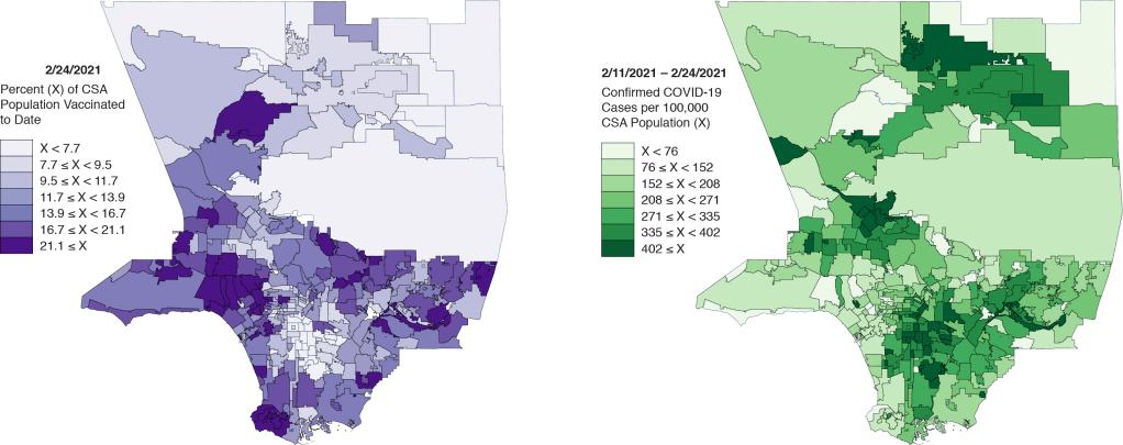
The Los Angeles Times recently posted two maps in an attempt to demonstrate the striking inequities in the COVID-19 vaccine rollout in Los Angeles County, far and away the largest county by population in the United States. One map showed the geographic distribution of vaccines to date, while the other showed the corresponding distribution of recent COVID-19 cases throughout the county.
In Figure 1 above, we display our own rendering of these two maps. The distribution of vaccinations on the left certainly looks different from the distribution of recent cases on the right. In fact, except for the broad swath of the San Gabriel Mountains and Los Angeles National Forest that cut across the county, the two maps look like negatives of each other.
But that doesn’t tell the whole story.
People who’ve already had COVID-19 don’t think they need to be vaccinated.
There is, in fact, an entirely plausible, alternative explanation for the apparent negative relation between the rate of vaccination and the incidence of COVID-19 in a community. In particular, people who have already come down with COVID-19 do not perceive the need to be vaccinated.
We could debate the science underlying the need for past sufferers of COVID-19 to get vaccinated. On the one hand, recent evidence suggests that the natural immunity acquired from a SARS-CoV-2 infection is indeed lasting, at least for 6-8 months. On the other hand, a single dose of an mRNA vaccine appears to confer significantly more immune protection in a previously infected individual than in an infection-naive person.
But this isn’t about scientific need for a vaccination. It’s about the perceived need for a vaccination. As economists would put it, prior infection reduces the demand for vaccination.
A Two-Way Plot
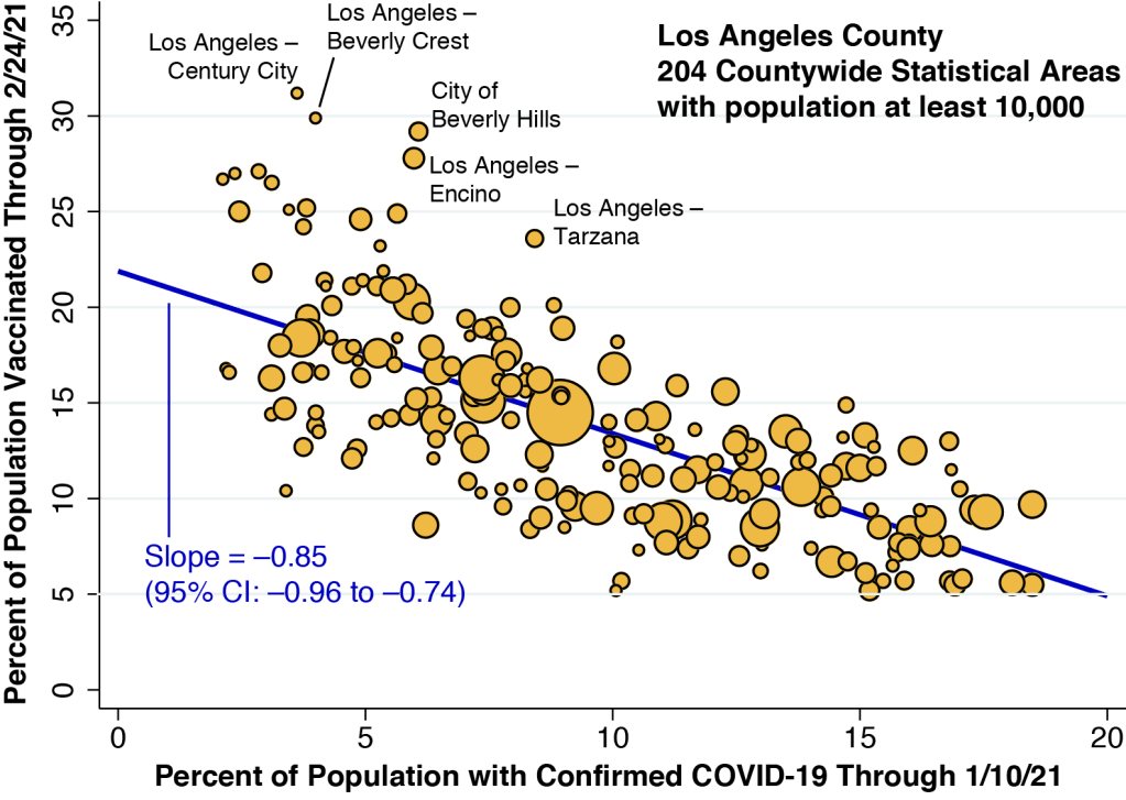
In Figure 2 above, we’ve plotted the percentage vaccinated in each community against the cumulative number of confirmed COVID-19 cases in that community. We’ve restricted our plot to the 204 communities within Los Angeles County that have a population of 10,000 or more. (Technically, these communities are called countywide statistical areas, or CSAs.) The size of each data point corresponds to community’s population. Strictly speaking, the horizontal axis measures the cumulative proportion of individuals who ever had a confirmed case of COVID-19, while the map at the right in Figure 1 shows the geographic distribution of recently confirmed cases. Still, the two variables are highly correlated.
The regression line fitting the data points in Figure 2 has a slope of –0.85. This would mean that for every individual who has had a confirmed case of COVID-19 since the epidemic began, 0.85 individuals deferred vaccination.
There is plenty of evidence that the number of confirmed cases substantially understates the actual number of cases of COVID-19. However, a lot of those unreported cases have been asymptomatic people who still don’t know they were infected. When it comes to our analysis of the effect of past infection on the perceived need for immunization, those people don’t count.
To be conservative, let’s assume that the true number of symptomatic infections is 25% greater than the confirmed number. Then our slope would drop to –0.85 / 1.25 = –0.68. That would still imply that most of the negative correlation seen in the two-map comparison can simply be accounted for by deferrals among those who already got sick.
The outliers offer a clue.
Figure 2 has a number of notable outlier points. We’ve annotated the five most obvious ones. With the possible exception of the Century City neighborhood of Los Angeles, where you can still buy a condo for under $1 million, housing prices in the neighborhoods of Beverly Crest, Encino, and Tarzana, as well as the City of Beverly Hills are way, way through the roof. It would be a delicate understatement to say that these outliers are affluent communities.
That gives us a clue that, quite apart from the influence of prior SARS-CoV-2 infection, income has played a role in the distribution of vaccinations to date.
Taking Income into Account
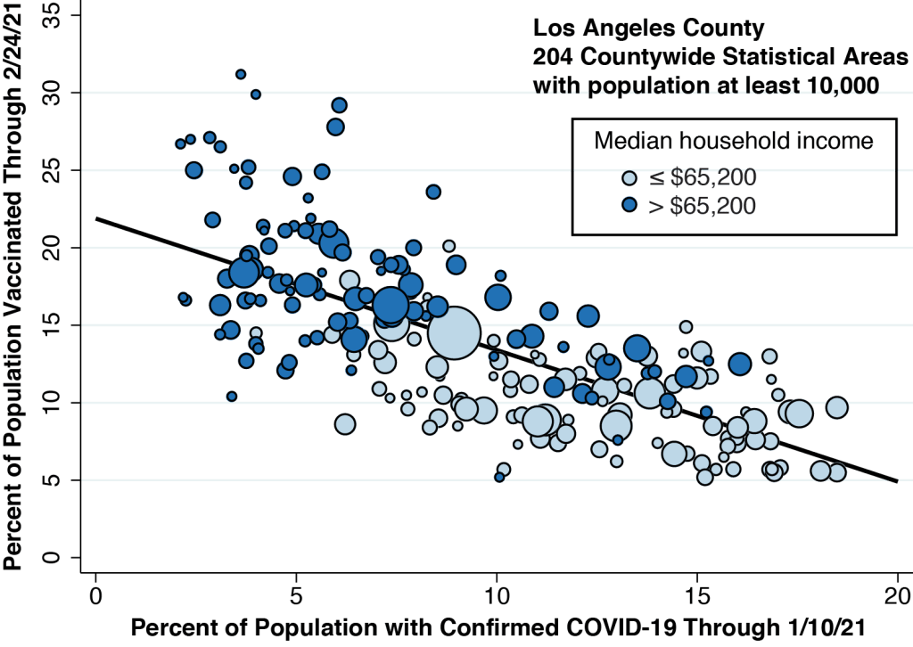
In Figure 3 below, we’re redrawn our two-way plot, coloring the data points according to the median household income of each community. (We set the cutoff at $65,200, the median of the medians.) The higher income communities tend to be clustered at the left, where the cumulative incidence of COVID-19 infection is relatively low. But we can also see a vertical gradient, with lower income communities situated below higher income communities. This gradient implies that, for any level of cumulative COVID-19 infection, higher income still yields a higher vaccination rate.
What about the elderly?
During most of the rollout to date, persons aged 65 years or more were classified as high priority for vaccination. So, in Figure 4 below,we carried out the same exercise as in Figure 3, recoloring our basic two-way plot to distinguish communities on the basis of the percentage of persons aged 65 or more.

Comparing Figures 3 and 4, we learn that the higher-income communities in Los Angeles County also tend to have a higher proportion of elderly persons. (The correlation coefficient was 0.78.) This strong correlation creates a nontrivial problem in the interpretation of our cross-community data. We had the impression from Figure 3 that higher income communities have fared better. But that may merely be a consequence of their higher proportion of persons 65+
An Attempted Statistical Solution
It is arguable that, at this juncture, we’ve reached a logical impasse. We might be able to pick out two communities which differ only by income and not by the proportion of elderly persons or the percent infected. But that sort of comparison would not necessarily tell us much about the equity of the vaccine rollout in the county as a whole.
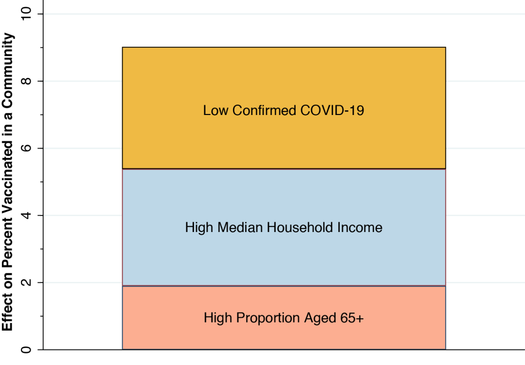
One way out is to formulate a statistical model of each community’s vaccination rate in relation to our three factors: the cumulative proportion of confirmed COVID-19 cases; the median household income; and the percentage of persons aged 65 or more. We’ve done this in Table 1 below.
| Binary Explanatory Variable | Coefficient | Lower Range | Upper Range |
| Low Confirmed COVID-19 | 3.64 | 2.58 | 4.69 |
| High Median Household Income | 3.48 | 2.39 | 4.57 |
| High Proportion Aged 65+ | 1.90 | 0.81 | 1.95 |
In Table 1, we treated each of the three explanatory variables as binary, that is, as either high or low. That allowed us to compare the magnitudes of each of the variables’ estimated effects. The table tells us that a low proportion of confirmed COVID-19 cases is associated with a 3.64 percentage point increase in a community’s vaccination rate. That’s very close to the estimated impact of a high median income. A high proportion of elderly persons, however, had an impact that was significantly lower.
For more on our statistical analysis, see the Technical Notes below.
A Deeper Look
Our results in Table 1 give us a reasonable idea of the magnitudes of the effects involved. A community with a low percentage of confirmed COVID-19 cases, with a high median income and a high proportion of elderly persons would have a vaccination rate 3.64 + 3.48 + 1.90 = 9.02 percent greater than a community at the other extreme. That’s the height of the bar in Figure 5 below, which shows each of our three estimated effects stacked atop one another. With a median vaccination rate of 13.1% to date, a combined increase of 9.02% is no small effect.
Our results confirm that the simple comparison of two maps in Figure 1 gives a distorted picture of the extent of inequality in the vaccine rollout to date in Los Angeles County. Still, when we took a deeper look at the data, we confirmed that a community’s median household income indeed had a significant positive impact on its vaccination rate.
How Inequality Works
Not a workday goes by without our witnessing first-hand the enormous inequities in access and outcomes that have been baked, seared, engraved and branded into our so-called system of healthcare. That our system of allocating lifesaving vaccinations is likewise unfair comes as no surprise.
But what is it about our system that makes the distribution of COVID-19 vaccines unfair?
Let’s put aside anecdotal evidence that persons with privilege have been able to jump the queue, and talk instead about systemic factors.
First, there is the hidden administration charge. When a patient receives a COVID-19 vaccine, he or she incurs no out-of-pocket expense. But the healthcare provider who administers the vaccine can charge the patient’s insurer for the service. Medicare, in particular, pays $28.39 for the administration of a single-dose vaccine and $16.94 for the first dose and $28.39 for the second dose of a two-dose vaccine. California Medicaid appears to be paying the same rate. This hidden administration charge creates a strong incentive in favor of vaccinating insured individuals. And to the extent that private insurers pay at higher rates, it creates an even stronger incentive to vaccinate privately insured individuals.
Second, there is the web-based sign-up. It obviously makes sense to set up an online appointment system. But the initial, crash-prone website was overloaded with page after page of required information to be filled out. In fact, one of the hidden functions of the website was to require registrants to upload images of the front and back of their insurance cards to make sure that providers could bill for the administration fee. This sign-up system heavily favored those with Internet access, especially those with laptops who could simultaneously open up ten browser windows – each with the required information automatically inserted by auto-fill – until they finally got in.
Third, there are the automobile-based vaccination sites. At the risk of overstating the obvious, lower-income people who rely on public transportation simply can’t wait in line for hours in their cars until it’s their turn.
Finally, there is the inexplicable but clear bias against community health centers. The current federal administration is launching an initiative to distribute vaccines directly to these community health centers. But for as yet unclear reasons, state- and county-level authorities don’t seem to have displayed the same enthusiasm. Yet community health centers are already strategically located to help the poorest people who would otherwise face serious barriers to access.
The Trusted Advisor Model
What’s more, community health centers, with their physicians, nurse practitioners and other providers standing ready to give personalized counseling, take full advantage of the trusted advisor model, which has been receiving increasing empirical support.
What if you heard that you should not get a mammogram right after your COVID-19 vaccine shot? Or what if you’re wondering whether the skin test for tuberculosis you had last week might interfere with your upcoming COVID-19 vaccine? Or what if you’re allergic to dust mites? Or what if you’re just plain suspicious of authoritative statements by experts who, despite appearing to speak English, don’t seem to be understandable?
Do you think a busy vaccinator at a mega-pod site will answer your questions? Or a busy pharmacist at one of the new sites to be rolled out in March 2021? With the best of intentions, they’ll suggest that you call your doctor for advice.
What doctor?
Technical Notes
Statistical models may help summarize complicated relationships between multiple variables, but they may also entail hidden, unverifiable assumptions. One such assumption here is that the contributions of our three factors are independent of each other. Still, alternative statistical models that we tested did not show any significant interactions between our explanatory factors. Another is that our binary distinction between high and low levels of each variable obscures more complicated nonlinear relationships. Our tests of models with continuous explanatory variables did not appear to support this possibility.
One such alternative test was a linear model with continuous explanatory variables, rather than the binary explanatory variables shown in Table 1. As shown in Table 2 below, the estimated slope coefficient for the cumulative percent of confirmed COVID-19 cases was -0.37 (95% CI, –0.51 to –0.23), which was less than half of the slope in the bivariate plot of Figure 2. That is, once we took all our explanatory factors in account, the impact of prior SARS-CoV-2 infection on vaccination rates was attenuated considerably. The estimated coefficient of a community’s median household income was 0.077 (95% CI, 0.046 to 0.108). That is, a $10,000 increase in a community’s median household income was associated with an increase of 0.77 percentage points in the vaccination rate.
| Continuous Explanatory Variable | Coefficient | Lower Range | Upper Range |
| Percent Confirmed COVID-19 | -0.37 | -0.51 | -0.23 |
| Median Household Income ($000) | +0.077 | +0.046 | +0.108 |
| Percent Aged 65+ | +0.45 | +0.26 | +0.64 |