Major Misconception About Acquired Herd Immunity

When herd immunity is achieved through large-scale population exposure, the epidemic doesn’t come to a halt. Millions more could ultimately be infected.

What, exactly, is herd immunity? Let’s look at some recent descriptions.

“Herd immunity occurs when enough people become immune to a disease to make its spread unlikely.” Herd immunity is “the point at which the virus can no longer spread widely because there are not enough vulnerable humans.” “Herd immunity occurs when a large portion of a community (the herd) becomes immune to a disease, making the spread of disease from person to person unlikely.”

Another authority has noted, “For example, if 80% of a population is immune to a virus, four out of every five people who encounter someone with the disease won’t get sick (and won’t spread the disease any further). In this way, the spread of infectious diseases is kept under control.”

And still another reference explains, “Herd immunity can be achieved when so many members of a population have become immune to an infectious disease that it can’t find new people to infect. There are two ways to get there: by exposing a large percentage of the population to a virus so they can develop antibodies on their own, or by vaccinating enough people to interrupt its transmission.”

The last description does draw an important distinction between herd immunity acquired through large-scale population exposure and herd immunity acquired through a campaign of immunization. But it does not go far enough. That’s because the two ways of achieving herd immunity have vastly different consequences. In fact, the widespread tendency to confuse the two has led to a major misconception as to what would happen the day after enough people got infected to cross the herd immunity threshold.

Herd Immunity Through Large-Scale Population Exposure

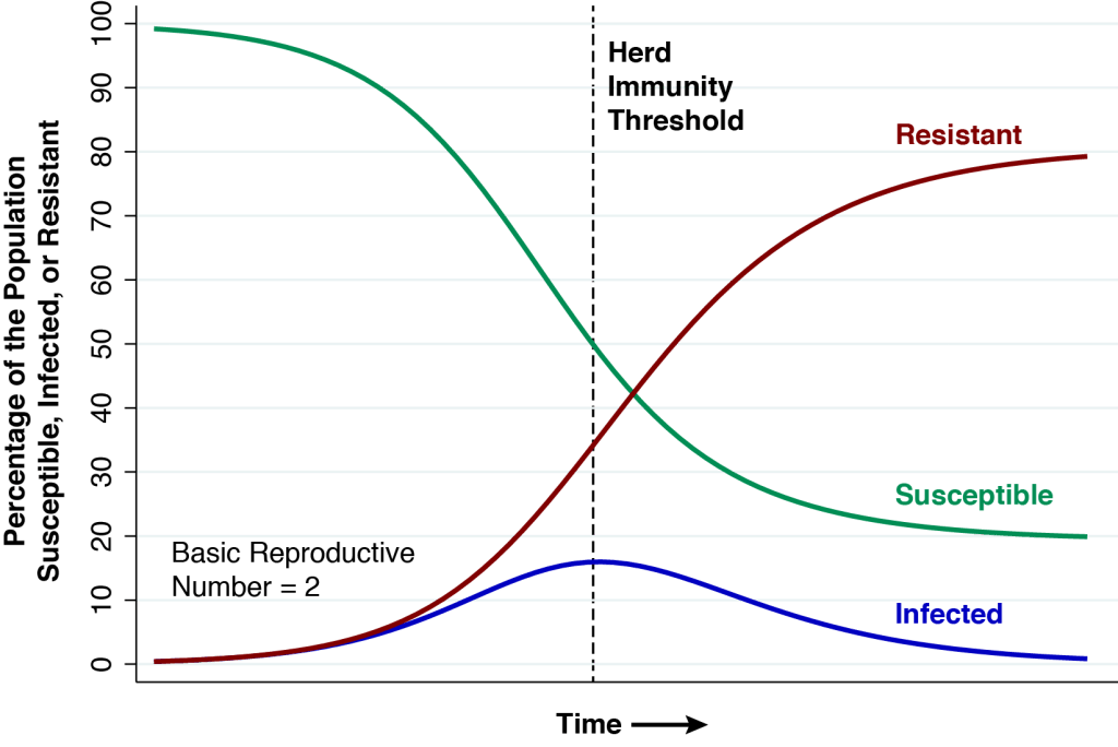
The above graphic shows the natural course of an epidemic governed by the classic SIR model, first described in 1927, which has served as the mainstay of mathematical epidemiology for nearly a century. This particular realization of the model has three features. First, the entire population is assumed to be naïve to the infectious agent at the outset. Nobody has natural immunity. Second, the epidemic is seeded by a very small number of infectious individuals imported from outside the population. Third, the basic reproductive number (or {\Re_0}) is equal to 2. At the very start of the epidemic, each infected person will, during the time he or she remains infectious, cause an average of two other persons to become infected.

At the start of the epidemic at the very left, the green curve shows that nearly 100 percent of the population is susceptible (S) to the infectious agent. The blue curve seems to show that no one is initially infected (I), but in fact the proportion seeding the epidemic is so small that we can’t see it on the graph. The red curve shows that zero percent of the population is initially resistant (R).

As the epidemic gets going, the proportion of infected people initially grows. But each infected individual remains infectious only for a limited time period. He or she eventually becomes resistant, either by recovering from the infection or dying. As more people get infected, the proportion remaining susceptible falls, and as more infected people recover from their infections, the proportion becoming resistant rises. At all times during the course of the epidemic charted in the graphic, the sums of the proportions susceptible, infected, and resistant add to 100 percent.

The Herd Immunity Threshold

In the classic epidemic model we’ve charted above, the herd immunity threshold is reached when the proportion of infected people reaches a peak. At this point, exactly half of the population remains susceptible. In mathematical terms, the remaining proportion of susceptible individuals at the point of herd immunity is the inverse of the basic reproductive number, that is, 1 / {\Re_0}.

At the start of the epidemic, each infected person was passing his or her infection to two other people. But with half of the population no longer susceptible, that won’t happen any longer. Infected person A will expose the infectious agent to individuals B and C. But the infection won’t take in the case of person C, who is either infected or resistant, and thus can’t acquire a new infection. Thus, each infected person (individual A) will be replaced by only one other infected person (individual B). The rate of growth of the infected population is exactly zero.

As the epidemic passes the immunity threshold, so that the proportion of susceptible persons falls below 50 percent, the rate of growth of the infected population turns negative. One infected person will give rise on average to less than one other infected person, and the proportion infected declines. That’s exactly what we see happening in the blue curve in the graphic.

The Catch

But there’s a problem, a catch, a rub. At the threshold of herd immunity, the red curve tells us that only 35 percent of the population is actually resistant, while the blue curve tells us that 15 percent are still infected. Each remaining infected person will indeed cause less than one new infection, and the percentage infected will indeed begin to fall. But there are still plenty of infected people to continue to pass their infections to the remaining susceptible individuals. In fact, at the far right of the graphic, by the time the epidemic finally fades away, the red curve tells us that about 80 percent of the population will have either recovered or died.

Millions More

Perhaps percentages are too abstract, too intangible. Here’s an application with absolute numbers. We start out with a population of 300 million susceptible people. We reach herd immunity when only 150 million remain susceptible. At that point, 45 million individuals will be actively infected and 105 million will have recovered or died. By the time the epidemic is over, however, 240 million will have either recovered or died. That is, 240 – 150 = 90 million additional people are infected after the herd immunity threshold is reached.

Why This Differs from Mass Immunization

Think about how different the roll-out of the epidemic would be if 50 percent of the susceptible individuals were instead immunized at the outset. When each of a handful of infected individuals is imported from outside, he or she will be unable to infect more than one other person. While it could still take some time for the resulting infections to completely dissipate, the extent of propagation will be minuscule in comparison to the our previous scenario of herd immunity through large-scale population exposure.

Total Deaths Are Understated, Too.

More than a few commentators have rightly pointed out that lots of people will die by the time we get to herd immunity. The message of the present analysis is that these estimates of the numbers of deaths are also understated.

For the sake of argument, let’s assume an infection fatality rate of 0.5 percent, which is at the low end of the World Health Organization’s recent estimate. Our SIR model teaches us that at the point of herd immunity, 50 percent of the population will have been infected. That means 0.5% \times 50%  = 0.25% will have died. In a population of 300 million, that’s 750,000 deaths. The point of this article is that, in fact, 80 percent will eventually be infected, so that 0.5% \times 80%  = 0.40% will have died . In the same population of 300 million, that’s 1,200,000 deaths.

While all of the foregoing results have been known for nearly a century, we have been searching far and wide for someone to explicitly acknowledge them in the context of the current COVID-19 pandemic. We have so far found only one instance. Almost as an afterthought to an article that likewise omits the long tail of infections in its calculation of how many millions will have to die, the Washington Post aptly quotes Carl Bergstrom of the University of Washington: “The epidemic doesn’t stop on a dime when you hit herd immunity. … The herd immunity point is when you’re at the peak of the epidemic. So you’ve come up the curve. But you still got to go all the way back down.”

But Aren’t We Closer to Herd Immunity Than We Thought?

A number of analysts have suggested that we may be closer to herd immunity than we thought. One source of evidence is that some individuals may already have a degree of cross-immunity from other prevalent coronaviruses – though the data are too meager at this juncture to know how many. Another line of argument is based on the idea of incomplete mixing. The entire population could reach herd immunity, so the argument goes, once the groups with the most infectious individuals become saturated with infections. Data from Florida, however, indicate that there is plenty of mixing from the most infectious to the most susceptible populations.

Still, in terms of our classic SIR model, these contentions share a common feature – namely, the initial proportion of susceptible persons is less than 100 percent. That would indeed change the scale of our model, but not the basic dynamics.

Let’s start out once more with a population of 300 million people, but this time assume that 100 million are not susceptible from the get-go. For the remaining 200 million, we reach the herd immunity threshold when 100 million (or 50 percent of the initial susceptible individuals) have gotten infected. By the time the epidemic has full dissipated, 160 million (or 80 percent) will have been infected.

What If Our Estimate of the Basic Reproductive Number is Wrong?

We assumed that the basic reproductive number {\Re_0} is equal to 2 solely for illustrative purposes. This round number made it easier for us to communicate the basic ideas. In fact, we have estimated that in the early days of the epidemic in New York City, the basic reproductive number was on the order of 3.4. Still, as explained in the Technical Notes below, the same underlying dynamics apply generally to any value of {\Re_0} > 1.

In our application of the classic SIR model, we further assumed that the population was closed. We could certainly complicate our model, allowing for new entrants and new exits, but the same overall dynamics would still apply. Of course, a country could encourage the immigration of millions of resistant individuals. But we don’t think that’s what anybody has in mind.

What About Social Distancing?

At this juncture, there is plenty of evidence that social distancing reduces viral transmission, and that the reversal of social distancing enhances transmission. One could imagine an endgame where social distancing measures are used to modulate the rate of infection until herd immunity is gradually achieved over the long run. That strategy would indeed mitigate the problem identified in this article.

But our objective here was not to recommend or predict how we will ultimately get out of this mess. Instead, our narrower goal was to bring to light the hidden costs of a strategy of letting lots of people get sick in the name of herd immunity.

Technical Notes

Classic SIR Model

We’ll work with the classic SIR model. It is the simplest mathematical model describing the time course of an epidemic. A more complicated model – of which there are a great many, including SEIR, SEIIR, and SEIAR – would do no more than distract attention from the main issue. Everything that follows here has been known for nearly 100 years.

Let S (t) denote the proportion of the population that is susceptible to the disease at time t \ge 0. Let I (t) denote the proportion infected, and let R (t) denote the proportion resistant. We assume a closed population, that is,

S (t) + I (t) + R (t) = 1

for all t \ge 0. All infected people are assumed to be immediately contagious upon infection. That is, there is no latency period. Individuals can become resistant either through recovery or death.

The SIR model is governed by two coupled differential equations. The first equation is a law of mass action describing the rate at which susceptible individuals get infected. Specifically,
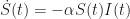
\dot S(t)  =  - \alpha  S(t)  I(t)

where \alpha is a positive constant parameter. Here, we use the dot notation \dot S (t) = dS (t) / dt for the first derivative.

The second equation describes the rate at which infected individuals become resistant. Specifically,

\dot R (t) = \beta I (t)

where \beta > 0 is also a constant parameter. Upon becoming infected, each individual thus remains infected for a mean time period equal to {1 \mathord{\left/ {\vphantom {1 \beta }} \right. \kern-\nulldelimiterspace} \beta } . Given the constraint of a closed population, the corresponding differential equation for the number of infected individuals is therefore

\dot I (t) = \alpha S (t) I (t) - \beta I (t)

We start off our epidemic at time t = 0 assuming everyone is naïve to the infectious agent, that is, R\left( 0 \right) = {R_o} = 0. The epidemic is initially seeded by I\left( 0 \right) = {I_0} > 0  infected individuals imported from outside. The initial number of susceptible individuals is S (t) = {S_o} = 1 - {R_o} -{I_o} = 1 - {I_0}. If the initial number of infected individuals is small, then {S_o} \approx 1.

How Many Are Infected in the Long Run

In the long run, as time t \to \infty , our epidemic will eventually dissipate and there will be no remaining infected individuals, that is, I\left( t \right) \to 0. At that point, some fraction of susceptible individuals will still not have been infected. We write S (t) \to {S_\infty } and R (t) \to {R_\infty } for the limiting numbers of susceptible and resistant individuals, where {S_\infty } + {R_\infty } = 1 and {I_\infty } = 0.

To derive an expression for these limiting quantities, we combine our two differential equations \dot S (t) = - \alpha S (t) I (t) and \dot R (t) = \beta I (t) , to get dS/dR = - \gamma S, where \gamma  = \alpha  /  \beta . The resulting differential equation has the closed-form solution

S (t) = {S_0} \exp (  - \gamma R (t) )

As time t \ge 0 advances, this equation traces out the phase diagram of the epidemic in the \left( {R,S} \right) plane. At time t \to \infty , we get {S_\infty } = {S_0}\exp \left( { - {\gamma }{R_\infty }} \right). Since {S_\infty } + {R_\infty } = 1, we end up with

1 - {R_\infty } = {S_0}\exp ( { - {\gamma }{R_\infty }} )

The root of this equation is thus the limiting quantity {R_\infty }. In what follows, we use the fact that {R_\infty } = 0.7968 when \gamma = 2 and {S_o} \approx 1.

Reproductive Number and Herd Immunity Threshold

Let’s revisit the differential equation governing the growth in the proportion I\left( t \right) of infected individuals, that is, \dot I\left( t \right) = \left( {\alpha S\left( t \right) - \beta } \right)I\left( t \right). We can rewrite this equation as \dot I\left( t \right) = \beta \left( {\gamma S\left( t \right) - 1} \right)I\left( t \right). The expression

\Re \left( t \right) = \gamma S\left( t \right)

 is the reproductive number of the epidemic at time t \ge 0 . At any specific time t \ge 0 during the course of the epidemic \Re \left( t \right) gives the average number of new infections generated by a single infected individual. We let \Re \left(0 \right) = {\Re_0} = \gamma {S_0} denote the basic reproductive number at the start of the epidemic.

When the reproductive number \Re \left( t \right) is exactly equal to 1, we’re at the herd immunity threshold and the growth rate of the infected population is zero, that is, \dot I\left( t \right) = 0. When the reproductive number is less than 1, we’re past the herd immunity threshold and the growth rate of the infected population is negative, that is, \dot I\left( t \right) < 0.

The Epidemic Does Not End at the Herd Immunity Threshold.

At the herd immunity threshold, where the growth rate of infected individuals is zero, there is still a positive number of infected individuals in the population, and they will continue to infect other susceptible persons.

Let’s further characterize the moment t' at which the epidemic reaches the herd immunity threshold. We know that \Re \left( t' \right) = \gamma S\left(t' \right) and \Re \left( t' \right) = 1. We also have {\Re_0} = \gamma {S_0}. So, the proportion of susceptible individuals at the herd immunity threshold equals

S \left( t' \right)= {S_0} / {\Re_0}

According, the combined number of infected and resistant individuals at the herd immunity threshold is I \left( t' \right) + R \left( t' \right)= 1 - {{S_0}\mathord{\left/ {\vphantom {\alpha \beta }} \right. \kern-\nulldelimiterspace} {\Re_0} }.

At the threshold of herd immunity, when \Re \left( {t'} \right) = 1, we have \gamma S\left( {t'} \right) = 1 . We already know that S\left( {t'} \right) = {S_0}\exp \left( { - \gamma R\left( {t'} \right)} \right), so \Re \left( {t'} \right) = \gamma {S_0}\exp \left( { - \gamma R\left( {t'} \right)} \right) = 1. Since \Re \left( 0 \right) = {\Re _0} = \gamma {S_0}, we have {\Re _0}\exp \left( { - \gamma R\left( {t'} \right)} \right) = 1. This gives us the relation between the basic reproductive number {\Re _0} and the number of resistant individuals at herd immunity R\left( {t'} \right) :

R\left( {t'} \right) = {S_0}{{\left( {\log {\Re _0}} \right)} \mathord{\left/{\vphantom {{\left( {\log {\Re _0}} \right)} {{\Re _0}}}} \right. \kern-\nulldelimiterspace} {{\Re _0}}}

Accordingly, for an epidemic with \gamma = 2 and and {S_o} \approx 1, the basic reproductive number is {\Re _0} = 2 and the proportion of resistant individuals at the herd immunity threshold is R\left( {t'} \right) = {{\left( {\log 2} \right)} \mathord{\left/{\vphantom {{\left( {\log 2} \right)} {2}}} \right. \kern-\nulldelimiterspace} {2}} = 0.3466.

Comparing the Herd Immunity Threshold With the Long Run

We have assumed an SIR model where everyone is naive to the infectious agent and where the initial number of infected individuals is small, so that {R_o} = 0 and {S_o} \approx 1. Under these conditions, the basic reproductive number of the epidemic is {\Re _0} = 2. Based upon our calculations above, we can compare the proportions of susceptible, infected and resistant individuals at the herd immunity threshold when t = {t'} and in the long run as t \to \infty .

Proportions of Individuals in the Susceptible (S), Infected (I) and Resistant (R) States at the Herd Immunity Threshold and in the Long Run

t = {t'}t \to \infty
S\left( t \right)0.50000.2032
I\left( t \right)0.1534
R\left( t \right)0.34660.7968

The Earliest Days of the Coronavirus Outbreak in New York City: Part 1

Within less than a week, community-acquired infections were documented in every borough of the city. How did the virus spread so rapidly across Gotham?

The Question

The graphic above shows the counts of the earliest cases of test-confirmed COVID-19 reported by the New York City (NYC) department of health, starting on February 29, 2020. The counts represent individuals initially identified through targeted testing of symptomatic persons in accordance with restricted criteria issued on February 28 by the U.S. Centers for Disease Control (CDC). The horizontal scale indicates the dates that the cases were diagnosed over the ensuing 8 days. The color coding shows the boroughs of residence of the affected individuals: Brooklyn (sky blue), Bronx (light gray), Manhattan (dark gray), Queens (peach), and Staten Island (lilac). These data tell us that by March 4, test-confirmed cases had been identified in every borough except Staten Island, and by March 6, in every borough of the city.

The very same data file from the NYC department of health provides the numbers of individuals ultimately diagnosed with COVID-19 in connection with their inpatient hospitalizations. The counts of these hospitalization are graphed above according to each individual’s date of admission during the same 9-day interval. These data tell us that by March 1, infected individuals from every borough had already sought care at the city’s hospitals.

Let’s think backwards in time. The incubation period between infection and first symptoms of COVID-19 – such as fever and body aches – is on average 5 days, with a range of up to 2 weeks. Since it usually takes a few days before a symptomatic person also develops severe shortness of breath, the elapsed time from initial infection until he is sick enough to be hospitalized would be even longer. Accordingly, in all likelihood, SARS-CoV-2 infections were already occurring by mid- to late-February in every one of the five boroughs of this city of over 8 million.

Our task here is to inquire: Why didn’t we instead observe a distinct outbreak in one borough – say, Brooklyn – followed by another distinct cluster of cases in another borough – say, Queens – followed by yet another cluster in another borough? How could this early, rapid and widespread geographic dispersion possibly have taken place?

Why This Is So Important

With COVID-19 cases now reported in 3,112 out of the 3,143 counties in the fifty United States and the District of Columbia, with this country having already lived through an initial flattening of the epidemic curve, followed by a generally abortive reopening, and now enduring a masked-man retrenchment, it’s difficult to maintain perspective on the early events of February, March and April 2020.

Yet back at the beginning, the epidemic in New York City was a singular event. Even by the third week in April, reported COVID-19 cases in the city had topped 145 thousand, or about one-sixth of all reported cases in the United States. This cumulative total was considerably greater than the combined number of reported cases in the counties comprising Chicago, Detroit, Los Angeles, Miami, Boston, Philadelphia, New Orleans, Seattle and Houston. The New York City tally, in fact, exceeded total cases in the Lombardy region of Italy, the Community of Madrid and the Province of Tehran combined.

We take the liberty here of awkwardly mixing metaphors. Astronomers have learned that they cannot fathom the structure of the universe unless they understand the Big Bang. And we, as epidemiologists, virologists, immunologists, healthcare providers, social scientists, lawyers, and policy makers, cannot fathom how our country got into this mess unless we look back to the very core of the epidemic in the Big Apple.

Two Principal Explanations

As we’ve already hinted, there are two principal – though not mutually exclusive – explanations for the early, wide geographic dispersion of COVID-19 cases seen in the two graphics above. The first is that each borough had its own distinct viral signature (or clade, in virologists’ terminology), and each clade was imported from a different foreign source. Under this explanation, what looks like rapid geographic dispersion was just the parallel, contemporaneous seeding by different clades. The second is that community spread was responsible for the rapid mixing of the same clade (or clades) of the virus throughout the five boroughs. It’s the latter explanation that would compel us to inquire: How did the virus propagate so fast – faster than a speeding bullet – across Gotham?

Macro versus Micro

Our two New York City-based graphics omit one additional case diagnosed on March 3 in a resident of New Rochelle in nearby Westchester County, to the north of the city. The individual in question apparently worked in the borough of Manhattan. We might inquire how old he or she was, or what was his or her line of work, or whether he or she recovered. But those micro details are subsumed by a more important question: How did he or she get between home and work.?

When we ask how the virus spread so fast across the city, we’re not really focusing on the characteristics of the individuals who came down with SARS-CoV-2 infections. They could have originated in Harlem or Italy or Kuwait, worked in security or housekeeping, or shared a bedroom with two others or no one. Instead, we’re asking questions instead about the system of moving people – and thus viruses – around a vast city.

If we didn’t ask these macro questions about the system as a whole, we wouldn’t have a discipline of public health. We’d still be wondering about the lead paint in the woodwork of each individual child’s house in Flint, Michigan, having never thought of the water source feeding the entire city. If we hadn’t asked big-picture questions, we wouldn’t have the discipline of macroeconomics either.

If we focus myopically on micro questions, we’ll never figure out what happened in Gotham.

Virologists Have the Answer.

We review here the genetic profiles of virus samples drawn from COVID-19 patients seeking care within the Mount Sinai Health System (MSHS) in New York City. Based upon their genetic sequences, MSHS virologists classified each individual sample as belonging to a particular clade. They could then ascertain whether each borough had its own characteristic clade (or clades), or whether samples within the same clade were contemporaneously seen throughout multiple boroughs.

MSHS virologists began collecting coronavirus samples soon after the CDC liberalized its testing criteria on March 8. From that date onward, the researchers identified the signature mutations that placed each of 84 patient samples on its appropriate branch of the SARS-Cov-2 family tree (or phylogenetic tree, in virologist’s terminology). They located virus samples on various branches of the tree, a finding consistent with independent introductions of distinct clades from multiple origins throughout the world. The vast majority of the isolates, however, clustered within clade A2a. The viruses in the A2a clade had been previously found in isolates from Italy, Finland, Spain, France, the United Kingdom, and other European countries – and, to a limited extent in North America. The virologists dated their introduction into the New York City area to early to mid-February.

The original article on the MSHS sample did not provide the dates when the individual virus samples were drawn. However, we were able to reconstruct those dates for 78 MSHS patients in the A2a clade by merging one of the virologists’ supplemental data files with a subsequent compilation, as described in the Technical Notes below. The distribution of these patients, according to date of virus sampling and borough of residence, is shown above. In addition to four of the New York City boroughs (Brooklyn, Bronx, Manhattan, and Queens), two of the MSHS A2a patients were from Westchester County (colored cyan) and five patients had unknown residence (colored white).

The MSHS virologists were further able to isolate two genetically homogeneous local transmission clusters within the A2a clade. The larger cluster of these two local transmission clusters consisted of 17 samples sharing a common mutation designated ORF1b: A1844V, as further described in the Technical Notes. These 17 samples are identified in the above graphic as pink bubbles. The earliest sample in this local transmission cluster was drawn from a Manhattan patient on March 14. Another was drawn from a Westchester patient on March 15, and two more from two separate Brooklyn patients on March 16. Within the narrow space of five days, from March 14–18, virus samples with the same signature mutation were found in residents from Brooklyn, Manhattan, Queens, and Westchester County.

The serial interval between the time the infector has COVID-19 symptoms and the time the infectee has symptoms is an estimated 5–6 days. That means the infector (or infectors) of the individuals in the MSHS local transmission cluster were shedding the virus at least during the interval from March 8–13. Given the broad range of the incubation period from infection to symptoms, the infector (or infectors) were in turn infected during the first week in March. That’s when the virus was being propagated throughout the city.

Our analysis should not be construed as implying that just 17 people constituted the nucleus of the New York City pandemic. To the contrary, this sample of individuals provides a window into a large-scale phenomenon that was rapidly occurring throughout the city.

Nor should we attach any biological significance to the particular mutation shared by the 17 individuals in the MSHS local transmission cluster. Just think of the code “ORF1b: A1844V” as nothing more than a shared serial number.

Lest one get the impression that we’ve stretched the data beyond its reasonable limits, we refer to the conclusions of the virologists conducting the MSHS study: “Morever, we found evidence for community transmission of SARS-CoV-2 as suggested by clusters of related viruses found in patients living in different neighborhoods of the city.”

Hypotheses to Knock Down

While there were multiple introductions of SARS-CoV-2 into the city during February and early March, the evidence supports rapid community spread throughout the city during the first week of March. We return to the big-picture question: How did the virus spread so far so fast?

Let’s start with a straw-man: the virus spread through the city’s water supply. After all, that was the big-picture hypothesis that got the Flint, Michigan investigators on the right track. We know that this hypothesis is wrong right off the bat because it is biologically implausible. We know that the virus is air-borne, not water-borne. We know that the virus enters the human respiratory system through the nose and mouth. We don’t get sick drinking the virus.

Here’s another hypothesis to knock down: there was a huge super-spreader sports or entertainment event in late February or early March that fans from all over the city attended. To be sure, March Madness Basketball didn’t start until March 15. But how about the Celine Dion concerts at the Barclays Center on February 28-29 and March 5?

The difficulty with this hypothesis is that there are no reliable, concrete data to support it. Qualified investigators identified super-spreader events arising from a March 10 choir practice in Skagit County, Washington and church attendance during March 6–11 in rural Georgia. A scientific meeting in Massachusetts in late February has likewise been characterized as a super-spreader event. A party in Westport, Connecticut – snarkily dubbed Party Zero – was alleged to be a super-spreader, but formal, reproducible evidence of contagion to New York City has not been forthcoming. In short, no qualified epidemiological investigation has identified a super-spreader event that could have propagated the virus throughout the city in late February or early March.

Transport

Let’s move on to the New City transportation system. We have private transportation, including cars, trucks, private buses, taxis, scooters, motorcycles, app rides, vans, and limousines. And we have public transportation, including buses and subways. Why couldn’t private transportation have served as the super-spreader? Why couldn’t one of the six Brooklyn residents in the MSHS local transmission cluster have commuted by car to his work in Manhattan? Of course, that’s possible. But there’s a problem. The math doesn’t add up.

One of the distinguishing features of New York City, as the Metropolitan Transit Authority (MTA) has noted, is its massive public transportation system.

The MTA network comprises the nation’s largest bus fleet and more subway and commuter rail cars than all other U.S. transit systems combined. It provides over 2.6 billion trips each year, accounting for about one-third of the nation’s mass transit users and two-thirds its commuter rail passengers. … While nearly 85 percent of the nation’s workers drive to their jobs, four-fifths of all rush-hour commuters to New York City’s central business districts use transit, most operated by the MTA, thus reducing automobile congestion and its associated problems.

The MTA Network: Public Transportation for the New York Region

If private cars, vans and trucks were the critical mechanism underlying the rapid geographic dispersion of SARS-CoV-2 in densely populated urban areas, one wonders how New York City alone could have become the singular epicenter of the COVID-19 pandemic in the United States.

That leaves us with the public transportation system, particularly New York City’s public subway system. We continue to stress the word system, because we should think of the subways not as a loose aggregate of individual stations docked in individual neighborhoods, but as a whole, as a mechanism for efficiently pooling millions of individuals into one large mixing basin.

New York City’s unique subway system had the capability in late February and early March to rapidly disperse SARS-CoV-2 throughout the city’s boroughs – faster than a speeding bullet, able to leap under tall buildings in a single bound.

This is the first article in a series about the earliest days of the coronavirus epidemic in New York City.

Technical Notes

To identify the dates of sampling and boroughs of residence of viral samples from the A2a clade in the MSHS study, we merged two databases:

We merged the two files on the unique common identifier variable gisaid_epi_isi. (GISAID stands for Global Initiative on Sharing All Influenza Data.) This gave a total of 78 MSHS viral samples within the A2a clade.

Next, we used the variable strain in the merged file to identify the 17 virus samples specifically highlighted as sharing the ORF1b:A1844V mutation in the New York Cluster 1 in Figure 2C of the main MSHS article. These 17 samples are indicated as the pink bubbles in our figure above.

We reproduce the two MSHS New York clusters from the original Figure 2C here, changing only the color coding to match our own scheme above, and dropping the bootstrap support values indicated in the original figure. The strain descriptors are shown next to each sample. For example, the strain at the very top of the figure (NY-PV08127/2020) was derived from a viral sample drawn on 3/14/2020 from a Manhattan resident. The red lines show the branches of the phylogenetic tree corresponding to the two NY clusters. The lilac lines refer to background branches from a larger worldwide database of samples. The entire tree is part of a larger branch containing the A2a clade.

The ORF1b: A1844V mutation shown at the origin of NY Cluster 1 branch refers to a specific base substitution in the stretch of the virus’ RNA that codes for its ORF1b protein, which is one of the two replicase proteins common to SARS coronaviruses. At amino acid position #1844 in this protein, the mutation specific to the MSHS NY Cluster 1 resulted in a change in the resulting amino acid from alanine (A) to valine (V). In terms of the virus’ underlying genetic code, the mutation corresponded to a single base substitution in the virus’ positive-sense mRNA codon from GUX to GCX, where G = guanine, U = uracil, C = cytosine, A = adenine, and X = any of these four bases. This single RNA base substitution (or missense mutation) was shared by samples of infected persons residing in Manhattan, Queens, Brooklyn and Westchester County.

Declining COVID-19 Case Mortality: Learning by Doing

Death rates have fallen in Florida in all age groups over 50 years old. Is it because we’ve developed new treatments, or because we’ve learned what not to do?

The graphic above shows the case mortality rate among persons diagnosed with COVID-19 in Florida during four successive time periods, as indicated along the horizontal axis. During each time period, individuals were followed for at least 28 days after their initial diagnosis in order to ascertain their vital status. The individuals are grouped above by age: those 50-59 years old denoted by lime-colored points; those 60–69 by pink points; those 70–79 by mango points; and those 80 years or more by cyan points. We calculated the case mortality rates from data released by the Florida Department of Public Health, as described in this technical report. We previously used the same data source to study the propagation of the disease from younger to older persons after the reopening of the state in mid-May.

The graphic shows significant declines in case mortality in all four age groups. With the exception of the transition from the first diagnostic interval to second in the case of 50- to 59-year-olds, the changes have been continuous from one interval to the next.

Not Entirely a Novel Observation

The observation that case mortality rates have been headed downward is not entirely novel. Declining in-hospital mortality from COVID-19 pneumonia was reported in San Raffaele Hospital in Milan, Italy during February 25 – May 20. Similarly declining in-hospital mortality was reported in Colorado hospitals during March 1 – May 31, and in United Kingdom hospitals during March 24 – June 14 and critical care units during March 1 – May 30. Declining case mortality has also been mentioned in the local press in Hawaii, Louisiana, and Illinois.

So what, if anything, makes the current study distinctive? For one thing, it kept track of hospitalized COVID-19 patients even after they’ve left the hospital. It also kept track of COVID-19 victims who were never hospitalized to begin with. What’s more, it kept track of everyone for a specified follow-up interval of at least 28 days – long enough to find out if the patient died.

Is the Drop in Mortality No More Than an Illusion?

While the current study may have made some methodological advances, that’s not the main question here. Declining case mortality has now been reported with sufficient regularity to pose a more difficult question: Is the observed drop in mortality real?

Let’s dispose of the first possibility – namely, that the apparent mortality decline is a statistical illusion resulting from inadequate tracking of COVID-19 fatalities. Prior studies of in-hospital mortality, one might contend, have been missing deaths that occurred after hospital discharge. Grandpa was sent home at the end of week 2 when his blood oxygen saturation came back up, and then he died suddenly at home during week 3 of a massive blot clot in his lung. The current study obviates this potential bias by tracking patients in and out of the hospital and for long enough to capture the life-threatening blot clots that have been observed later in the course of the acute illness. One might contend instead that Florida has been losing track of nonresidents whose death certificates went to vital records departments in other states, but there just aren’t enough of these out-of-state patients to bias the mortality rates significantly.

The second argument that the apparent mortality drop is illusory is far more slippery and imprecisely framed. Increasingly mild cases of SARS-CoV-2 infection, so the argument goes, have been picked up as a result of expanded testing. These additional milder infections have diluted the overall pool of COVID-19 cases and thus artificially lowered the death rate. In view of the observed declines in mortality seen above in every age group over 50 years, this alternative explanation would require us to posit that the expanded testing has identified ever milder cases among 80-year-olds. In view of the multiple studies documenting declines in mortality among hospitalized patients, we would be further required to posit that doctors have been admitting ever milder cases to the hospital. As we’ll see below, there is evidence that just the opposite trend has been occurring.

What’s more, the available evidence strongly contradicts the hypothesis that expanded testing has been pulling less severe cases into the state’s COVID-19 registry. To the contrary, increased disease incidence has been pushing up the demand for testing. (See Florida: Coronavirus Infections Push Tests, Testing Does Not Pull Infections.)

Finally, one needs to inquire whether there is really any concrete evidence in favor of the dilution hypothesis. The standard PCR test to determine whether a nasal or throat swab has coronavirus RNA actually reports a numerical index called the cycle threshold or CT. The lower the CT, the more virus the patient harbors. We haven’t seen any reports that the average CT value of the typical coronavirus-positive sample has been creeping up. Or that fewer infected patients have a blood oxygen saturation below 95 percent. The best we can do is speculate that there may be persons out there with sufficient cross-immunity from other coronaviruses to attenuate a SARS-CoV-2 infection without blocking the infection altogether, and that these individuals are now getting detected in substantial numbers.

Learning by Doing

We’re left with the conclusion that the decline in case mortality is, in all likelihood, real. And that leads us to an even more difficult question: How did it happen?

Our contention here is that the observed improvement is COVID-19 case survival is the result of the accumulation of a significant number of incremental improvements in patient care learned on the job – what economists have long called learning by doing.

At the risk of over-explaining the basic point, we’ll head to the kitchen. Let’s say you’re trying make clafoutis, a French dessert with fruit and a custard-like creamy filling. If you bake it too little, the dessert is runny and tastes like eggs. If you bake it too much, your guests won’t appreciate the chalky custard. You’ve got to make clafoutis several times to really get the hang of it. To take a more complex example, once an organ transplant team has worked together on hundreds of cases, the transplant surgery goes faster, there are fewer complications, and the organ recipient’s long-term survival is improved.

A natural response to the learning-by-doing hypothesis is that it’s no big deal or, even more stinging, it’s completely obvious. After all, the press has been reporting for months that doctors have found alternatives to ventilators for serious ill patients, have discovered how positioning patients in the prone position improves breathing, and have learned that blood thinners can stave off a fatal stroke or a massive blood clot in the lung.

But there’s more going on here. Informal advances in the clinical care of COVID-19 patients, very often encountered through trial and error, motivated the randomized controlled trials that ultimately established new standards of treatment. Not the other way around. The idea that the common steroid dexamethasone could check disastrous inflammation was in the air well before a formal study demonstrated its life-saving benefits. Doctors were battling to get the antiviral drug remdesevir well before federal regulators gave the green light to its widespread use.

Enhanced Productivity

When we talk about learning by doing, we’re not necessarily referring to advances embodied in a particular clinical technique or therapeutic intervention. Sometimes, workers simply get better at their jobs without adopting any new, distinct technology. The press is filled with vignettes about how these doctors have learned to do this and those doctors have learned to do that. In fact, it is the entire healthcare team that has learned how to work better.

In the case of improvements in COVID-19 care in seriously ill patients, we’ll venture an educated guess that the most increasingly productive members of the healthcare team have been the intensive care unit nurses. It was the ICU nurses, we contend, who made the extraordinary discovery that the oxygen level of a COVID-19 patient can rapidly deteriorate without the patient looking short of breath. That’s because the lungs somehow maintain the natural compliance that lets the chest move up and down with each breath, even while the tiny air sacs responsible for exchanging oxygen are flooded with inflammatory liquid.

Learning What Not To Do

One of the most critical ways that learning by doing can advance clinical care is by figuring out what doesn’t work. This is not the place – Or is it? – to enumerate all the blind alleys we’ve had to pull back from. We hope that outpatient providers have stopped administering nebulizer treatments that spread coronavirus-laden aerosol into the lungs of other as-yet uninfected patients. We hope that ICUs have opted for non-invasive ventilation when trained respiratory technicians were unavailable to properly operate ventilators.

We know that hydroxychloroquine prescriptions in U.S. pharmacies surged through March 2020. But we have not seen data on the medication’s subsequent use once specialty societies began to caution that its attendant risk of cardiac complications was substantially enhanced in COVID-19 patients, if only because the virus appeared to attack the heart directly. We wonder, with good reason, whether the observed improvement in case mortality was attributable in part to widespread learning that hydroxychloroquine was not the drug to prescribe.

Not Just in the ICU

Lest any reader assume that the improvements in care were exclusively an accomplishment of the hospital team, we point to the growing volume of patients who are discharged to home on portable oxygen tanks, many of whom learned to give themselves subcutaneous injections with blood thinners. Those nurses who taught those patients how to inject themselves – and the interpreters who translated their instructions into fourth-grade vocabulary in the patient’s native language – saved their lives. The technicians who transported and set up the oxygen tanks in their bedrooms saved their lives. The primary care physicians, nurse practitioners and physicians assistants who on the front line identified the sickest patients and got them to the hospital just in time saved their lives. Without the blare of trumpets or the roll of drums.

When Not to Go to the Hospital

The Florida Department of Public Health also collected information on the hospitalization status of every person diagnosed with COVID-19. Unfortunately, delays in ascertaining whether someone was hospitalized limit the reliability of this source of information. Still, we can learn something from the results for persons aged 60–69 years old, as indicated in the graphic above.

For each of the four diagnostic intervals, the graphic shows the case mortality rate for 60- to 69-year-olds known to have been hospitalized (lilac points), those known not to have been hospitalized (peach points) and those with unknown hospitalization status (sky-blue points). Among those who were hospitalized, the mortality rate progressively declined during the first three intervals, but then increased in the fourth interval (6/14 – 7/4/20). Among the two other groups, the case mortality rate did not show a clear pattern during the first three intervals. During the fourth interval, the case mortality declined.

Among the 60- to 69-year-olds in the hospitalized group, the increase in case mortality raises the possibility of congestion effects. These adverse effects on the quality of care arise as a hospital nears capacity. As we wrote long ago, “There are queues in front of radiology. The supply of a certain type of blood is exhausted. The floor stock of chest tubes is out just as Dr. A declares Mr. X’s life-saving need for one. … As the degree of capacity utilization increases, previously stable risk-sharing arrangements break down. Doctors, fearing that they will not have access to the necessary inputs, grab up their own exclusive shares to keep themselves protected.”

There is, however, an alternative explanation for the data in the graphic. The marked decline in the case mortality during the fourth interval among those not hospitalized strongly suggests that many low-risk patients were no longer being hospitalized. Learning by doing, healthcare providers have come to understand more clearly who can be treated adequately outside the hospital.

This is not simply a passive transfer of cases from one data bucket to another. Under a wide range of circumstances, staying out of the hospital is good for your health. You’re less at risk for nosocomial infections. You remain more active at home, and thus can retain more muscle mass. You can eat home-cooked meals. You’re less depressed, less likely to end up sun-downing. And if your family can transfer you to a wheelchair, you can go out on the patio and see the clear night sky.

Commentary (Profa. Dra. Izabela Sobiech Pellegrini):

Prof. Pellegrini (Escola de Artes, Ciências e Humanidades – EACH|USP, University of Sao Paulo) reports comparable observations on declining case mortality among persons aged 50 years or more in the state of Sao Paolo, Brazil.

Commentary (Prof. Riccardo Puglisi):

COVID-19 Reporting Delays: Whither New York City?

We correct for case reporting delays using a statistical method first applied to the AIDS epidemic in the 1980s.

Under our current system of voluntary testing in the United States, it takes time before the results of a COVID-19 test are communicated to the patient and reported by the public health authority. Shown above is our reconstruction of the distribution of reporting delays in New York City, computed from successive database updates issued by the health department. To that end, we used a statistical method first applied to reporting delays of AIDS cases in the 1990s. The graphic above is an update of a recently issued technical report, and incorporates the latest data through August 15, 2020. The mean delay in reporting is now 5.43 days.

The second graphic above shows the cumulative distribution of reporting delays, derived directly from the first graph. Reading off the dashed green lines, we see that 81.3 percent of all positive COVID-19 tests are reported within 10 days of the date the test was performed. That means 18.7 percent (almost one in five) take longer than 10 days from testing to reporting. These two updated graphs show some further slowing in reporting times compared to our technical report, based on data from June 21 through only August 1, 2020, which gave a mean delay of 4.95 days and 85.2 percent reported by 10 days. A critical difference is the emergence of a second mode in the distribution, shown in the first graph at 12–13 days. It’s telling us that there is a second, distinct population of tests that take a lot longer to be reported.

Recent Incidence of New COVID-19 Cases, Corrected for Reporting Delays

As the New York City department of health acknowledges on its COVID-19 data dashboard, “Due to delays in reporting, recent data are incomplete.” But we can use the above estimate of the distribution of reporting delays to fill in the missing data. While we cannot predict any single individual’s pending test result, we can still get a reasonably accurate estimate of recent, new COVID-19 cases at the population level.

The graphic above shows the number of new, daily COVID-19 cases in New York City from June 21 through our cutoff date August 15. (As above, this graphic is updated from the corresponding figure in our technical report.) The gray data points show the numbers of cases so far reported as diagnosed on each day. As a result of reporting delays, the most recent gray data points give the false impression that the epidemic has petered out. The pink data points show that, once all the case reports come in, the counts of new daily cases are expected to continue to run in the range of 100 – 500 per day, with dips during the weekends.

The additional graphic above offers a longer-term perspective on our projections of new COVID-19 diagnoses. We have converted the numbers of daily diagnoses into incidence rates per 100,000 population and then graphed the overall trend from April 19 onward. The incidence rates are plotted on a logarithmic scale, gauged by the left-hand axis. As above, the gray-shaded points correspond to the reported cases to date, while the pink-shaded points represent the projected cases projected from the distribution of reporting delays. In addition, the larger connected points represent the weekly averages, computed as the geometric means.

While the average weekly incidence since the week of June 7 remains in the range of 2.95 – 4.21 cases per 100,000 population per day, there is a suggestion of a recent renewed increase in incidence. Continued monitoring will reveal whether this more recent trend is fleeting or permanent.

How Long Is Too Long to Wait?

This question admits two answers – one from the individual decision-making perspective, and the other from the public health perspective. In both cases, however, the answer is that even two days is too long to wait.

Here’s a story typical of those we routinely encounter in our clinical work. Your patient, a single mother of an 11-year-old and a 13-year-old, took her two children to her sister’s place for dinner last Friday. On Sunday, the sister calls to say that she has fever, body aches, and a stuffed nose. She’s going to get tested. Your patient also lives with her two parents, who are in their mid 60’s but fortunately could not make it to last Friday’s dinner. Your patient calls you, her primary healthcare provider, inquiring whether she should get tested.

Unless you can obtain a reliable, rapid test for your patient and her two children that same day – and, if it’s negative, the following 2, 3, 4 or even 5 days – you have no choice but to advise your patient to immediately isolate herself from her parents. Your might also advise the patient and her two children to get tested on Sunday or Monday, but they would still have to remain isolated at least until their COVID-19 tests came back. And even then, you’d be concerned that the tests would have be repeated, as it could take a couple of days before your patient and her children shed enough virus to convert to positive.

When it comes to your immediate clinical decision, even a two-day delay makes testing irrelevant.

By Monday, as it turns out, your patient felt really tired and noticed that food tasted like cardboard. The 13-year-old had a fever. Her two elderly parents, holed up in their bedroom for the next two weeks, never got sick. Like so many other things in primary care, you may – without fanfare – have saved their lives.

From the public health standpoint, even a two-day delay could be quite costly. As an official closely monitoring the course of the epidemic, you might be missing an incipient outbreak. Just look at the above graph of daily incidence. Relying on the pink data points to estimate of recent incidence corrected for reporting delays, you might have a chance of detecting the outbreak. But without an estimate of case incidence corrected for reporting delays, how easy would it be to miss an abrupt jump over to 600 cases per day, or more?

Whither New York City?

Let’s put aside the early detection of an outbreak and ask: How stable is the city’s current incidence of 3 – 4 cases per 100,000 population per day? If the current incidence in fact represents an unstable balancing between opposing trends, what are the underlying trends?

Our final graphic gives us a clue. Shown is the daily incidence of new COVID-19 cases per 100,000 population in New York City among two broad age groups: persons aged 18–44 years; and those aged 45 or more years. The calculated incidence rates in this graph are based upon the dates each case was reported, and not the dates of diagnosis. Hence, there is already a two-to-three week lag built into the graph.

Even with the delay, we can see that the incidence in the younger adult group, ages 18–44, is beginning to overtake the incidence in the older group. In the period through June 20, the younger adults had an incidence that was on average 40 percent lower than that of their older counterparts. After June 20, COVID-19 incidence among younger New Yorkers was about 20 percent greater.

As public health analysts, we will be watching the numbers closely in New York City during the days to come. As clinicians, we will be waiting impatiently for the rapid turnaround tests we desperately need.

Commentary (Prof. Lawrence Gostin):

COVID-19, Bar Crowding, and the Wisconsin Supreme Court

A Non-Linear Tale of Two Counties

Daily Incidence of Confirmed COVID-19 Cases per 100,000 Population in Milwaukee and Dane Counties, Wisconsin, March 15 – July 24, 2020

We begin with a comparison of the incidence of confirmed daily COVID-19 cases in Wisconsin’s two most populous counties: Milwaukee County, which includes the City of Milwaukee; and Dane County, which includes the City of Madison. Raw counts of positive COVID-19 cases in these two counties are regularly reported by the Wisconsin Department of Health Services. We rely here on the data posted on July 23, 2020. In the graphic above, we have converted the raw case counts into daily incidence rates per 100,000 population, based on 2019 populations of 945,726 for Milwaukee County and 546,695 for Dane County. The orange-colored points are the Milwaukee County data, while the purple-colored points are the Dane County data. As in earlier articles, we have plotted the incidence rates on a logarithmic scale, shown at the left. That way, a straight line in the graph corresponds to exponential epidemic growth.

The two counties are situated in the same state. They share the same governor, the same state legislature, the same state supreme court, and the same state department of health. They have been subject to the same statewide policies. Yet they show distinct patterns of evolution of COVID-19 cases during nearly five months that the United States has endured the pandemic. Our task here is to inquire why.

No Excuses

What is so striking about the above graphic is the strange interlude between the end of March and the end of June when the Dane County data points drop an order of magnitude below the Milwaukee County data points – almost as if a purple cable had come loose from its orange trestle. One could argue that these divergent trends are simply meaningless noise, inasmuch as counts of confirmed COVID-19 cases are thought to vastly understate the actual number of infections. But there’s a limit to how much one can rely on this pat excuse for dodging what appears to be genuine evidence.

The March 24 Safer at Home Order

Like many populous areas in the United States, coronavirus infections in Milwaukee and Dane Counties were surging in early March 2020. The two counties’ incidence curves began to flatten only after Secretary-Designee of Health Services Andrea Palm issued her Safer At Home Order on March 24, which kept non-essential businesses closed throughout the state for an entire month. For some reason, however, the statewide wide order had a much more pronounced effect in Dane County, bending the epidemic curve downward, while in Milwaukee County, there was at best a flattening of the curve.

Statewide “Safer At Home” Order Entered Into Effect on March 24, 2020.

The April 7 Primary Elections

One possible explanation for the initial divergence of the two epidemic curves is the differential response of the two counties to the statewide primary elections. In an attempt to minimize in-person turnout at the polls, Gov. Tony Evers on March 27 called on the legislature to send an absentee ballot to every voter in Wisconsin. When the legislature rejected the proposal, the governor issued an executive order postponing in-person voting in the election for two months. That order, however,was blocked by the Wisconsin Supreme Court, and the spring primary elections went forward on April 7, as marked in the graphic below.

In-Person Voting for the Statewide Spring Primary Elections Took Place on April 7.

The severe shortage of poll workers on primary election day had a much greater impact on the density of voting in Milwaukee County than in Dane County. To accommodate the shortage, only 22 percent of Milwaukee County voting locations were allowed to open, compared to 78 percent of Dane County locations. The consolidation was even more severe within the city of Milwaukee, where 325 polling sites were collapsed into just five. According to one press report, voters in some Milwaukee precincts had to wait in line up to 2 1/2 hours to cast their ballots. “Now, over two weeks later,” wrote the newly elected justice to the Wisconsin Supreme Court in a follow-up opinion piece, “we have an uptick in Covid-19 cases, especially in dense urban centers like Milwaukee and Waukesha, where few polling places were open and citizens were forced to stand in long lines to cast a ballot.”

The hypothesis that the long lines at Milwaukee’s primary polling places served as a seed for an upswing in COVID-19 cases has been subject to more than passing investigation. In a case tracking study, the Milwaukee County COVID-19 Epidemiology Intel Team identified numerous individuals who were diagnosed as COVID-19 positive during the three weeks after the primary election, but the team could not reach any definitive conclusions from the interview evidence alone. An econometric study of Wisconsin counties found that the proportion of cases testing positive in the three weeks after the primary was directly related to the number of in-person voters and inversely related to the number of absentee voters.

We’re left with the disturbing fact that Dane County, which felt little impact from the consolidation of polling places, continued to flatten its epidemic curve during the three weeks after the primary. Meanwhile, Milwaukee County’s epidemic curve began to reverse itself one week after the election. As we noted in San Antonio Conundrum, the timing fits with the evidence on the 5-day incubation of the disease. What’s more, the serial interval between the time the infector gets sick and the time the infectee gets sick is only about 5 or 6 days. That would give enough time for people infected at the primary to transmit the virus to others.

The Wisconsin Supreme Court Intervenes Again

On April 20, Gov. Evers announced his Badger Bounce Back plan to gradually reopen the Wisconsin economy. Adhering to the recent White House guidelines for Opening Up America Again, Evers’ plan continued the state’s Safer At Home restrictions, requiring that non-essential businesses remain closed until there was a sustained 14-day decline in COVID-19 cases. Golf courses, however, were allowed open, and exterior lawn care was permitted. A week later, Secretary-Designee Palm announced an Interim Order to Turn the Dial, allowing non-essential businesses to make curbside drop-offs and opening up outdoor recreational rentals and self-service car washes, so long as social distancing measures remained in place.

The governor’s carefully crafted regulatory scheme, however, would not stay in place for long. On May 13, upon petition of the legislature, the Wisconsin Supreme Court ruled that Palm’s Safer at Home order did not adhere to established rule-making procedures and was therefore unenforceable. While Palm indeed had some power to act in the face of the pandemic, her order to confine people to their homes and close non-essential businesses exceeded her authority.

Wisconsin Supreme Court Nullifies Statewide Stay At Home Order on May 13.

Madison & Dane County Respond

With the court’s nullification of the statewide Safer at Home order, Wisconsin’s public health policy toward the COVID-19 epidemic devolved into a collection of variegated, asynchronous, substitute measures taken at the county and municipal level.

On the same day as the Supreme Court order, Janel Heinrich, Public Health Officer for Madison and Dane County, issued her own order adopting essentially all of the governor’s regulatory scheme – Safer at Home, Badger Bounces Back, and the Interim Order to Turn the Dial – but with reduced restrictions on religious entities. “Data and science will guide our decision making,” announced Madison Mayor Satya Rhodes-Conway. Five days later, the county set in motion its own Forward Dane Plan, which implemented a cascade of emergency orders – on May 18, May 22, June 5, June 12, and June 25, gradually loosening restrictions on social distancing. The May 22 order, in particular, allowed the opening of businesses, including salons, indoor restaurant and bar operations, to 25 percent capacity. The June 12 order increased the allowable threshold to 50 percent capacity.

The July 1 order, however, took a very different position. COVID-19 incidence had been rising in Dane County since the week after the Wisconsin Supreme Court nullified the statewide plan. “An emerging pattern in Dane County confirms that bars and mass gatherings create particularly challenging environments for the COVID-19 pandemic,” the order’s preamble noted. With the new order, indoor seating in restaurants was cut back to 25 percent of capacity. Bars – which technically entailed any business earning more than half of its revenues from alcoholic beverages – were again restricted to pickup and takeout. The most recent July 7 order required the wearing of a face covering while taking public transportation, waiting in line, and remaining indoors with non-family members.

City of Milwaukee & Milwaukee County Suburbs Respond

When it came to public health, the City of Madison and Dane County operated essentially as a unified entity. But that was hardly the case in Milwaukee County.

Back on March 25, City of Milwaukee Commissioner of Health Jean Kowalik had already issued her own stay-at-home order that pretty much paralleled Safer At Home. So, when the Wisconsin Supreme Court decision came down on May 13, Commissioner Kowalik initially elected to keep the existing local order in place. That apparently did not sit well with the 18 suburban communities constituting the rest of Milwaukee County, who issued their own new order. Starting May 22, according to their new Phase A/B/C/D plan, restaurants and bars could reopen with a recommended capacity of 50 percent, while salons and gyms could open up with a recommended 25 percent capacity. The very next day, the city’s Mayor Tom Barrett, aligning himself more closely with the suburban Milwaukee communities, decided to issue his own Moving Milwaukee Forward order allowing salons and playgrounds to reopen.

From that point onward, the City of Milwaukee adhered to its own phase 1/2/3 plan, while the suburban Milwaukee communities continued to follow their phase A/B/C/D plan. On June 12, the communities entered into Phase C, allowing mass gatherings of up to 50 persons and relaxing capacity constraints for restaurants and bars to 75 percent and gyms to 50 percent. But with COVID-19 case counts on the rise in early July, the communities held back on scheduled Phase D, which would have reopened restaurants, bars, salons and gyms to full capacity. Meanwhile, the City of Milwaukee moved forward with its Phase 4, allowing retail stores, restaurants and bars to open at 50 percent. Salons were to be held to a capacity of one customer per stylist, while faith-based gatherings and gyms were restricted to the lesser of 50 percent capacity or one person every 30 square feet.

By July 13, with COVID-19 counts continuing to rise both in the city and suburbs, the Milwaukee Common Council adopted the Milwaukee Cares Mask Ordinance.

The Bars

There is simply no way we can assign each blip and dip of the COVID-19 incidence curve to a particular event along the timeline of successive regulatory actions taken by the two counties. We need an overarching theme – a common underlying mechanism – to bring all the facts together. To that goal we now turn.

Daily Indices of Entry Into Bars in Milwaukee and Dane Counties, March 1 – June 30, 2020, Based Upon SafeGraph Patterns Data.

The graphic above displays the daily indices of visits to bars located in Milwaukee and Dane Counties during March 1 – June 30, 2020. The graphic is derived from the Patterns database maintained by SafeGraph, which we have already used in San Antonio Conundrum and TETRIS for Tulsa. The database follows the movements of a cohort of smart phone users who have consented to leave their location trackers activated. For every day from February 17 through June 30, we computed the number of entries into each of 240 Milwaukee County bars and 230 Dane County bars. We selected bars first on the basis of the business name, including Bar, Tap, Tavern, Pub, Lounge, Speakeasy, Cocktail, Ale, Saloon, and Brew. We then added specific businesses in each county based on lists of bars maintained by Yelp. To make the two series compatible, we normalized the numbers of entries so that the mean for the period February 17 – March 13 was equal to 100.

After entries into bars plummeted in March, there was a persistent difference in the volume of visits between Milwaukee and Dane counties. For example, during the week starting Monday, April 6, the geometric mean values for the two indices were 27 for Milwaukee County and 17 for Dane County. By mid May, the indices had begun to rise for both counties, but more rapidly for Dane County. By the week starting Monday, June 8, the indices were 53 for Milwaukee and 52 for Dane, respectively – in other words, about half of pre-epidemic activity levels.

While it is difficult to line up the dates precisely, the gap between the two counties in the index of visits to bars tracks the corresponding gap in the COVID-19 incidence. To interpret the relationship between the two graphs, one needs to understand that the two measured phenomena involve very different time constants. The number of visits to a bar on a given day can abruptly turn on a dime. The resulting change in COVID-19 incidence will take at least two weeks to play out, and even longer when one considers secondary spread.

How Non-Linearity Works

In early April – even before the spring primary election – the bar-entry indices averaged 27 for Milwaukee County and 17 for Dane County. That’s a ratio of 27/17 = 1.6. Yet at the same time, COVID-19 incidence in Milwaukee County was already about 6 times that in Dane County. The magnitudes, it would seem, don’t line up.

But they do. And the reason is the inherent non-linearity in the relationship between social distancing indices and disease transmission outcomes.

Computer Simulation of the Effect of Density in an Enclosed Space on the Risk of COVID-19 Transmission

The graphic here displays a computer simulation that addresses this question. Each square represents an enclosed space – it could be a bar room, but it doesn’t have to be – in which a specified number of patrons are randomly and uniformly distributed. On the left, there are 17 patrons, each represented by a solid purple dot. On the right, there are 27 patrons. The first 17 patrons, colored purple, are in exactly the same locations as their counterparts on the left. The additional 10 patrons have been colored in orange to distinguish them. The left and right panels are intended to capture the differences in density between a Dane County bar and a Milwaukee County bar in early April. Strictly speaking, the density within the bar room at any point in time is not necessarily equal to the flow of patrons into the bar, as gauged by our social mobility indices above. But at least it’s a start at capturing the idea.

Surrounding each patron is a gray circle with the same radius. Focusing sharply on the droplet mode of transition, we are trying to capture the maximum distance between an infector and infectee patron. Transmission occurs only if one of the patrons is inside the radius of the other.

Let’s see what happens as the number of patrons increases. On the left, with 17 patrons, patrons A and B are just within each other’s radius. Everyone else is too far apart to get infected. Now move to the right, where there are 10 new patrons. C and D are paired – C was there from the start and D has entered the bar room and C’s radius. But that’s just one new pairing. Altogether, a total of 12 patrons are now at risk of transmitting and receiving an infection. That’s a six-fold increase in transmission risk for a 60-percent increase in capacity.

We hope the point is clear. Epidemic containment could be going along just fine at a capacity limit of (say) 25 percent. What might appear to be an incremental relaxation to (say) 50 percent could be an invitation to disaster.

Why This Is Really Important

The non-linearity arises here from the fact that the risk of transmission from one person to another falls off abruptly when the two are separated by a distance exceeding the size of infected person’s contaminated droplet cloud. That is the critical mechanism that permits us to explain why strict social separation initially works, but then fails to contain the spread of coronavirus as the relaxation of distancing measures proceeds.

One might counter that the index of bar visits is interesting but wildly over-interpreted. After all, during the initial Safer At Home phase, the bars were closed to all service but pickup and takeout. We wonder how well those restrictions were enforced, especially in a world where a bar with a food menu can at least maintain the pretense that less than half its revenues are from alcoholic beverages. In any event, we need to think of the index of bar visits as an overall indicator of the extent of social distancing. We are not asserting that all or even most coronavirus transmission occurs in that venue.

When we studied the sixteen most populous counties in Florida, we found that incidence trends ran pretty much in parallel. COVID-19 cases fell together and then rose together. Younger persons came down with the virus first, and then they gave it to socially less mobile older persons. Here, we have a unique opportunity to study a divergence in trends between two counties whose major urban centers are only about 80 miles apart. We have confirmed that a social distancing indicator still holds up as the key intermediate variable in explaining the widening and narrowing of the epidemic gap between the two counties.

We cannot broadly conclude that the Wisconsin Supreme Court decision on May 13 to nullify the statewide Safer At Home order was the but-for cause of the COVID-19 rebound in Madison and Dade Counties. For we do not know what social distancing measures would have prevailed in a counterfactual world with Safer At Home still in place. But we can more narrowly conclude that the Court’s decision triggered the replacement of Safer At Home with a motley collection of uncoordinated, asynchronous local measures that ultimately opened the door to a debacle.

Acknowledgments: Thanks to Prof. Chad Cotti for supplying the data on the consolidation of polling locations in Milwaukee and Dane Counties during the April 7, 2020 primary elections.

Addendum: Prof. Martin Andersen and Dr. Paul Cieslak have both drawn attention to the dismissal of approximately 7,800 University of Wisconsin students who were living in dormitories at the start of spring break on March 14. Could this massive exodus alone have accounted for the substantial divergence in COVID-19 incidence rates between Dane and Milwaukee Counties ? Yes. But only under the extreme assumption that the dismissal staved off a major outbreak of 50 cases in the dorms. That would come to a rate of 640 per 100,000 students, comparable to that seen among front-line Metropolitan Transit Authority workers in New York City during March and April.

Addendum: In the computer simulation above, we focused on the number of patrons who were located within the infectious radius of at least one other patron. Prof. Dan Spielman has suggested a better indicator of overall transmission risk, in particular, the number of pairs of individuals within the infectious radius. After all, patron M in the bar room with 27 patrons (at the right above) is at higher risk than the others because she’s in three distinct pairs with patrons K, L, and N. Prof. Spielman’s approach leads to a general formula that applies to any bar room, including a rectangle, an ell, or an oval. For a particular shaped room, let p_r denote that probability that any two randomly located patrons are within a distance r > 0 of each other. If a total of n > 1 patrons are randomly located in the bar room, then the mean number of pairs of patrons within the infectious radius r is p_r \frac{n(n-1)}{2}. For any given shaped bar room and any fixed infectious radius r, this risk indicator goes up non-linearly with the number n of patrons.

Addendum: This article has been accepted for publication in Research in International Business and Finance.

Florida: Coronavirus Infections Push Tests, Testing Does Not Pull Infections

A massive statewide surge of 55,500 tests on May 20 had no effect on the number of positive tests.

The graphic above plots two data series on coronavirus testing in the entire state of Florida from April 19 to July 18, based on the nationwide monitoring efforts of the COVID Tracking Project. The first data series, rendered as the connected blue line and measured on along the left-hand vertical axis, shows the total number of test results reported on each day. The second data series, rendered as the connected burgundy line and measured along the right-hand vertical axis, shows the number of positive test results on the same day. The two data series are measured on different scales – with the positive tests magnified four-fold compared to total tests – so that both series can be readily visualized on the same graph.

The question posed by the graphic appears straightforward: Did the number of COVID-19 infections, as captured in the positive-test data series, push ahead the total amount of testing? Or did the total number of tests performed pull on the detected number of COVID-19 infections? Put more succinctly, did the movements in the burgundy line cause the movements in the blue line? Or was the causation the other way around?

In reality, the question is improperly framed. There is no reason that the direction of causation goes only one way. It’s entirely possible that the forces of both push and pull have been operating simultaneously. On the push side, it is possible that a surge in infections has increased the demand for testing. On the pull side, it is possible that enhanced testing has resulted in the detection of COVID-19 infections that would otherwise have gone undetected. The more precise question is: Which of the two forces, if any, was more important?

To resolve the question, we would ideally perform two experiments, which we can describe in the context of the push-pull diagram above. Experiment #1: We’ll have the pusher let up and have the puller keep pulling, and then see if the pusher and cargo move. To make sure, we could have the puller exert maximum effort while the pusher just holds onto the cargo and takes it easy. Experiment #2: We’ll have the pusher exert maximum force while the puller goes along for the ride, and once again see whether the puller and cargo budge.

Fortunately, Florida has performed both experiments for us. To see how, we’ve annotated the opening graphic. On May 14, 2020, Gov. Ron DeSantis issued Executive Order 20-123, Full Phase 1: Safe. Smart. Step-by-Step. Plan for Florida’s Recovery. The order, which took effect on May 18, allowed restaurants, retail establishments, and gyms to operate at 50 percent capacity, opened professional sports events and training camps, and permitted amusement parks and vacation rentals to operate subject to prior approval.

As part of the Full Phase 1 effort, the state massively expanded its COVID-19 testing capacity. On May 19, the day after Full Phase 1 went into effect, the governor held a press conference discussing in part the state’s expanded COVID-19 testing efforts. As documented in the Florida Department of Health press release for that day, the governor took the following steps:

  • FLNG [Florida National Guard] has expanded its support to mobile testing teams and the community-based and walk-up test sites. To date, the FLNG has assisted in the testing of more than 227,000 individuals for the COVID-19 virus.
  • In an effort to increase testing, Governor DeSantis has directed Surgeon General Dr. Scott Rivkees on an emergency temporary basis to allow licensed pharmacists in Florida to order and administer COVID-19 tests.
  • At the direction of Governor DeSantis, the state has established 15 drive-thru and 10 walk-up testing sites across the state, with more coming online. More than 100,000 people have been tested at these sites. Floridians can find a site near them here.
  • At the direction of Governor DeSantis, AHCA [Agency for Health Care Administration] issued Emergency Rule 59AER20-1 on May 5 requiring COVID-19 testing by hospitals of all patients, regardless of symptoms, prior to discharge to long-term care facilities.

The graphic confirms a massive increase in testing after Full Phase 1 went into effect. The following day, on May 20, 2020, a total of 55,493 test results were reported, of which only 527 (or 0.95%) were positive and 54,966 were negative. (While the massive increase could have reflected the clearing of a huge backlog of recently performed but as yet unreported tests, we still can’t get around the fact that less than 1 percent of those tests were positive.) The green dashed lines in the graphic highlight the step-up in testing. Before Full Phase 1, from April 19 through May 17, an average of 13,975 test results were reported daily. In the month immediately after Full Phase 1 went into effect, from May 28 through June 24, an average of 26,751 tests results were reported daily. That’s nearly double the amount of testing.

When testing massively increased on May 20, positive tests did not change. When the puller pulled with maximum effort, the pusher and cargo didn’t budge. During the month after Full Phase 1, while total testing on average had nearly doubled, positive tests began to move upward but only with a delay of couple of weeks. As a result of the state’s Full Phase 1 reopening, the pusher was starting to push.

As documented in Data From the COVID-19 Epidemic in Florida Suggest That Younger Cohorts Have Been Transmitting Their Infections to Less Socially Mobile Older Adults, the initiation of Full Phase 1 was soon followed by an increase in COVID-19 incidence. In parallel with gains in social mobility indicators – such as the number of diners at sit-down restaurants – COVID-19 infections surged among younger adults and also increased substantially among older individuals. By about June 25, as shown in the above graphic, COVID-19 infections had increased to the point where they were forcing further expansion of total testing.

The pusher was pushing hard, and the puller was going along for the ride.

Thus far, we have avoided the technical jargon of policy evaluation. For the record, we’ll translate here. In natural experiment #1, an exogenous increase in testing driven by an abrupt change in public policy had no observable effect on the number of positive tests. By contrast, in natural experiment #2, when the exogenous policy relaxed social distancing restrictions, enhanced social mobility and thus drove up COVID-19 infections, the observable effect on total tests was substantial.

The above graphic, which is directed to specialists in policy evaluation, communicates the same conclusions in the form of an X-Y plot. The vertical axis (or Y-axis, in mathematical jargon) measures the number of positive tests. The horizontal axis (or X-axis), measures the total number of tests. During the period from April 19 through June 24, 2020, as indicated by the green data points, the relation between positive tests (Y-axis) and total tests (X-axis) was basically flat. After the surge in COVID-19 cases, which we’ve pegged here as starting on June 25, there is a direct relationship between the two variables. Positive tests (the Y variable) have been driving up total tests (the X variable).

The evidence from Florida strongly supports the conclusion that the recent surge in COVID-19 cases has pushed up the total amount of testing. The observed rise in testing did not pull along the number of positive tests.

Acknowledgments: Thanks to A. Marm Kilpatrick for pointing out that the massive bump in reported tests on May 20 could have represented the clearing of a huge backlog of recently performed but as yet unreported tests.

San Antonio Conundrum

New COVID-19 cases have spiked, while social mobility indices have fallen. Did the protests have a role?

The graphic above shows the daily counts of newly confirmed daily COVID-19 cases in San Antonio, Texas from March 20 through July 14, 2020, as reported by the City of San Antonio’s COVID-19 Dashboard Data. As in earlier posts, we have plotted the case counts on a logarithmic scale, marked off along the left-hand vertical axis. The logarithmic scale has the advantage that an upward straight-line trend represents exponential growth.

While the San Antonio Dashboard doesn’t show the initial takeoff phase of the city’s COVID-19 epidemic, we can at least see the case counts rising during the end of March. After the week of Sunday, April 5, the epidemic curve flattens out and remains that way until the weeks of May 31 and June 7. At that point, the incidence of new cases turns upward exponentially, with a doubling time of 7.5 days. Beginning with the week of July 5, we see what may turn out to be a deceleration in the upward trend.

Above, we’ve annotated our opening graph of new daily COVID-19 cases in San Antonio. Superimposed on the original daily counts, which we’ve faded into the background, are larger purple data points, connected by line segments. These larger points show the weekly averages, computed as geometric means. These weekly averages help us distinguish the period of flattening of the incidence curve from the more recent, exponential rise in new COVID-19 cases.

The Protests

George Floyd died on May 25. Protests began in San Antonio on May 30 and continued to take place through at least June 11. We’ve marked this interval as a yellow band on our graphic above. The positioning of this band raises an important question: Does the new surge in COVID-19 cases have anything to do with the protests?

As we’ve noted in earlier posts, the incubation period between infection and initial symptoms is about 5 days. After that, there is a further variable delay until the affected individual seeks testing and the test results are reported by the health department. Still, data on symptom onset issued by city’s health department suggest that this additional delay may be only a couple of days. That would mean a time lag of about a week between the onset of an outbreak and the subsequent rise in reported cases. So the timing shown in the graph wouldn’t be too far off. What’s more, it’s at least conceivable that the continuing exponential rise in new cases after the protests was the result of secondary spread from those initially infected during the protests to still other persons. After all, the serial interval between the time the infector gets sick and the time the infectee gets sick is only about 5 or 6 days.

Numerous press write-ups suggest that the vast majority of participants in the protests were younger persons. And the San Antonio Dashboard tells us that to date about half of all confirmed cases of COVID-19 to date have occurred in people aged 18–40 years. But those facts don’t really help us narrow down the possible causes of the recent surge, since young persons could have contracted and transmitted the virus in many different settings, including restaurants, bars, and entertainment venues.

Contact Tracing

According to one press report, the city health department has purportedly asserted that there was no evidence of a link between the protests and the subsequent surge in cases. However, the standard form developed by the Texas Health Department to trace the contacts of infected persons does not ask about protests, family gatherings, or bars. The city’s Dashboard tells us only that 57% of infected persons had a close personal contact, while 37% were infected via “community transmission,” which basically means that no specific personal contact was identified. In other words, community transmission could include contact with an unidentified infected person during a mass gathering such as a protest.

We’re right back to the problem identified in TETRIS for Tulsa. Contact tracing in real life is a different ball game than contact tracing in theory.

Social Mobility Indicators

We relied on two sources of data to produce the graphic above. The first, corresponding to the blue line, comes from the Google Mobility index, which we relied upon in earlier posts on Tulsa, Orange County CA, Los Angeles, and Florida counties. It measures the percentage change in visits to retail stores and entertainment venues from the 5-week baseline period January 3 – February 6, 2020. The percentages are measured on the left-hand vertical axis.

The second source, corresponding to the red line, comes from the Patterns database maintained by SafeGraph, which we used in TETRIS for Tulsa to study visitors to Pres. Trump’s BOK Center rally on June 20. Here, we identified 1,661 San Antonio restaurants within SafeGraph’s nationwide master list of places of interest. The list included sit-down restaurants, fast food and takeout, chains like MacDonald’s, Arby’s, Wendy’s, Jack in the Box, Chipotle, KFC, and numerous other taquerías, tortillas, sub shops, burger, ramen noodle, pizza, pollo frito, shakes, barbecue, and various well known venues in the area. We aggregated the visits to these restaurants into a single daily index, where each visit is a movement of an Android or iOS user from the SafeGraph panel into a place of interest. The numbers of visits, which exceeded 30 thousand per day in February, are measured on the right-hand vertical axis.

From the point of view of an empirical social science researcher who routinely works with noisy data, the coincidence of these two indicators of social mobility – one focused on retail stores and entertainment venues, the other focused on restaurants – is remarkable. The precipitous drop in both data series in the second and third weeks of March reproduces a pattern we’ve seen in many other locations. The gradual but partial rebound during April and May is also a familial finding. What is strikingly different is the concurrent reversal of both social mobility indices some time during the first week of June.

Now that we’ve displayed the social mobility data series, we can again superimpose the time band corresponding to the protests, as shown above.

Finally, we show the relationship between the incidence of COVID-19 cases and the trends in a third social mobility indicator, derived from the Open Table data base on sit-down restaurants. The indicator gauges the change in the number of seated diners from online, phone, and walk-in reservations. Measured on the right-hand vertical axis, it is computed as a percentage of the corresponding number of diners one year earlier. Thus, the flat portion of the curve at –100 percent represents sit-down restaurants that were closed during March and April. With the exception of a spike on Father’s Day, Sunday, June 21, the Open Table data once again reproduce the pattern of social mobility seen in the Google and SafeGraph data.

What Brought the Mobility Indices Back Down?

It is not obvious how the protests by themselves could have caused the massive and lasting reversal of visits to restaurants, retail stores, an entertainment facilities. On Sunday, May 31, after a reported vandalism spree on Houston Street, San Antonio Mayor Ron Nirenberg issued a curfew order covering Alamo Plaza and the downtown business district. The curfew was subsequently extended until June 7 for Alamo Plaza and the downtown business district, but lifted after several days of peaceful demonstrations. While there were some initial reports of chaos, we can find no reports of property damage so vast as to continue to deter social activity once the protests ended. In any event, the locations covered in the three data bases extended far beyond the Alamo and downtown business district.

Perhaps the city’s response to the growing number of cases in early June was a contributory factor. On June 13, the mayor reminded the public to practice safe behaviors. On June 17, the mayor endorsed the Bexar County administrator’s executive order requiring businesses to develop policies mandating mask use when distancing is infeasible. On June 24, the mayor barred outdoor gatherings of more than 100 people, and on June 26, the mayor closed bars and some park facilities.

Still, the best explanation for the reversal may simply be the public’s perception that going out to shop and eat was just too dangerous.

Where Does the Epidemic Curve Go From Here?

We’re left more than a few unsolved puzzles. We don’t seem to have enough evidence to exclude the possibility that the May 30 – June 11 protests triggered a new wave of infections, and convincing data from contact tracing don’t appear to be forthcoming. We don’t really know why social mobility indices underwent a striking reversal in San Antonio – a phenomenon not seen in Tulsa, Orange County CA, Los Angeles, and the most populous Florida counties.

What’s more, we’re left wondering why the reversal in social mobility has not so far resulted in a deceleration in COVID-19 incidence rates in San Antonio. Perhaps the best explanation is that in some environments, it may take extra time – perhaps a month or more – before enhanced social distancing effectively retards viral propagation. If so, we’d like to know what makes those environments so resistant to epidemic control.

In the meantime, we’ll be watching those daily COVID-19 case counts.

Acknowledgments: Thanks to Dr. Gil Brodsky for pointing out that the spike on Sunday, June 21 in the Open Table data corresponds to Father’s Day.

TETRIS For Tulsa

Only 40 percent of the visitors to President Trump’s June 20 rally at the BOK Center were from Tulsa County.

Updating a recent post, the graphic above shows the daily counts of new COVID-19 cases reported by the Tulsa Health Department through July 11, 2020. The daily case counts, represented by burgundy filled circles, are measured on a logarithmic scale, as indicated on the left-hand vertical axis. The arrow indicates the timing of President Trump’s rally at the BOK Center in Tulsa on June 20.

The Tulsa Health Department, we noted in the same post, has apparently been engaged in extensive contact tracing of hundreds of newly diagnosed cases. The results of such contact tracing, we pointed out, could be highly informative about the contribution of the June 20 rally to the continuing rise in new infections in Tulsa.

In this post, we suggest that systematically tracking down COVID-19 sufferers who were exposed at the Tulsa rally is likely to prove quite difficult.

TETRIS: Testing, Tracing and Isolation

Since April, a number of think tanks, foundations, academic institutions and other authorities have issued their own formal plans to guide the reopening of the U.S. economy in the face of the ongoing COVID-19 epidemic. These white papers, for the most part, have envisioned widespread if not universal testing, contact tracing, and isolation of infected individuals (or TETRIS) as fundamental to the nation’s recovery. Much has already been written about the benefits and costs of widespread testing of asymptomatic individuals, as opposed to the current system of voluntary, symptom-based testing now prevalent in the United States. And much has likewise been said about the ethics and feasibility of compulsory isolation, as opposed to our current system of voluntary, self-imposed quarantine. The issue here is real-world task of contact tracing.

Where Did The Attendees Come From?

The map above displays a partial enumeration of the counties of origin of attendees at the president’s rally on June 20. The map is based on our analysis of the Patterns database maintained by SafeGraph, which has been following a panel of Android and iOS device users as they enter and exit numerous points of interest throughout the United States, including – it just so happens – the BOK Center in Tulsa during the month of June 2020.

The burgundy shaded county at the center of the map is Tulsa, which was the origin of 40 percent of the recorded visitors. We have divided the remaining counties of origin into those with relatively high attendance, shaded in orange, and those with relative low attendance, shaded in mango. The orange shaded, high-attendance counties, taken together, covered 31 percent of the attendees, while the mango shaded, low-attendance counties covered the remaining 29 percent. The latter group included three remote counties not shown on the map: Seminole County FL, Cabarrus County NC, and Calvert County MD, the latter a suburb of Washington DC. As we discuss in the Technical Details below, there is good reason to believe that these estimates overstate the proportion of attendees from Tulsa County and understate the proportional attendance from the other counties.

The graphic above shows the daily counts of newly reported COVID-19 cases in the same three groups of counties, computed from the New York Times database. The three groups are color-coded to correspond to the Oklahoma counties of BOK Center attendees shown in the map above. The burgundy data points correspond to Tulsa County. The orange data points correspond to the combined daily cases in the high-attendance counties in the map within Oklahoma, while the mango points correspond to the combined daily cases in the low-attendance counties within Oklahoma.

The graphic shows that case counts have been surging exponentially, at least since the end of May 2020, in all three groups of Oklahoma attendee counties. We haven’t graphed the remaining Oklahoma counties, as we cannot be sure that they weren’t the home to some BOK Center attendees. Still, the trend in the remaining counties is parallel to that seen in the graphic.

Barriers to Contact Tracing

The data show that at least 60 percent of the attendees to President Trump’s June 20, 2020 at the BOK Center in Tulsa, Oklahoma came from outside Tulsa County. To ascertain the full extent that the rally contributed to the recent rise in COVID-19 cases – if the rally indeed did so – the Health Department will have to track down cases in surrounding counties. This will nearly triple the Department’s caseload. Failure to expand the scope of contact tracing may result in quantitative findings with too little statistical power to detect an effect, what statisticians call a Type II error.

When it comes to barriers to contact tracing, the BOK Center rally is by no means an anomaly. Unless the investigators are fortunate enough to have a restricted list of attendees, tracking down potentially infected participants in any mass gathering will have to confront significant problems of scope.

Contact tracing requires skill. You can’t just give a neophyte a battery of standard questions and expect him to come up with a reliable enumeration of contacts any more than you can give a first-year medical student the standard review of systems –Do you have headaches? swollen ankles? blurred vision? no energy?– and expect him to come up with a reliable diagnosis. It would be a profound error to assume that the “TR” in TETRIS is going to be a trivial task.

During the past four months, I have personally taken the medical history of dozens of patients who have come down with COVID-19. Occasionally, a patient will recall that her workplace has been closed because one of her coworkers tested positive. Sometimes, another will recall attending a birthday party. But a substantial proportion live in a household where multiple family members are sick and, because nearly everyone came down with symptoms at about the same time, no one is sure who gave it to whom. Some older patients will conjecture that their adult children in their 20s and 30s may have brought the virus home, but without interviewing the children, we don’t really know.

Technical Details

We have characterized the enumeration of counties of origin as partial because the SafeShare Patterns database covered only a sample of the full universe of attendees to the rally or, for that matter, to any of the points of interest in the database. Of the 1,434 visits to the BOK Center included in the data record for the month of June 2020, a total of 891 (62%) occurred on June 20, leaving an average of 19 daily visits for each of the remaining 29 days of the month. For the entire month of June, but not for each individual day, the database gave a breakdown of visitors by census block group of origin. These data were then aggregated into counties of origin for the construction of the map above.

Accordingly, one limitation of the analysis is that we have data on the origins of visitors for the entire month, and not just for June 20, the day of the rally. However, location exposure (LEX) data from PlaceIQ indicate that, on ordinary non-rally days, only about 4.8 percent of the devices pinging from Tulsa County did not originate from that county, while the corresponding proportion of “foreign” devices was 7.3 percent on June 20. (More precisely, other than the day when the Tulsa-based ping was detected, a “foreign” device emitted no pings from Tulsa during the prior two weeks.) This observation suggests that the inclusion of non-rally days in the construction of the map has resulted in an upward bias in the proportion of rally attendees from within Tulsa County.