The pervasive use of home-based rapid tests has raised doubts about the adequacy of publicly reported case counts. We need new sentinel indicators of disease burden.
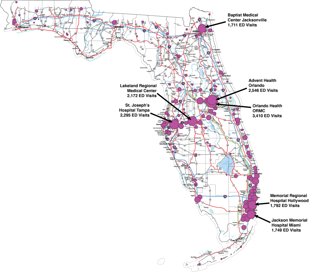
Fig.1 maps the number of emergency department visits for COVID-19 to 204 Florida hospitals during the week ending December 24, 2021, as reported to the U.S. Department of Health and Human Services. Each data point represents one hospital, and its size reflects the number of reported ED visits. We have specifically identified the seven hospitals with the highest volume of ED visits for COVID-19. At the head of the list was Orlando Health Orlando Regional Medical Center, located in Orange County, with 3,410 ED visits for COVID-19.
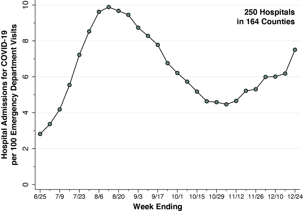
Emergency Department Visits Are Now Approaching Their Delta Peak of Last Summer.
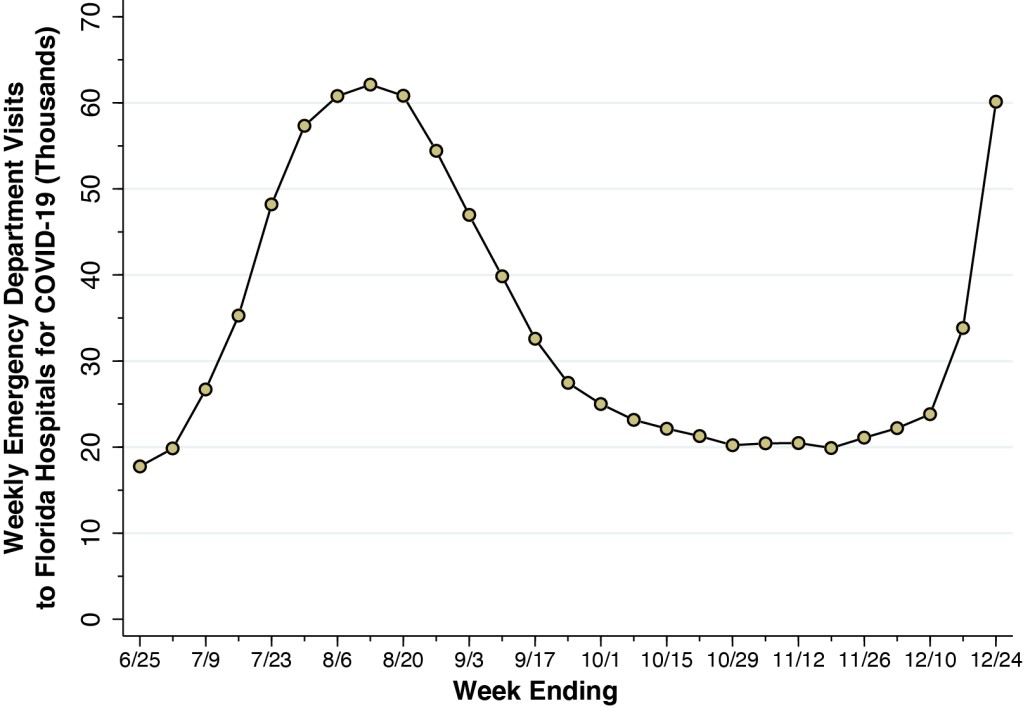
As shown in Fig. 2 below, weekly emergency department visits to Florida hospitals – representing all of the points in Fig. 1 combined – have now reached 60,113, a level just short of the maximum of 62,109 attained during the week ending August 13 during the Delta wave.
It’s arguable that the ED visit-based map in Fig. 1 has its own biases. Florida has a notably high concentration of uninsured individuals, who may preferentially seek the ED simply to get tested. Large hospitals with emergency departments may serve wide geographic areas. Residents from outside Orange County may travel to the two Orlando-based hospital EDs identified in our map of Fig. 1.
Still, emergency department visits quite likely track cases of Omicron infection with more than just a sore throat, fever, body aches and fatigue. They capture patients who are more seriously concerned about their symptoms. As we show in a separate article, ED visits track hospitalizations.
County-Based Maps Give a Distorted Picture.
The map in Fig. 1 above offers a much more finely detailed view of the recent spread of COVID-19 in Florida than the county-based maps that have already appeared in so many websites. Since the Florida Department of Health now reports only weekly total cases for the entire state, analysts have relied instead on the Community Profile Reports issued by the U.S. Department of Health and Human Services. In Fig. 3 below, we have constructed our own version of the county-based map, color-coded according to the number of reported cases per 100,000 population in each county.
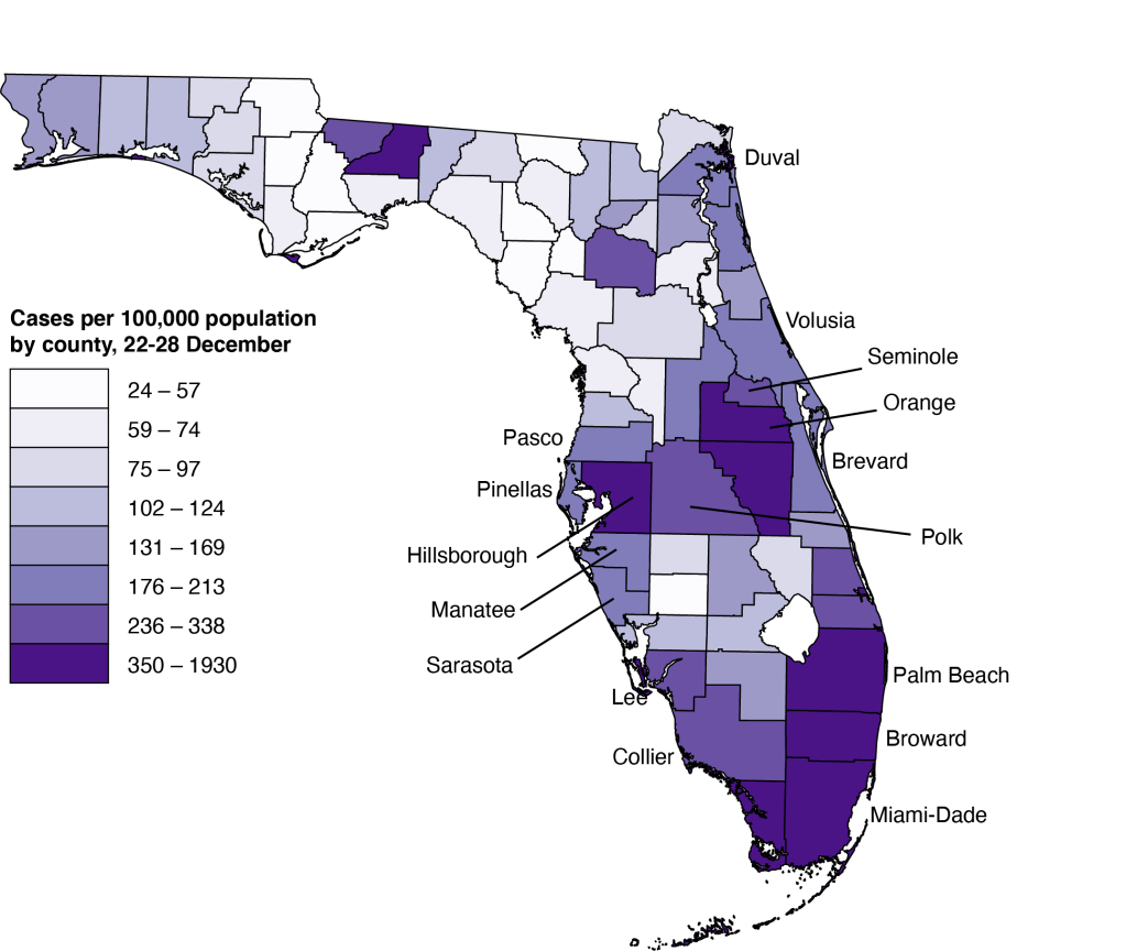
Unfortunately, these county-level visualizations may give us a distorted picture of where COVID-19 is actually surging in Florida. One problem is wide dispersion in population denominators. The map above tells us which counties have the highest reported case rates per population, but the counties vary widely by population. A high case-to-population ratio gets a darker shade of purple even if the county has relatively few inhabitants. Monroe County at the southwest tip of the state, encompassing the Everglades, had a rate of 496 cases per 100,000 population per week and thus merits a dark purple shade on our map, but the county only had 0.29 percent of all statewide cases.
Counties Are Too Big.
What’s more, the county is far too large a geographic entity to make any real sense of what’s happening in Florida at the micro level. Broward County had a rate of 1,205 cases per 100,000 during the week of December 22-28. The map in Fig. 3 tells us that the entire 1,323 square miles of Broward County is a hot spot. But Broward contains the cities of Fort Lauderdale, Pembroke Pines, Hollywod, Miramar, and Coral Springs, each with a population exceeding 125,000. By contrast, Fig. 1 tells us that the largest concentration is in Hollywood.
Rapid Tests as Luxury Goods
But there is an even more vexing problem. The map in Fig. 3 relies on an indicator of the spread of COVID-19 that has come increasingly into question. While state and county health departments like Florida’s continue to attempt to compile all confirmed diagnoses of COVID-19, particularly those cases documented through PCR (polymerase chain reaction) testing, the recent explosion in rapid home-based tests massively exaggerates the long-standing problem of case under-ascertainment.
Now think economics. As the demand for rapid home-based tests expands in the face of a limited supply, the market price of a rapid tests rises. As the market price continues to rise, rapid tests become a luxury good. They are consumed disproportionately by higher income consumers. That means those areas with higher incomes will suffer from even more under-counting.
That’s why emergency department visits, rather than aggregate case counts, hold more promise as indicators of COVID-19 spread in the state.
Technical Notes
The data were derived from COVID-19 Reported Patient Impact and Hospital Capacity by Facility, posted by the U.S. Department of Health and Human Services (HHS). The database is updated weekly. The most recent update, on which this article is based, covers the week ending 12/24/21.
The data on emergency department visits for COVID-19 are based upon the variable previous_day_covid_ED_visits_7_day_sum, defined as “Sum of total number of ED visits who were seen on the previous calendar day who had a visit related to COVID-19 (meets suspected or confirmed definition or presents for COVID diagnostic testing – do not count patients who present for pre-procedure screening) reported in 7-day period.”
The map was based upon the geocodes (longitude and latitude) of each hospital, which were already included in the HHS database. We relied on the Texas A&M interactive geocoding website to fill in the missing geocodes for 18 hospitals. The size of each point was based upon the weighting scheme built into the Stata scatter command. We set the weight of each hospital data point equal to (1 + EDV), so that the 30 hospitals with no ED visits were visible as the smallest points on the map.
The data available from the Florida Department of Health was much less limited in scope at the start of the COVID-19 epidemic. During the spring and summer of 2020, we took advantage of an extensive database of case-by-case reports of COVID-19, posted almost daily by the Department, to study the transmission of the virus from younger, socially mobile individuals to older, less mobile persons. Each line entry in the Department’s database displayed the date of diagnosis, age, gender, county of residence, hospitalization and mortality status of every single confirmed case of COVID-19 to date.
Still, even Florida’s daily databases gave only county-level detail. When we studied COVID-19 transmission in Los Angeles and New York City, the respective health departments reported cases at the individual neighborhood and zip code level. When we studied a COVID-19 outbreak at a university campus in Madison, Wisconsin, we zoomed all the way down to the census tract. County-level reporting simply doesn’t cut it. Our reliance on the geocodes of Florida hospitals fundamentally represents an attempt to get around the geographic coarseness of the Florida data.